
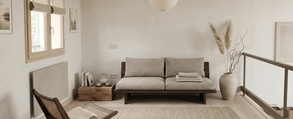
Japandi works best as a way of organizing a home rather than a list of objects to buy. Natural textures, restrained color and fewer well-chosen pieces matter, but they cannot compensate for awkward circulation or storage that does not match everyday life.
Start with use and proportion. The principles of combining colors and materials apply here too: establish a hierarchy, then let each choice contribute to the whole.
A blended design language, not a formula
“Japandi” joins Japan and Scandi. It brings together ideas associated with Japanese simplicity and Scandinavian warmth and practicality.
The source connects these with wabi-sabi, including an appreciation of simplicity and patina, and hygge, associated with a comfortable, welcoming interior. These are useful associations, not complete definitions of either culture.
Texture, plants, gentle light and natural materials help a pared-back room remain inviting. The point is not to suggest all other minimalism is cold, but to keep visual restraint compatible with actual comfort.
Edit before adding anything
Decluttering is the first structural move. Adding pale wood and plants to an overfilled room does not by itself change how it works.
Observe routes, daylight, available storage and objects used daily. Remove what has no useful or meaningful role, then choose what deserves to remain.
A rug, pendant or pale-wood piece can become the starting point for a coherent composition. Small additions of restrained pattern in cushions or textiles can follow without turning the room into a collection of competing statements.
This staged method can avoid a complete renovation. It is not a promise that every project will be inexpensive; the scale depends on what the room actually needs.
Build color through a quiet hierarchy
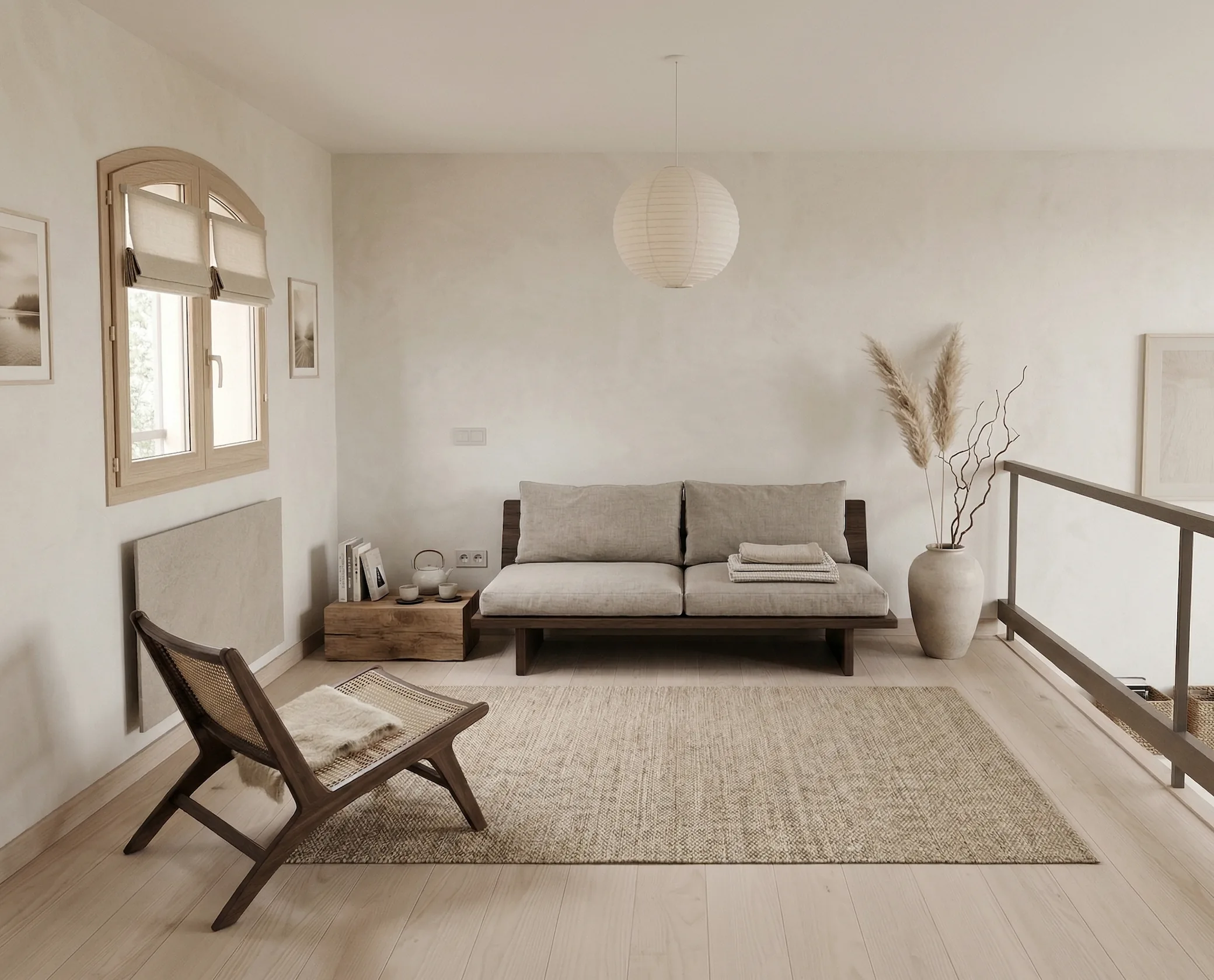
Off-white, beige, pale gray, khaki, seafoam and moss green form the source palette. Pure white is possible but not mandatory.
Forest green or deep navy can provide emphasis on one wall or inside a niche rather than taking over the whole background. These are compositional choices, not a universal ban on strong color.
Graphic or floral elements can fit when restrained: a well-proportioned picture, a branch in a stoneware vase, or a quiet textile pattern. Avoid multiplying motifs simply to make a neutral room appear decorated.
Choose materials for texture and use
Pale oak, ash and birch bring warmth; bamboo, linen, cotton, rattan and ceramics extend the palette. Matte texture is more characteristic than highly reflective finishes.
Avoiding glossy metal and plastic is a stylistic preference here, not a claim that those materials are inherently unsuitable in every home. A consistent relationship between surfaces matters more than rigid material rules.
Pale wood flooring is a natural fit, while wood-look tile or a restrained rug can also work. Keep format and color in scale with the rest of the room.
Read specifications as carefully as the appearance
Solid wood may allow sanding and repair depending on its construction. Veneer is often more stable and affordable but tolerates deep scratches differently, with less scope for sanding through the surface.
Oil or wax can preserve a matte appearance. A suitable matte varnish may be useful in a kitchen, but protection and maintenance depend on the actual product and exposure, not the finish name alone.
For engineered flooring, the wear layer affects future refinishing possibilities. With textiles, check fiber composition and washing instructions rather than choosing by the photograph alone.
Washed linen and substantial cotton add texture. Matte or soft-sheen paint often suits the palette, but not all matte paint is equally washable.
The source refers to wet-scrub classes 1 to 5 under NF EN 13300, the French adoption of the European standard, as a selection aid for busy areas. Check the declared product performance. FSC or PEFC information relates to responsible wood sourcing, not every aspect of durability or finish.
See our projects in video
Real floor plans and renovations explained step by step on the ArchiWorking YouTube channel. Watch how spaces are reworked before the works begin.
Living room: keep the essentials visible
A simple sofa, pale-wood table on slender legs and textured neutral rug can provide the main structure. Lower furniture leaves more visual height and helps an uncluttered arrangement feel open.
Keep a few intentional objects, such as a ceramic vase, plant or modest lamp. The opening living-room image illustrates low lines, pale wood and a restrained palette, not a requirement to reproduce every item.
Avoid filling every surface with ornaments. Empty space is part of the composition, while books and objects with a real role can still make the room personal.
Kitchen: useful objects, plain fronts
Off-white, sage or pale-gray fronts and discreet or wooden handles suit this approach. Wood, natural stone or a raw-looking countertop can reinforce it if chosen for its maintenance needs.
Highly glossy fronts and a heavy emphasis on stainless steel create a different visual direction. That does not make functional equipment incompatible; the overall balance is what matters.
A few plants or useful ceramic dishes on open shelves can remain visible. Keep that display selective so the kitchen stays usable rather than becoming another surface to overcrowd.
Bedroom and light: softness without stripping away life

A low bed can suit the look where appropriate for its users and ergonomics. Linen or cotton bedding, a small bedside table and gentle lighting can keep the composition quiet.
A book, fresh flowers and a carefully chosen lamp provide life without accumulation. This is a room in which objects are selected, not a room from which all comfort has been removed.
Use several light sources, such as a floor lamp, bedside lamp or wall fixture, rather than relying on one ceiling light. Around 2700 K gives the warm color temperature suggested by the source.
Suitable paper, linen or opal-glass diffusers soften the effect. A dimmer can provide clearer reading light and a lower evening setting, provided the equipment is compatible; decorative atmosphere is not a clinical sleep guarantee.
A continuous cabinet instead of new partitions
In the source’s house project, the owner wanted to reorganize a high-ceilinged living space without heavy construction or additional partitions, while retaining an interior lift.
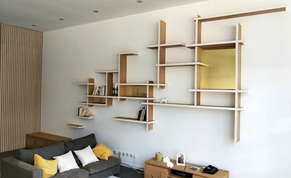
A continuous multifunctional unit was designed from the entry through to the living and TV area. It conceals the lift visually, holds books and objects and integrates the television.
Vertical wood slats emphasize height. Horizontal shelves connect the spaces, a round mirror softens the straight lines, and three brass plates placed in selected niches add restrained emphasis.
A joiner fabricated and installed the custom unit. Concealing a lift must not remove the access or operational provisions it needs; the composition is not a reason to compromise its function.
One architectural element answers several needs instead of multiplying independent cabinets. The project image shows the slats, continuous shelving and brass-backed niches, with no new partition as the organizing device.
How it differs from an industrial direction
Both approaches need coherence. The industrial interior guide emphasizes stronger contrasts, including metal and raw wood; Japandi generally favors softer transitions and continuity of natural textures.
These are tendencies, not absolute boundaries. The durable principle is a room whose functions, proportions and materials remain comfortable to live with after the visual trend has passed.
Frequently asked questions
What makes an interior Japandi?
A restrained blend of Japanese- and Scandinavian-associated design ideas, with practical organization, natural textures and warmth. Pale wood alone is not sufficient if the room remains cluttered or difficult to use.
Which colors are the starting point?
Off-white, beige, pale gray and muted greens. Forest green or navy can be concentrated accents rather than a whole-room background, with restrained pattern when it supports the composition.
How should a living room be arranged?
Begin with essential furniture, clear routes and proportion. Lower simple pieces and a few meaningful objects can keep the room open without making it empty or impersonal.
Is a complete redecoration necessary?
No. Edit first, then work from one useful structuring element. Textiles, cushions and rugs can introduce the language gradually while existing pieces are kept where they belong.