
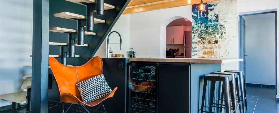
An industrial interior is not a checklist of exposed bulbs, black metal, brick, and concrete. Its appeal comes from the balance between those elements and the warmth needed for daily life. Clean lines and raw-looking materials can create a strong setting, but accumulation can turn an imagined welcoming loft into a crowded, cold room.
Clara AJMAR’s approach, updated in October 2026, begins with proportion rather than a furniture purchase. Color, material, and light are interdependent decisions. Each should respond to the room and the people using it, whether the project is a large open plan or a compact apartment.
Define the language, then choose what belongs
The recognizable vocabulary includes clean lines, some breathing space, controlled color, and contrasting materials. Pale timber often supplies warmth; flooring may be dark tile or parquet. Steel, stainless steel, and copper can appear in selected elements, while plants and graphic textiles soften the composition.
Common material families include raw or black powder-coated steel for legs, shelves, and framed glazing; solid pale oak or aged timber for tops and floors; leather seating; and concrete-effect surfaces. Brick slips, often around 1 to 2 cm thick in the source, can add a masonry reference without building a full brick wall. The actual substrate, fixing, and finish must suit the installation.
A slim steel-framed glazed divider, an exposed-track sliding door, or a metal light may already establish the direction. The fact that many attractive industrial objects exist does not mean they should all occupy the same living room, entrance, or bedroom. Hierarchy gives the theme its clarity.
Start with two columns: the room’s strengths and its apparent weaknesses. A constraint can become the strongest feature if the surrounding composition gives it a role. In a project of approximately 38 m², the client initially regarded the staircase as a problem. Once the industrial scheme was organized around it, it became one of the interior’s defining elements.
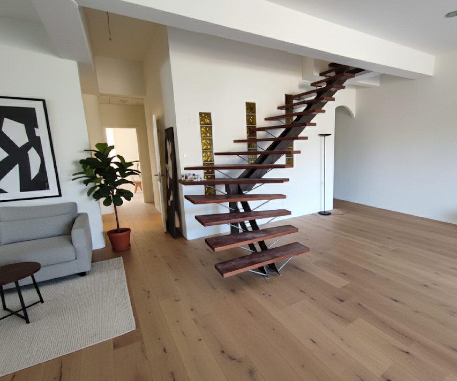
The staircase image illustrates that possibility: timber treads on a dark metal support, pale flooring, an armchair, and a large plant. It is the relationship between elements, not simply the presence of steel, that makes the scene work.
Calibrate color, material, and light together
A conventional starting palette might include charcoal, dark gray, and matte black, with timber or copper for warmth. Material choices could then combine textured surfaces, wood effects, and selected dark-metal details, including bathroom fittings where appropriate. Lighting determines whether those surfaces feel inviting or severe.
Before using large areas of dark color, assess natural light. A poorly lit apartment with charcoal walls and a dark floor can feel oppressive. In that situation, reverse the hierarchy: make light gray or off-white the main background and reserve the darker tones for accents. The industrial character does not depend on keeping the entire room dark.
For atmospheric filament-style light, the source suggests about 2200 to 2700 K. Around 3000 K offers a less amber option for a kitchen or desk area, subject to task needs. A color-rendering index, CRI, of 90 or higher can help timber and leather avoid looking dull. Color temperature and color rendering are different properties and should both be considered.
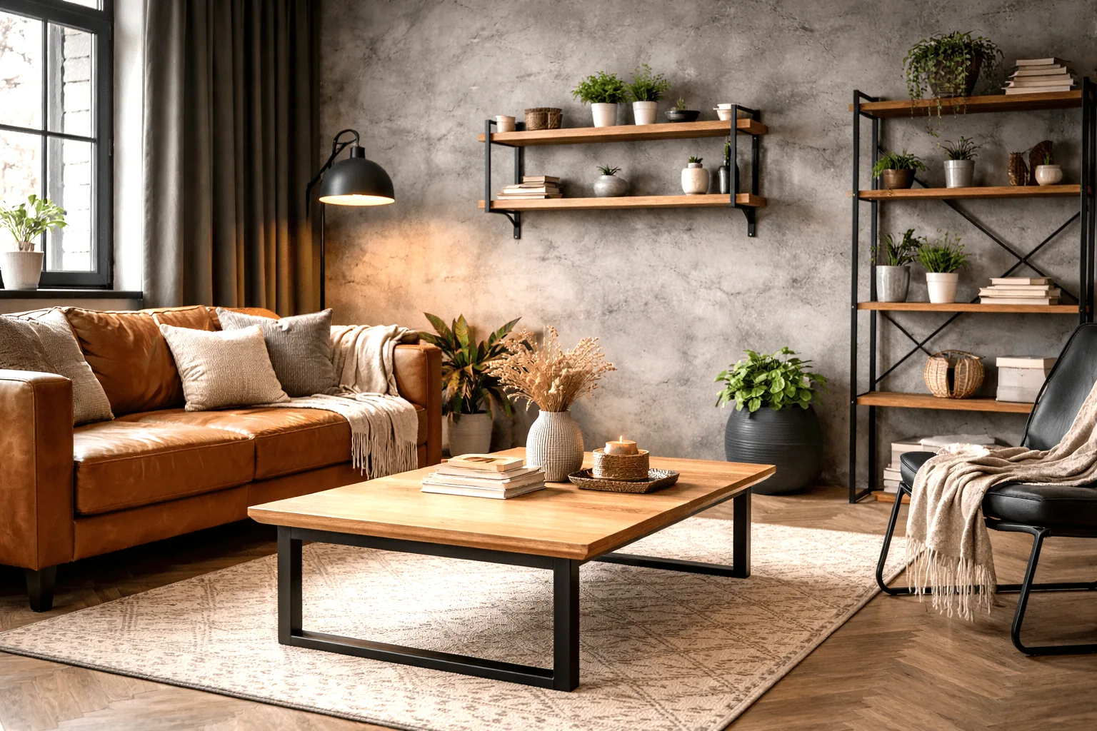
A black or charcoal wall works best when its light is intentional. In a darker room, a lighter background may reveal the same materials more effectively. This is why the style itself is not necessarily cold: the balance of surfaces and illumination determines the experience.
Counter hard materials with real warmth
Concrete effects, metal, and dark finishes provide much of the industrial vocabulary. If the palette stops there, the room can feel like a display rather than a home. Pale wood often supplies the missing counterweight without abandoning the intended character.
A light-oak tabletop on black steel legs, timber shelves against a dark textured wall, or pale parquet under charcoal walls works through opposition. Warm and cool materials should give one another definition rather than cancel each other out. See pale wood in interior design for species, finishes, and ways to avoid an incoherent mixture.
Textiles matter just as much. A graphic cushion, wool throw, or geometric rug adds tactile softness and makes the space comfortable to occupy. Plants can also soften a hard-edged composition. These are not accessories that must wait until everything else is fixed; they are part of the original balance.
In a renovation of a 1970s apartment, several partitions were removed to open the living area toward the kitchen. A large black-framed glazed screen marked the entrance-kitchen boundary. Matte-gray kitchen fronts related to the pale timber floor rather than competing with another dominant material.
Facing the entrance, an existing concrete-effect wall was retained as a central feature. Honey-colored parquet, a large heather-gray rug, and a sliding door on exposed rails completed the dialogue. The glazed divider and textured wall already gave the interior its identity, so there was no need to multiply industrial references. Our article on separating interior spaces develops the partitioning aspect.
See our projects in video
Real floor plans and renovations explained step by step on the ArchiWorking YouTube channel. Watch how spaces are reworked before the works begin.
Lighting can establish the style without heavy construction
Filament or Edison-style pendants are one accessible way to introduce an industrial reading. A visible bulb over a dining table, a black ceiling track, or a tubular brass wall light can change the room’s atmosphere without rebuilding its envelope. They are strong options in this author’s approach, not mandatory features of every industrial interior.
For a pendant above a table, the source gives approximately 70 to 80 cm between the tabletop and the bottom of the fitting. Treat that as a starting point to test against sight lines, glare, fixture dimensions, and user comfort. A long table may suit several lamps aligned along its length; a round table often suits one centered pendant.
LED filament bulbs commonly use an E27 base in the original European context and come in amber or clear glass. Select the correct base and electrical compatibility for the actual fitting and country. If using a dimmer, check that both lamp and control are compatible; a decorative bulb is not necessarily dimmable.
Compare light output in lumens rather than assuming that wattage tells you how bright the room will be. A black spotlight track can direct light onto a wall or shelving while avoiding a ceiling scattered with unrelated fixtures. Decorative light should be coordinated with the general and task lighting, not replace it automatically.
Concrete appearance does not require one particular coating
The source favors a well-chosen concrete-effect finish over genuine decorative microcement in many of its projects. The reasoning is practical: specialist application can be costly, cracking may occur if the substrate or system is unsuitable, and some surfaces need specific care and protection from acids or impacts.
That preference should not become a claim that every imitation is more durable than every microcement system. Performance depends on the complete assembly, substrate, protective layers, installation, and use. Compare products intended for the actual wall, floor, or wet area rather than choosing only from a photograph.
Several methods can create the appearance. A lime- or cement-based decorative render, often worked with a trowel in two passes, can provide depth. Concrete-effect paint is usually a simpler visual treatment but may appear flatter. A suitable wallpaper can be enough for one dry feature wall. In a damp room, verify the system’s suitability and any required protective finish; a generic matte coating is not waterproofing.
The original author describes a quality effect as visually indistinguishable in 90% of situations. This conveys her project experience, not an independently established product-performance statistic. Touch, light, joints, and edges may still reveal differences. See microcement in bathrooms and kitchens for the constraints of those more demanding locations.
Choosing a less demanding finish may free part of a renovation budget for other priorities. The relevant comparison is not simply the cheapest visible surface, but the cost and upkeep of a suitable installed system over time.
Two or three strong elements are often enough
The most common mistake is accumulation: filament pendants, concrete walls, metal shelving, black taps, dark tile, exposed metal framing, and vintage industrial furniture. Each can make sense individually. Together, without hierarchy, they may leave the eye nowhere to settle.
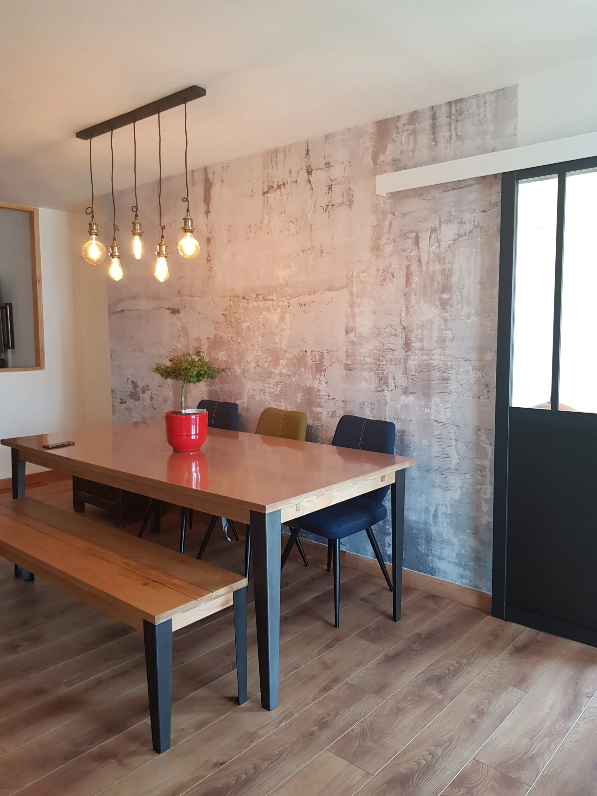
Clara’s practical rule is to choose two or three strong industrial elements per room and allow calmer materials around them. One well-positioned concrete-effect wall can have more impact than four competing textured walls. Restraint gives the selected pieces enough space to be noticed.
This is particularly important in a small room, where each addition has a larger proportional effect. The 38 m² example shows that a single existing feature, the staircase, can anchor the scheme. There is no requirement to recreate the full shell of a New York loft. See industrial style without a loft for adaptations to an ordinary apartment.
Questions before committing to the scheme
Which materials make the strongest starting combination?
Metal, timber, and a concrete-effect surface are a familiar trio in the source. Leather, brick, plants, or graphic textiles can complement them, but they need not all be present. Choose according to the room rather than treating the list as compulsory.
Is genuine microcement essential?
No. A suitable render, paint, or wall covering may achieve the intended visual reference. The right choice depends on location and performance requirements; a dry decorative wall and a shower enclosure are not interchangeable specifications.
How do I avoid a cold atmosphere?
Develop the palette, textures, and lighting together. Pale wood, soft textiles, and well-chosen warm light can temper hard surfaces. In a dim room, use a light main background with darker accents instead of surrounding the occupant with black and charcoal.
What should I check when choosing the bulbs?
Check color temperature, CRI, output in lumens, fitting compatibility, and dimming requirements. The source’s atmospheric range is 2200 to 2700 K with CRI 90 or above; task areas may need a different balance. Test the resulting comfort rather than relying only on the bulb’s appearance.