
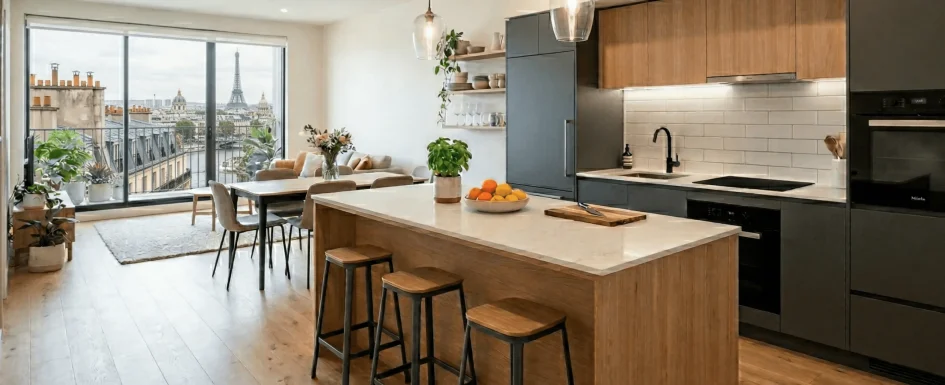
Pale wood can warm a room without making it feel heavy. Natural oiled oak, Nordic pine, wicker, and rattan bring different kinds of organic texture, and they no longer need to be painted or stained dark to belong in a contemporary interior. Their success depends on species, finish, proportion, and the way the space is used.
In this account, updated in October 2026, Clara AJMAR explains how she chooses and combines light timber. The aim is not to cover every available surface in wood, but to make a few well-chosen elements connect the room’s functions and colors.
Warmth without visual weight
Dark wood once stood for solidity and a classical interior; the all-white rooms associated with 2010s Scandinavian minimalism offered a different ideal. Pale timber provides another balance: warmth and visible material without the same visual density as a dark, heavily furnished scheme.
It can appear in a dining table, chairs, bookcase, headboard, or entrance bench. Smaller elements also matter: a raw-wood mirror frame, floating oak shelves, wicker baskets, or a rattan pendant can give the room depth and a lived-in character. These are related natural materials, not interchangeable timber species, and each has its own maintenance needs.
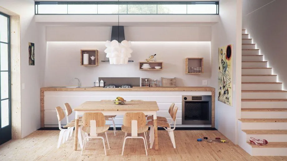
The kitchen photograph illustrates the principle simply. Pale wood in the worktop, table, and staircase warms a white base. The timber is active in the composition rather than a background assumed to be neutral. It links elements at different scales without requiring a separate decorative statement on every wall.
Why oiled natural oak is the author’s first choice
Clara often recommends natural oiled oak for its durability in everyday use and its gently honeyed tone. A suitable oak finish can develop an attractive patina rather than looking immediately dated. Compared with some pale pine, which may yellow noticeably, it can provide a more controlled starting palette.
That is a preference, not a promise that oak never changes color. Light exposure, the timber, and the finish all influence aging. Assess samples and product information instead of assuming that a species name guarantees permanent color or freedom from upkeep.
In one recent apartment, natural oiled-oak flooring was paired with slightly blonder brushed-oak kitchen fronts. The small difference created a gentle warm-versus-cool timber contrast without introducing an unrelated material. The clients had feared an overly uniform result; variation within the same family gave it depth instead.
Care should fit the finish. Avoid aggressive cleaners that strip the protective oil. The source suggests an annual application of a suitable maintenance oil as a reference, but the actual schedule depends on product instructions and wear. Regular appropriate care matters more than following a calendar regardless of the floor’s condition.
When a wood-look alternative is more sensible
Real pale wood is not automatically the best answer to a pale-wood brief. Strong direct light, frequent pet traffic, and a maintenance routine that is difficult to sustain can make a particular timber floor a poor match. Clara describes projects where those conditions led her to propose bleached-wood-effect tile instead.
That keeps a related color and texture while changing the practical characteristics. A suitable tile may simplify cleaning and resist the relevant wear better than the proposed timber system. It is still necessary to check the actual tile’s slip performance, installation, joints, and suitability; a wood-look pattern alone does not make every product appropriate.
The design decision is a balance between the desired atmosphere and the reality of use. Forcing an attractive material into an unsuitable situation can produce a worse long-term result than selecting a convincing alternative from the beginning.
Two reliable palette directions
For a gentle atmosphere, combine pale timber with off-white and linen. This is a familiar Scandinavian relationship: natural materials, a quiet palette, and diffuse light. A very light, almost blond wood helps maintain continuity where the aim is a restful interior without visual overload.
For a stronger contemporary or industrial setting, combine it with black or charcoal. The dark elements provide structure, while the timber brings warmth. A slightly warmer or more distinctly blond wood makes that contrast legible without necessarily making it harsh. The important part is their relationship, not a fixed recipe attached to a style name.
Our guide to combining interior colors explores the same question of proportion and repeated references. In both directions, wood should contribute deliberately to the composition. It need not be treated as an invisible neutral that can be added without considering its undertones.
See our projects in video
Real floor plans and renovations explained step by step on the ArchiWorking YouTube channel. Watch how spaces are reworked before the works begin.
One fitted unit, four connected functions
In a house project, a custom unit brought together a bookcase, desk, storage, and concealed hanging space. It was visible from both living and dining areas, so it needed to read as a coherent piece rather than a series of unrelated cupboards.
Pale-wood finishes worked with light colors and blue-green areas. White-and-gold marble-effect wallpaper lined the backs of niches. Two niches accommodated the desk, work surface, and open storage, while a door concealed a wardrobe for the household and guests.
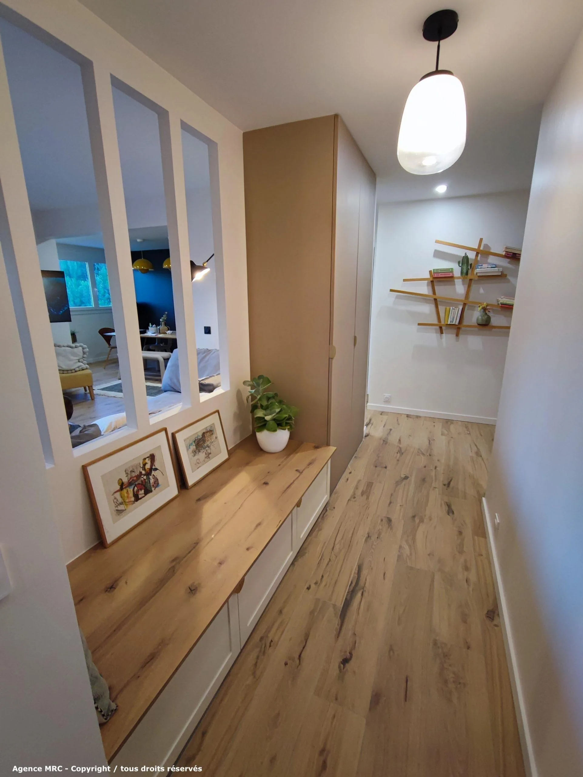
The timber served as the connecting thread among the functions. Cabinet depths, access, and fabrication finishes were considered in advance for the joiner, rather than resolved after the decorative image was complete. The accompanying entrance illustration similarly shows how a bench, storage, shelving, and oak flooring can share a material language.
Adapt its role to the style
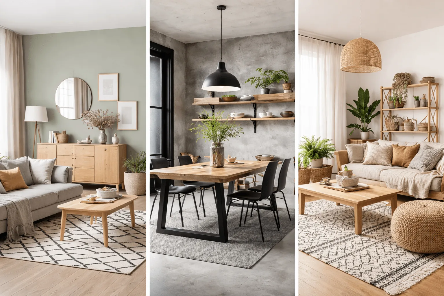
In a Scandinavian room, pale timber can be the base material. To avoid a sterile or excessively white result, Clara suggests a colored wall, graphic rug, or a more assertive piece of furniture in front of it. The wood then tempers the contrast while keeping the room warm and coherent.
In an industrial room, it counterbalances steel, concrete, and charcoal surfaces. A light-oak table on black metal legs, or a timber shelf against a textured wall, works through the opposition between warmer and cooler materials. The aim is not to neutralize either one, but to let each give the other definition.
In a bohemian interior, combine it with wicker, rattan, linen, and raw cotton. A pale coffee table, woven pouf, and black-and-white graphic rug can create an inviting setting. The author’s advice is to reserve the timber for principal pieces such as table, bed, and storage, then allow accessories to introduce other natural textures.
Too much wood can make even a pale bohemian room feel heavy. A material associated with airiness still needs restraint. The illustration showing Scandinavian, industrial, and bohemian settings demonstrates how the same broad timber family can play different roles.
A 180 m² house: repetition without covering everything
A reorganization study for a 180 m² house on two levels developed a warm industrial atmosphere with pale wood, black fronts, white surfaces, and blue accents. The L-shaped kitchen wrapped around an island incorporating part of an existing structural column.
Two pale-wood shelves along that column turned a constraint into useful storage. A worktop upstand approximately 25 cm high, finished in light-gray tile, protected the wall behind the cabinet run. Those small timber and finish decisions helped integrate the existing geometry rather than conceal it with unrelated details.
In the living room, a fitted television unit occupied an existing recess. Alternating open and closed niches let the pale wood balance the black surfaces. In the main bedroom, a 300 cm headboard incorporated niches and a large timber shelf. The repeated material related the rooms without making them identical.
The lesson is not that pale wood must be everywhere. Shelves, a worktop, and selected niches can establish continuity just as effectively when their placement is purposeful.
Keep the timber family under control
A pale-pine floor, bleached-oak table, beech bookcase, and bamboo frame can each look appealing separately yet conflict together. Their grain and undertones may compete even though all are described as light wood. The label is too broad to guarantee compatibility.
Clara’s working guideline is no more than two pale timber species in one room, preferably with tones close enough to create continuity. It is an editing principle rather than a universal prohibition. If natural oak is already the main floor, oak or a convincingly related tone in principal furniture gives a clear starting point.
Variation can come from finish: oiled, brushed, or matte surfaces provide depth without adding a third unrelated species. Compare samples together under the room’s lighting, with the existing floor visible. Material decisions should be made as a group rather than one attractive purchase at a time.
Common questions
Is pale wood limited to a Nordic interior?
No. It may be the foundation in a Scandinavian setting, a warm counterweight in an industrial one, or a principal material among woven textures in a bohemian room. Its role changes with the surrounding palette.
Can two woods work together?
Yes. The apartment’s oak floor and slightly blonder brushed-oak fronts show how subtle variation can avoid monotony. Keep a clear hierarchy and compare undertones rather than simply collecting several pale finishes.
What if real timber is too demanding?
A suitable bleached-wood-effect tile may preserve the visual direction while better fitting cleaning and wear requirements. Compare the actual products and the installation conditions, not just their appearance in a photograph.