
Will royal blue work with a coral table? Can a strong green coexist with patterned wallpaper, or mustard yellow with timber paneling? These questions often express the same concern: choosing a color that looks convincing on its own but feels wrong in the room. Clara AJMAR’s approach is to look at relationships, from one surface to the next and from one room to another.
The useful question is not whether two named colors are universally compatible. Their undertones, proportions, materials, and lighting determine how they behave together. A successful palette responds to what is already there and gives the eye a clear way to read the space.
Give the palette a hierarchy
The familiar 60-30-10 approach is a practical starting point. About 60% of the visual field belongs to a dominant color, often gentle or neutral; around 30% brings a secondary color with more character; the remaining 10% provides an accent. This is a decorative guide, not a universal law or an instruction to calculate every square inch.
Walls and flooring often carry the dominant share. Main furniture, a bookcase, or curtains can carry the secondary tone. A cushion, vase, picture frame, or plant may introduce an accent. Existing materials and the amount of visible surface matter more than forcing an exact percentage onto an awkward plan.
Before committing to a vivid accent, ask whether it can appear in at least three places. An isolated spot may look accidental; a few considered repetitions suggest intention. They need not be identical objects or equally large patches. A frame, lamp base, and tabletop detail can let color travel without filling every wall.
This is also a useful alternative to making a single feature wall do all the work. Small echoes guide the eye across the room, while leaving more of the background calm. The goal is a recognizable relationship, not an inventory of matching accessories.
Find the bridging tone, including its undertone
Gray can connect colors that initially seem difficult to reconcile, but it is not literally neutral in every setting. A warm, slightly beige gray often sits more comfortably beside reds, ochres, and yellows. A cooler, bluish gray tends to relate more naturally to blues and greens. Compare the actual samples rather than assuming that any gray will bridge any palette.
Off-white can play a similar linking role, often with a warmer impression. Light door frames and white baseboards can create a discreet outline around stronger walls. That framing gives a vivid color breathing room and helps structure the room without adding visual weight.
A pastel can also soften a more saturated shade. The contrast is not necessarily as abrupt as the color names suggest. In a room already organized around black and white, mustard yellow is one way to introduce warmth without dismantling the whole scheme. For other warm combinations, see orange and terracotta in interior design.
Bridging does not mean erasing character. The point is to give separate elements a context in which they can coexist, whether the anchor is paint, timber, a pale trim color, or a repeated finish. Judge the complete grouping, not a single pair of swatches held in isolation.
Test the finish in the light it will actually receive
Apply a generous sample, at least 50 × 50 cm in the source’s method, and observe it at different times. Morning daylight and evening artificial light can change the same color considerably. A small store sample cannot reveal every effect of orientation, nearby finishes, or the home’s lighting.
On older walls with imperfect corners, Clara sometimes uses a narrow return or border of less than 2 cm to obtain a cleaner visual edge without emphasizing an irregular junction. It is a site-specific finishing technique, not a requirement to outline every corner. Assess the wall and sight lines before adopting it.
The finish deserves as much attention as the hue. A glossy plane can amplify reflections, while matte finishes calm them. Texture changes how the color catches light across the day. A palette tested only as a flat printed chart leaves out a large part of the final result.
See our projects in video
Real floor plans and renovations explained step by step on the ArchiWorking YouTube channel. Watch how spaces are reworked before the works begin.
The material changes the color
The same green on velvet, smooth fabric, and paint does not have the same depth. Velvet’s pile catches and absorbs light differently as the viewing angle changes. That can make a strong color rich rather than flat. The source also values easy-care upholstery, but cleanability must be checked for the particular fabric: velvet is not automatically washable.
Clara describes a preference for a subtly textured wall finish and a matte ceiling. The wall texture dresses the surface without adding another overt pattern; the ceiling avoids distracting reflections. This is a project approach to light and texture, not a rule that every room must use a single finish system.
Color alone cannot compensate for weak lighting or awkward furniture placement. A beautiful paint choice may lose its effect if the room is badly arranged or the relevant surface remains in shadow. Layout, illumination, materials, and color should be developed together rather than treated as unrelated final decisions.
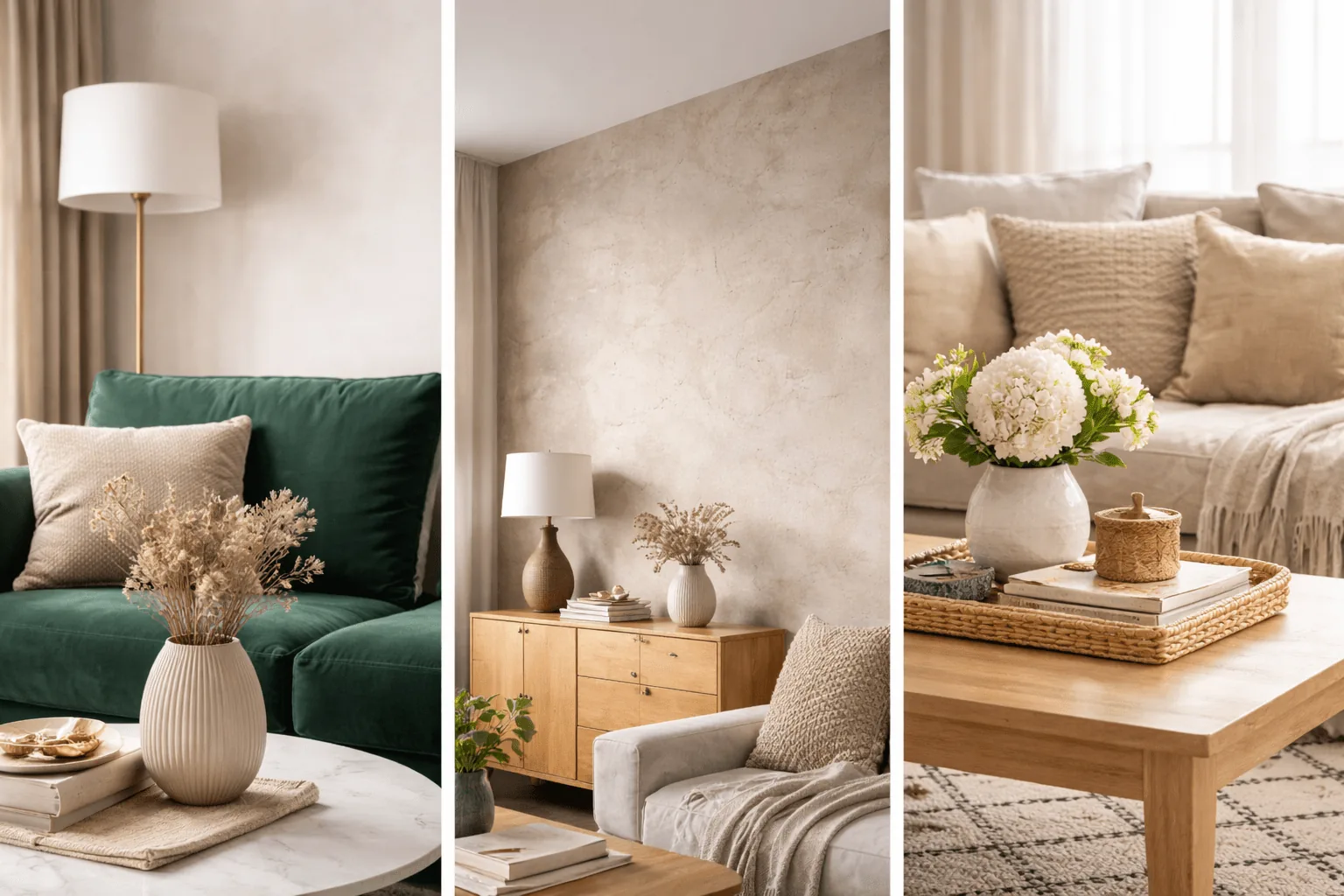
The illustration comparing green velvet, pale wood, and textured walls makes that relationship visible. It is not simply a selection of hues: it shows how light and surface character change the atmosphere within a related palette.
Two renovations, two ways to create continuity
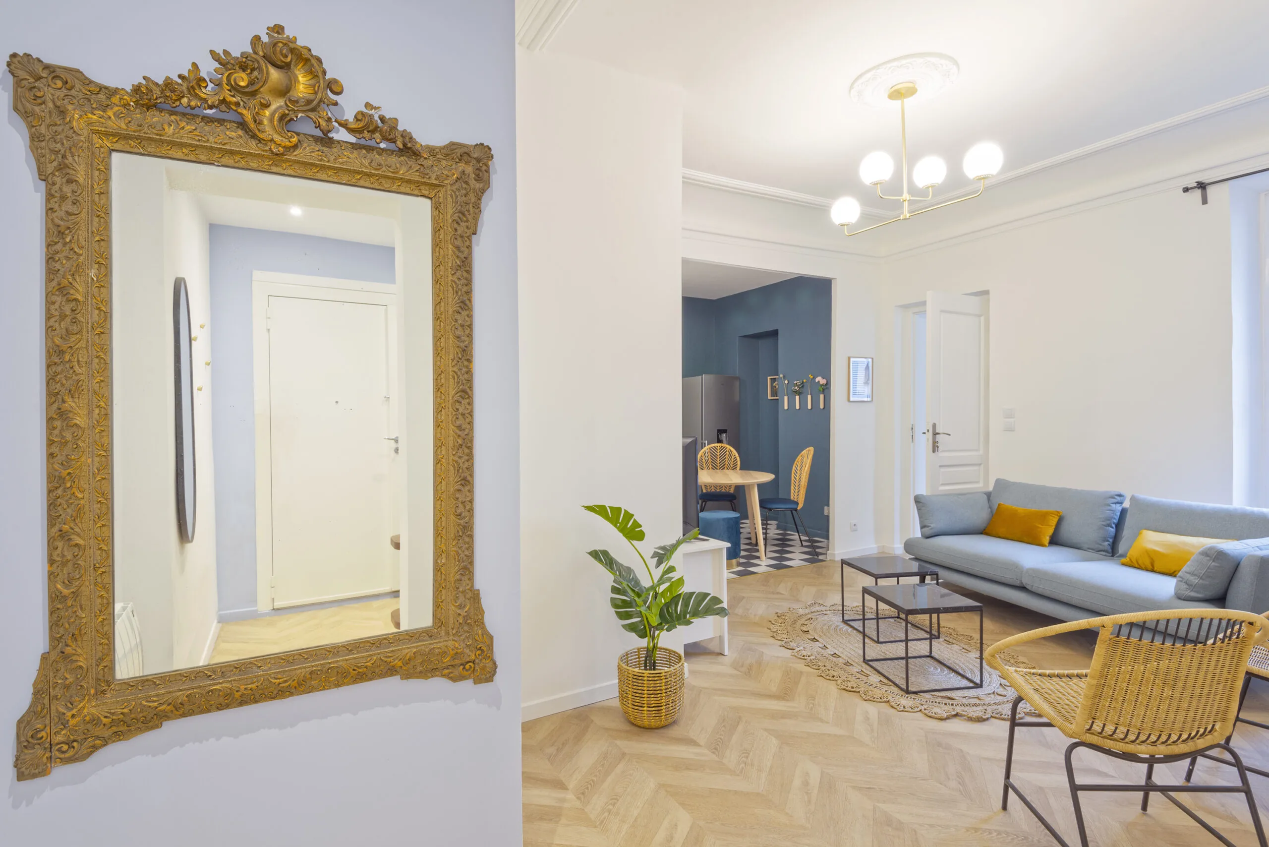
In an older 80 m² French T3 apartment with ceilings close to 3 m, the kitchen opens toward the living room. Deep peacock-blue cabinetry or surfaces are balanced by pale wood, a glossy zellige-effect backsplash, and brass details. A black-and-white checkerboard floor reinforces the vintage character without requiring every surrounding surface to become dark.
In the living area, related effects appear more quietly through a gold-toned pendant with frosted glass, an oval jute rug, and black-marble side tables. Continuity comes through materials and finishes, not by repeating precisely the same paint on every wall. The photograph of the large gold-framed mirror and view into the blue kitchen illustrates that dialogue.
A different approach appears in a 70 m² apartment. Retained dark parquet, a black wall, white walls, and stone cladding establish a stronger contrast. Pale-timber furniture, a mustard-yellow armchair, and white and colored wall-storage cubes soften and animate it.
In that apartment’s bedroom, deep emerald green wraps around almost the entire bed area. The existing closet’s mirrored doors were retained; they reflect the color and extend the perception of depth. A dark tone can work well when its surroundings and illumination are controlled, rather than being ruled out simply because it is dark.
Neither case follows a matching-set formula. Each responds to what the apartment already offers, using some repeated materials and a limited number of deliberate contrasts to make separate areas feel related.
Questions to settle before painting
Is 60-30-10 compulsory?
No. It helps establish a dominant, secondary, and accent relationship. Adapt it to the visible surfaces, existing materials, and light rather than forcing exact ratios. A clear hierarchy matters more than mathematical precision.
Does gray go with everything?
It works with many palettes, but its temperature matters. Compare warm grays beside warm colors and cooler grays beside blues and greens, then test the actual combination in the room. Off-white can be another useful bridge.
Is a large sample really necessary?
It is much more informative than a tiny swatch. Observe the sample in daylight and under the lights used at night, alongside the furniture and finishes that will remain. A color that looked right in the store may read quite differently at home.
Can material choice be as important as color choice?
Yes. Velvet, matte paint, smooth cloth, and reflective surfaces respond differently to light. Choosing the finish is part of choosing the color, not merely a technical decision made afterward.