
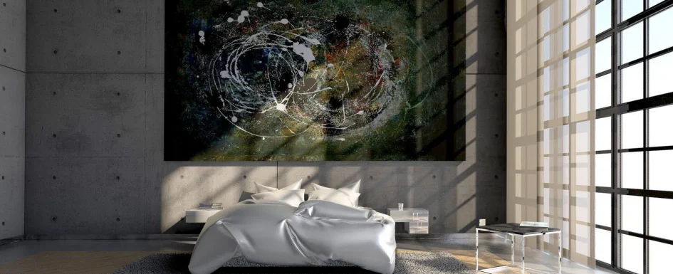
Wabi-sabi is not a reason to neglect a room or fill it with old objects. In an interior, it offers a way to value simplicity, natural variation and the marks of time while keeping the arrangement deliberate.
The same principles of color and material composition still apply: relationships, hierarchy and space around the things that matter. Patina becomes more expressive when it is not competing with clutter.
Begin by making room for character
Remove objects that have no useful or meaningful place in the composition. One worn piece in a restrained setting can have more presence than a room crowded with similar finds.
The aim is not to manufacture imperfection everywhere. Choose what deserves attention and give it a calm background. An irregular ceramic vessel, a knotted wood surface or an old frame can each become significant without requiring an entire antique interior.
Wabi is associated here with simplicity, quiet solitude and a relationship to nature; sabi with aging and patina. These are an entry into the design approach, not a complete account of Japanese aesthetic thought.
Distinguish patina from damage that needs attention
An old brick wall can retain visible history. A wood piece may show its grain and traces of use. A porous terracotta planter can record watering. These qualities can be part of the intended appearance rather than defects to erase.
That does not mean keeping unstable furniture, active deterioration or unsafe surfaces. A decorative trace of rust is different from corrosion that compromises a support. Preserve character without confusing it with a reason to ignore necessary repair.
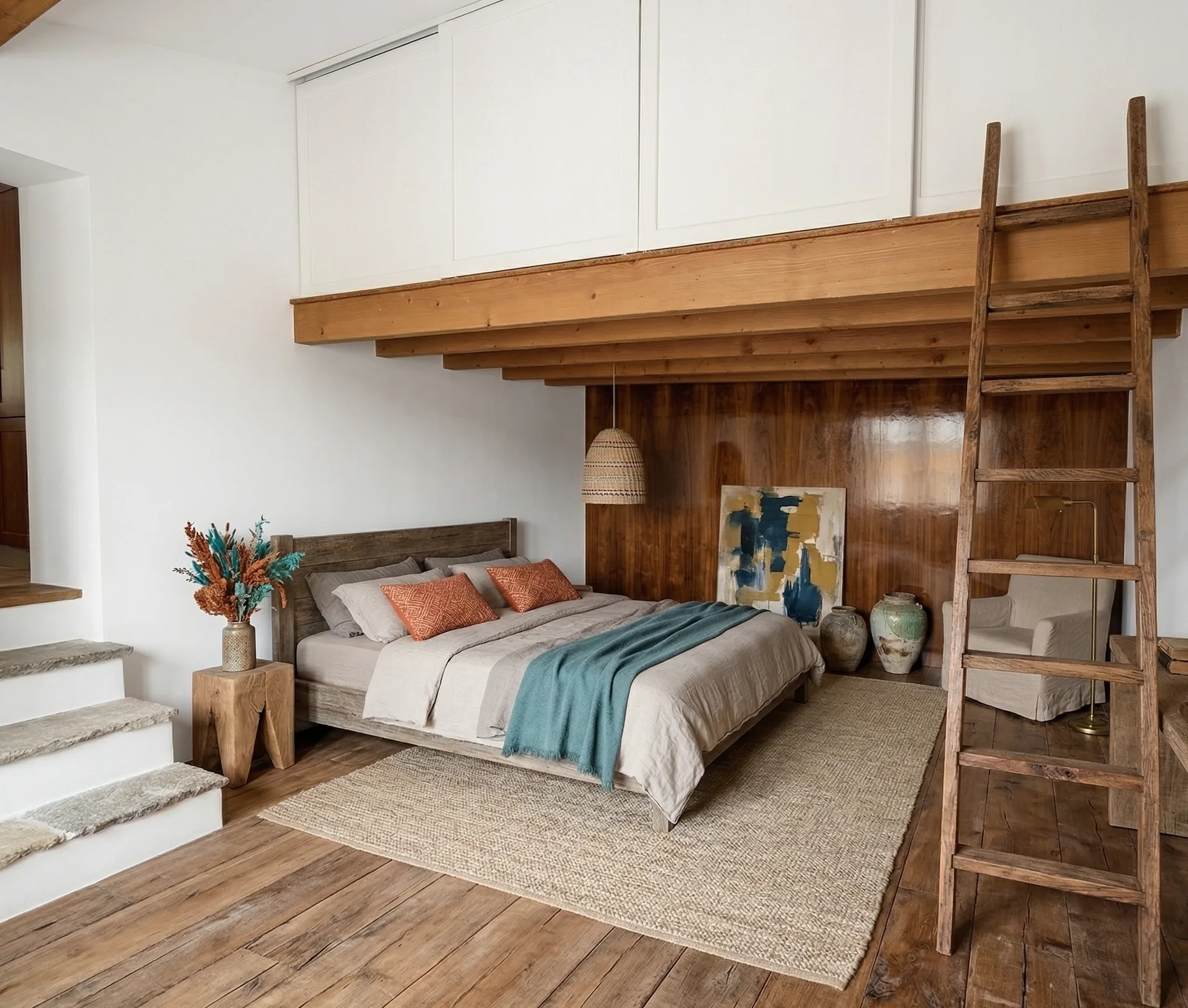
The photographs show patinated objects and natural materials within contemporary settings. They illustrate careful selection, not a requirement to accept every imperfection in a building.
Choose materials and their finish together
Wood, natural stone, linen, cotton, clay, handmade ceramics and rattan offer different kinds of texture and change over time. The appeal lies in how they are used, not an automatic rule that natural materials are always better.
An irregular vase, a solid-wood table with a visible knot or a slightly aged mirror can suggest history without a large decorative collection. Select a small number of pieces whose material qualities can be read clearly.
Oil or wax on an appropriate solid wood can allow local maintenance and the development of patina. A thick film finish can behave differently when scratched. Select by actual use and care rather than declaring one coating suitable for every surface.
Porous limestone may benefit from a compatible clear water- and oil-repellent treatment that avoids a wet-look effect. Confirm the particular stone and product; the desired aged appearance is not the same as accepting avoidable staining.
For walls, lime or clay plasters and suitable mineral paints can create subtle variation. Their compatibility with an older wall depends on the full construction and moisture conditions. “Breathing” is not a cure for a damp building.
Check handmade ceramics for intended food use and dishwasher suitability before using them that way. Unlacquered brass can darken and oxidize over time where that effect is wanted; lacquered brass gives a different maintenance and aging response.

Use contemporary pieces as the setting
Thick white curtains, a simple sofa and a pale neutral floor can frame the older or rougher elements. The new pieces do not undermine the approach; they help make the chosen patina visible.
A restrained room gives an old object space to be noticed. Repeated flea-market finds without hierarchy can instead make it difficult to understand what the composition is about.
The question is therefore not how many vintage pieces the room contains, but what each contributes. A useful contemporary item and one expressive older object can be more coherent than a room filled entirely with age.
See our projects in video
Real floor plans and renovations explained step by step on the ArchiWorking YouTube channel. Watch how spaces are reworked before the works begin.
A farmhouse study kept the existing character
In the ground-floor redesign study of an old mas, large existing beams and exposed stone walls defined the building. The task was to introduce a contemporary kitchen without erasing that identity.
The proposed palette combined soft seafoam green, a wood-effect laminate countertop and the retained stone. Color at the ceiling gave the kitchen a more individual treatment.
A custom glazed partition was planned between the kitchen and entry to distinguish functions while sharing daylight. The design incorporated existing irregularity instead of treating every old surface as something to hide.
This was a renovation study, not a claim that each proposed detail had already been constructed. Its dominant atmosphere remained bohemian chic, with a way of working close to the wabi-sabi interest in material history.
The useful lesson is the relationship between old structure and new function. A contemporary kitchen can belong in a historic setting without either copying the past or covering it completely.
Coordinate a natural palette
Beige, gray, off-white and brown can provide a quieter base. Deep blue or wine-red can be used on one wall to give objects and furniture a stronger backdrop, with lighter surfaces elsewhere to balance the room.
Those are examples rather than a fixed palette. Consider what the retained timber, stone and ceramics already contribute before introducing another color.
The source’s second image brings wood, linen, ceramics and patinated furniture together in neutral tones. Texture supplies interest where the number of colors remains limited.
Let light reveal the surface
Daylight changes how irregular materials are read through the day. Shadows on plaster, grain in wood and the relationship of planting to a window can give the room variety without adding more objects.
Branches in a vase or appropriate plants can support that relationship with natural form. They should belong to the composition, not become another layer of clutter.
For evening light, a wall fitting or indirect source near a textured surface can reveal relief. Grazing light also reveals defects, so choose the surface and direction intentionally.
The article uses around 2700 K and a color-rendering index of 90 or above as useful references for wood, clay and linen. They do not guarantee an exact daylight appearance; assess the actual lamps and finishes together.
Suitable paper, linen or ceramic diffusers can soften the source. Matte finishes produce a more diffuse reading than glossy highlights, but do not literally absorb all light. Use shades and lamps designed to work safely together.
Wabi-sabi and Japandi can overlap
Both favor restraint, natural materials and a relationship with nature. In the distinction used here, Japandi emphasizes a bright, functional simplicity, while wabi-sabi gives more prominence to time, irregularity and emotional association.
These are overlapping design approaches, not mutually exclusive rules. Let one guide the room and use the other more lightly if that helps keep a clear hierarchy.
The Japandi guide develops that related method. The result should feel intentional and livable rather than like an exercise in collecting recognizable style markers.
Frequently asked questions
Does wabi-sabi mean a distressed interior?
No. It values selected traces of use within an ordered setting. Maintenance and safety remain important; accidental neglect does not become a coherent design merely by being old.
How can vintage objects avoid looking cluttered?
Choose carefully, leave space and use quieter contemporary furniture as a frame. One or two meaningful pieces can be enough when their material character is visible.
Which colors work with it?
Natural neutrals and selected deeper backdrops are useful starting points. Relate them to retained materials and light rather than applying a mandatory beige scheme.
Must every piece show age?
No. Contemporary objects can provide function and a calm setting for patina. The balance between them is what allows the older piece to have presence without overwhelming the room.