
Choosing a blue you like is the beginning. The design work is making it belong to a particular room, with its light, materials, proportions and other colors.
Navy, petrol blue, teal, seafoam and Klein-inspired ultramarine are not interchangeable. The color-combination guide starts from the same principle: consider the whole composition rather than ask a paint name to do all the work.
Compare lightness, saturation and undertone
A commercial name is an imprecise description. Look first at value, meaning how light or dark the sample is, then saturation and whether the undertone appears greener, grayer or more violet.
Manufacturers may provide a light reflectance value, or LRV, on a scale from 0 to 100. Some dark navies reflect less than 10 percent, while some pale sky blues reflect more than half the incident light; check the actual product rather than assigning a fixed value to a color name.
Two blues with similar lightness but different undertones may create an awkward relationship if that contrast was not intended. They can also be combined deliberately; incompatibility is not an automatic property of the pigments.
A tonal composition can move from pale sky to nearly black midnight blue when a clear thread connects the shades. It is not necessary for every item to be exactly the same blue.
Mixing exercises explain direction, not proprietary paint formulas
In a subtractive color exercise, cyan is a useful starting point. Black can darken, white lighten, yellow shift a mixture toward green and red toward a more violet direction.
Gouache or acrylic studies can help explore those shifts before selecting a professional coating. They are not recipes that identify the actual pigments in every wall paint.
In particular, names such as petrol and duck-egg or teal do not prove the presence or absence of yellow pigment. Manufacturers use different formulations and sometimes different meanings for the same descriptive term.
Use the exercise to understand the intended direction, then compare the real sample. Do not assume a small handmade mix predicts the coverage, sheen or color of a commercial product.
Sample in the room, across the day
Test an area around 50 × 50 cm or larger with the intended finish and an appropriate prepared base. The actual wall is particularly informative; a representative prepared board can also help compare positions, provided its surface is understood.
Look in the morning, midafternoon and evening under the lighting that will actually be used. Store lighting can make a sample look quite different from its appearance at home.
Keep adjacent materials in the test. A blue considered alone against white may behave differently beside warm flooring, stone or a large piece of colored upholstery.
This is not indecision. It is how the paint is checked against the conditions it will occupy before a whole room is committed to it.

Distinguish the main blue families without treating names as standards
Navy is very dark and can approach black in its visual weight. It may suit a bookcase, lower wall, internal joinery or a deliberately dramatic alcove, often with brass or darker wood.
Petrol blue is commonly a deep, complex blue or blue-green. Its relationship to teal varies by range, so the original article’s distinction based on “no yellow” should not be read as a universal chemical definition.
A greener teal or “bleu canard” can bring a different balance, including on velvet or a living-room wall. The teal-blue guide develops its use with light and materials.
Seafoam is a much paler blue-green direction, useful where a lighter effect is wanted, including some small bathrooms or bedrooms. The green interiors guide explores the neighboring family.
For a lower painted wall section, approximately 90 to 120 cm is an initial height reference, sometimes described as around a third of the wall. Actual proportions decide that relationship; those measurements are not mathematically one-third of every room height.
A trim or clean line can emphasize the transition. Check the line with furniture and openings rather than carry an arbitrary height around every obstacle.
Finish changes the blue as much as the name
Deep matte can give a velvety appearance and reduce directional reflections, but cleaning resistance varies by product. Low sheen or satin may suit other uses without being universally better for every kitchen or bathroom.
The source refers to NF EN 13300 wet-scrub classes 1 to 5, with class 1 the highest resistance in that classification. Classes 1 or 2 can be useful selection targets in busy areas, alongside the maker’s declared suitability.
A very dark color may use a dedicated tint base and need a compatible tinted primer, sometimes gray or a related blue. Plan at least the manufacturer’s required coats; the article’s two finishing coats are a starting expectation, not a universal coverage promise.
Order sufficient material from a consistent production batch where possible and keep identification for later work. A retained remainder can help, although local touch-ups may remain visible on a deep matte surface.
Klein blue: an artistic history and a demanding surface
Yves Klein’s work in the 1950s is associated with intense matte ultramarine. He did not invent the ultramarine pigment itself.
With color merchant Édouard Adam, he developed a binder approach that fixed the pigment while preserving its particular appearance. The formula was deposited in 1960 under the International Klein Blue name, rather than establishing ownership of every saturated blue shade.
Decorative coatings described as Klein blue are not necessarily one identical reference. The French manufacturer Ressource is an example discussed in relation to this kind of finish, not a claim that any standard ultramarine paint reproduces an artwork’s material system.
Follow the chosen supplier’s substrate preparation, primer and application instructions. Smooth preparation and controlled finish matter to the intended depth, especially on an exposed focal wall.

Concentrate a strong ultramarine where it has a role
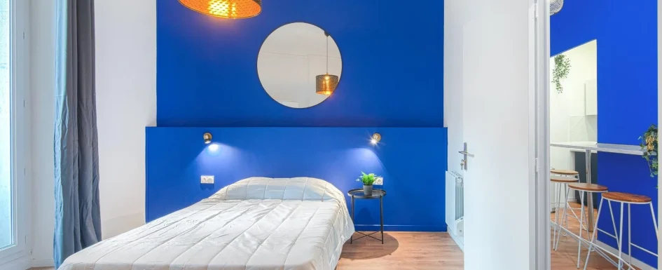
A bar surround, corridor wall or headboard area can carry a strong Klein-inspired blue while the rest of the space remains quieter. It is one design method, not a prohibition on every all-blue interior.
The first photograph retains the matte blue bar wall continuing toward a corridor, with wood stools, pale flooring and white surrounding walls. The second shows a blue headboard wall with round mirror, copper-colored pendant and white bedding.
Brass and copper add warmth, pale wood a softer balance and white a visual pause. Glass or stainless steel can reinforce a sharper contemporary reading where that belongs to the scheme.
Very matte saturated coatings may mark or be difficult to patch. Keep touch exposure and maintenance in mind, not only the photographed color.
The architectural blue article considers larger-scale color interventions and perception of volume. The same planning applies whether the blue is concentrated or more immersive.
See our projects in video
Real floor plans and renovations explained step by step on the ArchiWorking YouTube channel. Watch how spaces are reworked before the works begin.
Orientation helps explain light, but does not decide the result alone
North-facing light in the Northern Hemisphere can be cooler and less direct. East-facing rooms change substantially between morning and later hours; they are not permanently identical to north-facing rooms.
South and west exposures can offer stronger or warmer light at some times, but glazing, shading, weather and season alter the actual conditions. A deep blue needs sufficient light or a deliberate darker atmosphere, not a compass label alone.
A limited dark wall may work in a dimmer room where an all-over scheme would feel heavier than intended. Pale seafoam or a different teal undertone may offer another route, but neither automatically “warms” every north room.
Natural textures and quiet neutrals in a Japandi composition can make a concentrated deep-blue accent legible. The useful point is the controlled contrast, not a rigid rule about which style owns blue.
Test artificial light alongside paint
The article compares warm white around 2700 to 3000 K with neutral white around 4000 K. They can change the appearance, but the exact result depends on the source spectrum and the paint.
A color-rendering index of 90 or more is a useful target for many interiors, not proof that every blue will be reproduced perfectly or that all lower-rated lamps make it gray.
Consider a wall light, indirect strip or grazing light where appropriate rather than relying only on a powerful ceiling fixture. Direction and glare matter as well as output.
The lighting-by-use guide and colored-ceiling article place those decisions in the whole room. Test the evening scene before finalizing a dark wall.
Pairings: contrast and continuity are different tools
Blue and yellow can make a strong combination, but they are not a formal complementary pair on the traditional painter’s wheel. There, blue pairs with orange and yellow with violet.
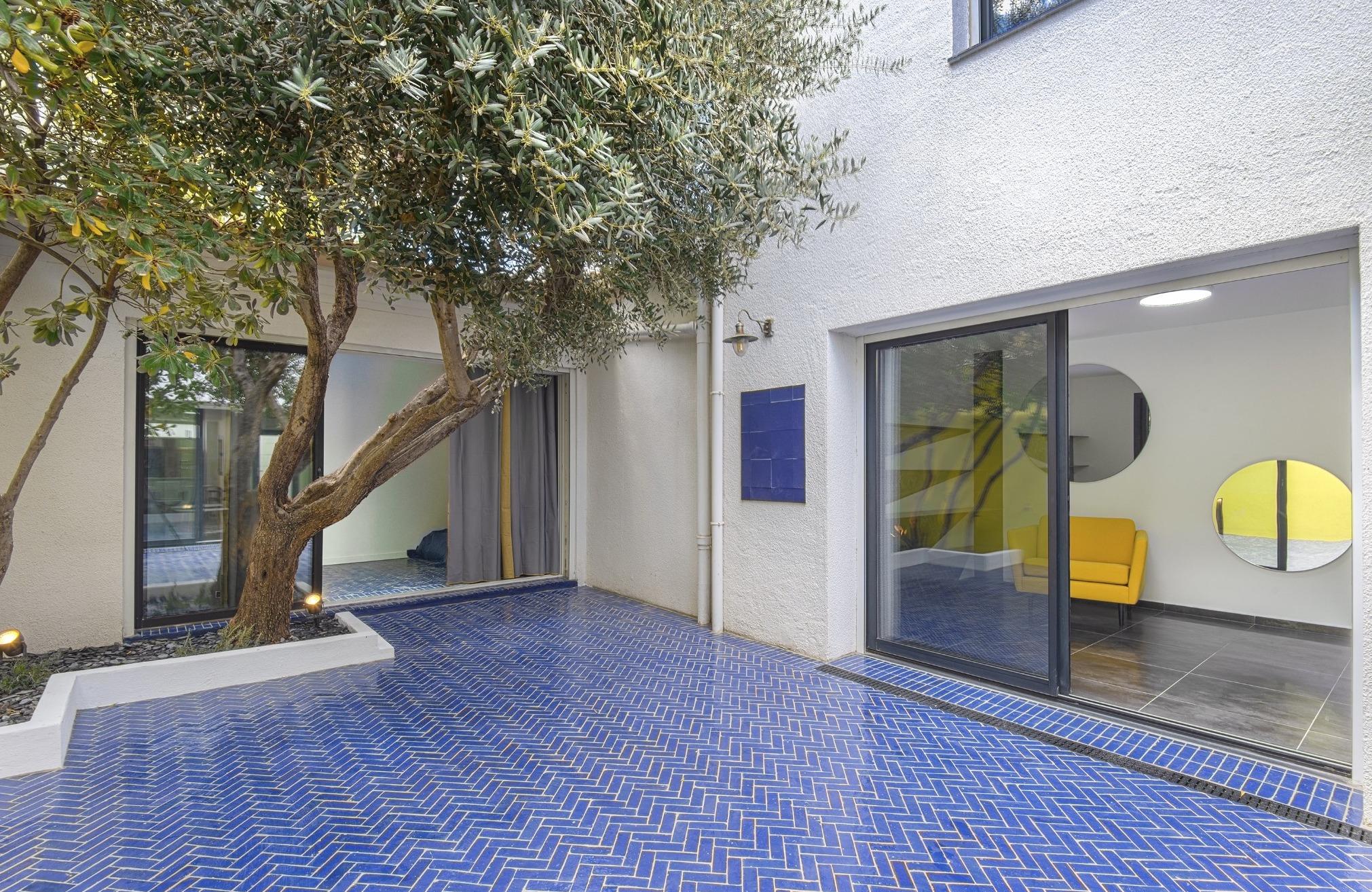
The patio photographs show why the actual combination can still be convincing: small blue tiles laid in herringbone, an olive tree in a white planter and a yellow detail beyond the glazing, then a stronger yellow wall with a metal stair.
The project’s herringbone work is described as taking around two weeks for an experienced craftsperson. That is a reported case duration, not a standard labor allowance for every patio.
Blue with orange or terracotta gives a more directly complementary contrast in that traditional system. The orange and terracotta article explores how to dose it in an object or textile.
Blue and green can produce a quieter neighboring-color relationship. Powder pink may soften a deep blue, while white, natural wood and stone tones provide less saturated companions.
The 60-30-10 guideline, about 60 percent dominant color, 30 percent secondary and 10 percent accent, can help think about hierarchy. It is not a requirement to measure every surface or force a room into exact percentages.
A house case with yellow linking the route
In a complete renovation of a 130 m² house, Mimosa yellow, reference CR4149-1, continued from entry toward patio across around 45 m² of painted surfaces.
That is painted area, not an additional floor area. It related to the patio’s blue and the home’s white surfaces as part of one scheme.
The yellow interiors article develops the project. Its value here is the visual thread between rooms, not a claim that a particular paint reference is right for every blue interior.
Furniture offers another scale of intervention
Pale-blue fronts within a white entry composition can introduce color without painting the surrounding walls. Changing a front can sometimes be easier than changing the whole scheme, though “reversible” depends on material and construction.
Gray-blue, ashy blue and powder blue are restrained options beside white, natural wood or brass handles. Treat them as choices, not a prediction that one trend is mandatory now.
Prepare a known safe surface by cleaning and, where appropriate, light sanding around grit 120 to 180, followed by dust removal and a compatible primer. Check older coatings for hazards before sanding them.

Raw timber, melamine and existing lacquer need different preparation. Use a coating suitable for furniture and joinery, with its required curing and cleaning instructions, rather than assume ordinary wall paint will perform identically.
Factory-lacquered or through-colored fronts offer other performance possibilities, but are not automatically more durable than every carefully specified site finish. Compare actual construction and repair options.
A velvet textile, brass handle or colored rug can connect the accent to the room. Avoid repeating blue on every object simply to demonstrate a theme.
The retained entry video runs 4 min 05 and shows storage, seating and a solid-wood surface turning a corridor into a functioning entry. The full entry project explains the fitted composition.
Frequently asked questions
Is petrol blue defined by having no yellow pigment?
No. Commercial names and formulas vary. Compare the real undertone, lightness and saturation instead of inferring chemistry from a descriptive label.
Can a dark blue work in a dim room?
Yes, if the intended atmosphere, extent and lighting support it. Use a real sample and evening test rather than assume a particular orientation either permits or forbids the color.
How should Klein-inspired paint be used?
Choose the focal surface or broader scheme deliberately, then follow the selected system’s preparation and maintenance instructions. A generic ultramarine name does not guarantee the same matte depth.
Which finish is best?
The one that combines the wanted appearance with declared suitability for the use. Check wet-scrub resistance, preparation and coats rather than deciding from matte, velvet or satin labels alone.
Which colors can accompany a blue wall?
White, natural wood and stone tones can provide a quieter frame. Orange or terracotta can give a stronger traditional complementary contrast, while neighboring green or powder pink create different relationships. Yellow is another effective possibility, as the patio case shows, without needing an incorrect color-wheel explanation. Decide the hierarchy and actual undertones rather than assume the same partner suits every navy, teal and ultramarine.
Which light should be tested with a blue sample?
The lighting that will be used in the room, especially in the evening. Compare the suggested warm 2700 to 3000 K direction with a neutral 4000 K source where appropriate, considering output, color rendering and glare together. An indirect strip or wall light can change the wall’s reading without making a powerful central fixture the only source. No temperature alone guarantees the intended result.