

By Mathieu REY, interior architect specializing in renovation (updated October 2026)
Green isn’t chosen from a paint chip alone: it depends on the light, the surface and the materials around it.
1. Choosing a green shade for the space and the light
2. Green on an interior wall: emerald, khaki, aqua
3. Green with light wood, copper and terracotta: pairings that work
4. Real projects: how we use green
5. FAQ: green in interior design
Green is one of the richest, and most demanding, colors in interior design. It is not a single hue: calming aqua, deep emerald, earthy khaki and warm velvet green each carry a different energy, a different visual weight and a different set of rooms where they feel right. Chosen well, any of them can transform a space. Placed poorly, the same green can feel heavy or out of place. The key is matching the shade to the room, the daylight and how the space is used, the same logic that guides any thoughtful color pairing in interior design.
Choosing a green shade for the space and the light
Before you pick a green, ask three questions: what is the room, what is it for, and who uses it. A primary bedroom does not call for the same shade as a bathroom or a living room. A quiet retreat has different needs from a hallway or a kitchen. Starting from those parameters is what makes the choice coherent, the reflex any interior architect applies before signing off on a color, rather than copying a hue from a photo without checking whether it fits the real space.
Light is the second essential filter. An aqua green in a north-facing room can shift toward a dull blue-gray. A strong emerald in a very bright room can become dazzling and hard to live with day after day. A khaki in a dark room can go flat and lose all of its subtlety. That is why, in practice, we always test the shade on site at different times of day before confirming it. On paper, many greens look balanced. In a real room, daylight, orientation and neighboring materials often change the reading completely.
A few precautions help when you compare greens in real conditions. Paint samples at least the size of a letter sheet (A4), on the final surface or on white-primed board, and look at them on both the brightest and the darkest walls. Check bulb color temperature too: warm light (2700-3000 K) softens khaki or olive, while cooler light pushes aqua toward blue. Finish also changes perception: matte absorbs light and deepens the hue, eggshell cleans more easily, satin reflects more and shows substrate flaws.
Pro tip: If you are torn between a bold shade and a softer one, ask yourself about fatigue: in six months, will you still want to see this color every day? If you are unsure, start with the softer option, or keep the strong color on a niche, a single wall or a ceiling rather than the whole room.
Green on an interior wall: emerald, khaki, aqua
Aqua is the most approachable shade. It is calming, soft, easy to pair, and a useful bridge between an all-white interior and a more assertive color. It works well in a bedroom, a bathroom or a hallway, and it can even continue onto the ceiling for a cocooning effect that does not feel oppressive.
Emerald is more demanding. It is a powerful, deep color that needs room to breathe without crushing the space. On a single wall behind a headboard, on a living-room accent with wood and copper, or as tile in a bathroom, it can be exceptional. On all four walls, it saturates quickly. Our most common approach: one wall or a ceiling, rarely both, and never everywhere. That is not a universal rule, in a small room, wrapping walls and ceiling in the same deep green can be a deliberate choice, as long as the lighting is carefully handled.
Khaki is probably the most timeless of the three. It ages well, adapts to many styles and stays elegant over time. It is often the right pick when someone wants a real color commitment without the risk of a look that feels dated or overdone. Paired with a soft pastel pink or a very light yellow, it creates a delicate, refined palette. The same principles apply to any colored accent wall in interior design, whatever the hue.
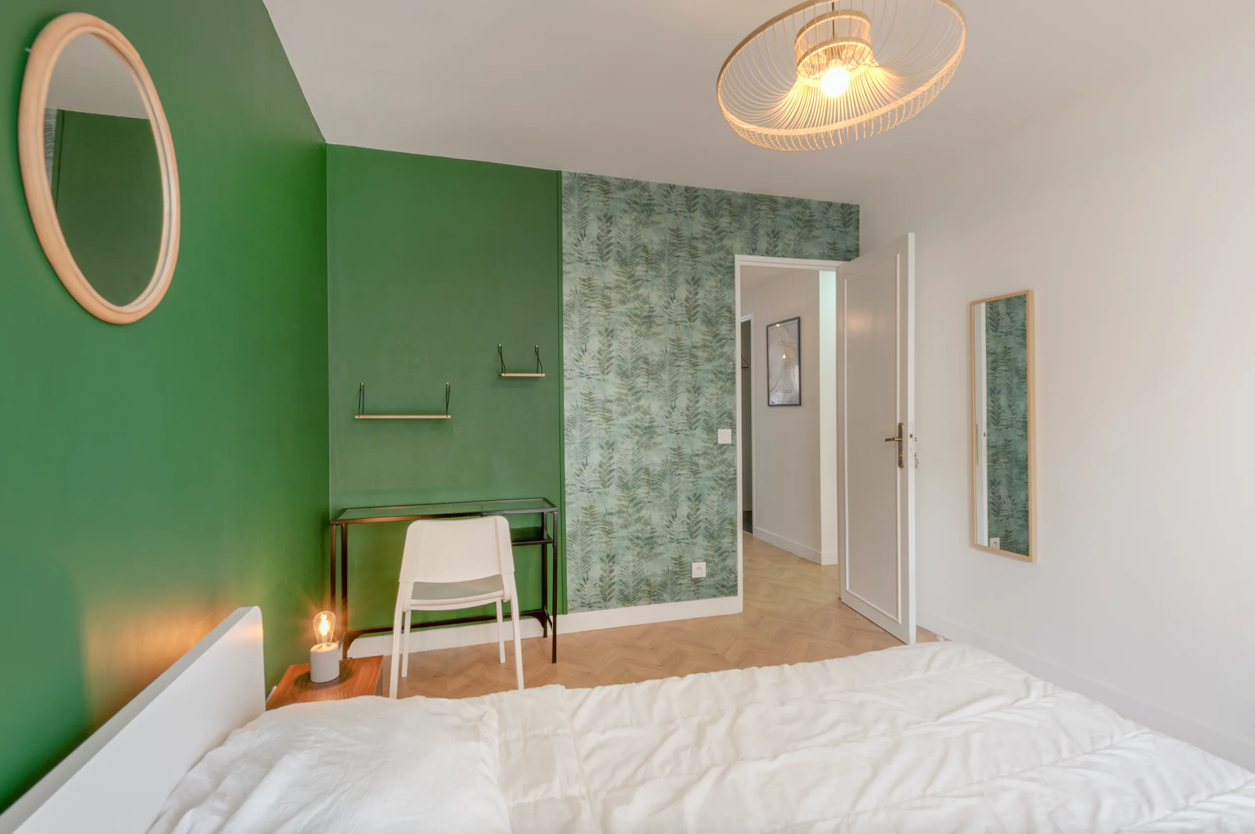
In a 75 m² (about 807 sq ft) apartment, we used several greens to give each bedroom its own identity. One, with a separate wet room (a 90 × 90 cm / 35 × 35 in shower and a small vanity in light wood tones), pairs Tollens CR4134-4 Salamandre paint with botanical wallpaper. Another takes a deeper green, Tollens CR4132-5 Aromate, with a foliage-pattern wallpaper. Each room has its own character while sharing a common language of plants and natural colors.
Green with light wood, copper and terracotta: pairings that work
Green and light wood is probably the pairing we use most often, for good reason. Light wood brings natural warmth where green can lean cool. Together they create a coherent organic balance that suggests nature without becoming a cliché. The combination travels well across styles and eras: contemporary, Scandinavian or more classic interiors.
Green and copper is a more sophisticated pairing. Copper adds a warm, precious counterpoint. On faucets, a light fixture, hardware or accessories, it creates sharp accent points. Each material makes the other look better.
Green and terracotta is bolder but very powerful. Both are earth colors with a shared natural root, one cool, one warm, so together they create a positive tension and a rare chromatic richness. We usually reserve this pairing for living spaces where you want real presence and character.
From the job site: When green is on the walls, the most common mistake is matching everything else to it, green cushions, plants, green frames. The result often lacks relief. Green works better when it talks to materials and colors that answer it without repeating it everywhere: wood, copper, white or terracotta, rather than a forced monochrome.
See our projects in video
Real floor plans and renovations explained step by step on the ArchiWorking YouTube channel. Watch how spaces are reworked before the works begin.
Real projects: how we use green
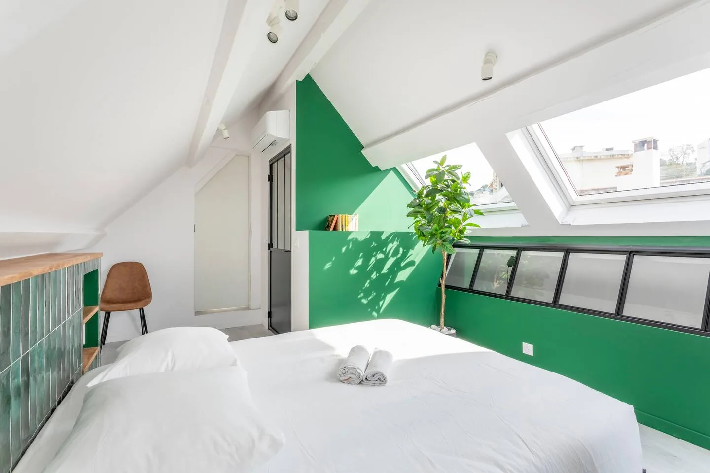
In a primary suite, we used a deep green on the main wall behind the headboard, with a black steel-and-glass partition and white walls on the other sides. The contrast between the black frame, the white walls and the deep green created a graphic, controlled composition with nothing superfluous. In this kind of project, green works because it structures the room without weighing it down, as long as it sits on the right surface and is framed by calmer tones.
That project was the renovation of a duplex apartment whose mezzanine became a self-contained primary suite with bedroom and bathroom. Under the sloped ceilings and roof windows, daylight had to keep moving: the custom black glass partition separates the spaces without blocking it. The headboard integrates drywall niches, with outlets and lighting planned from the first drawing. Carrying one color family across different materials (paint, glossy tile, black elements, white surfaces) ties the functions together without making every surface look the same.
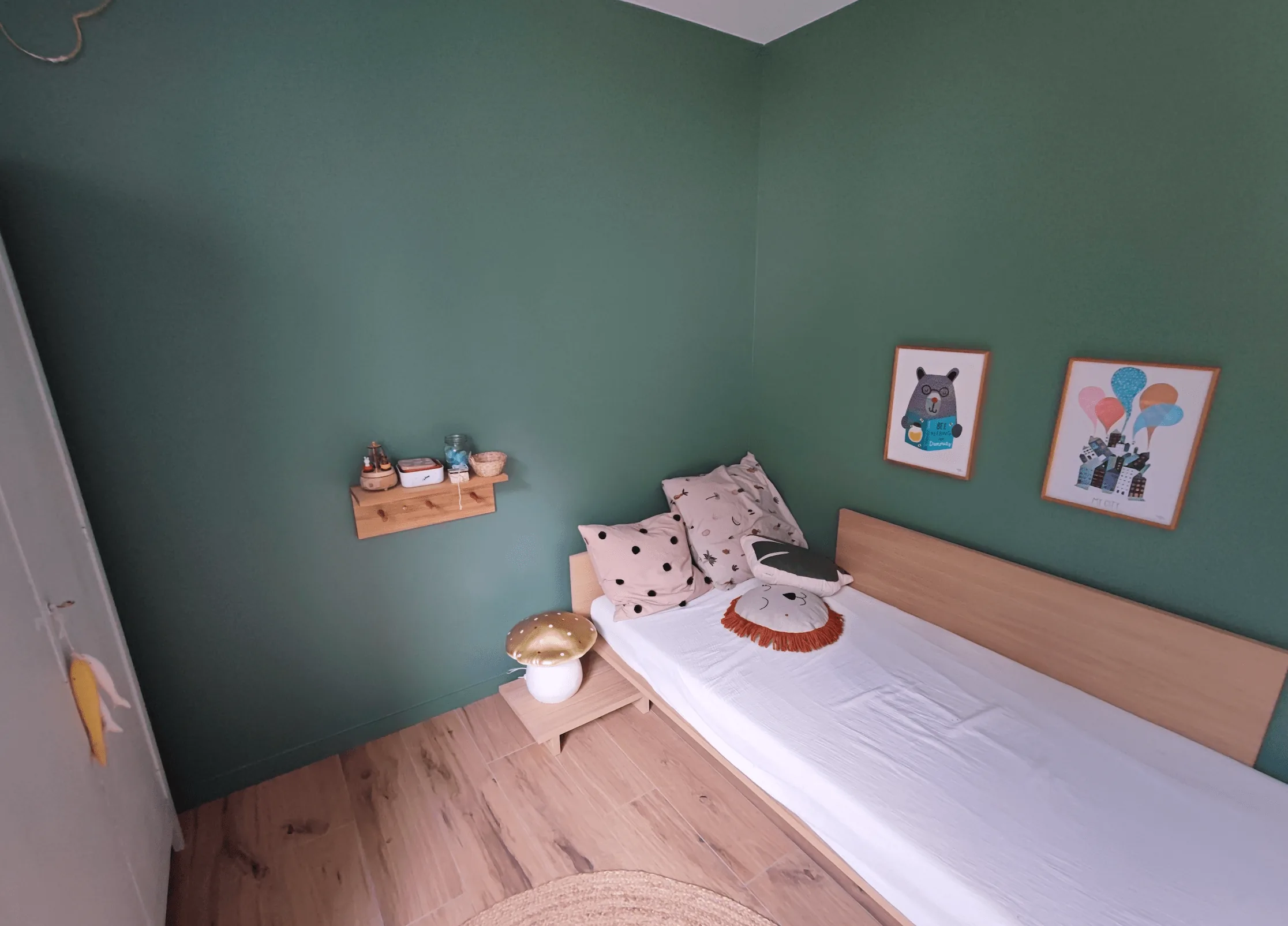
In a child’s bedroom, we painted velvet green full height and paired it with light-wood furniture: the headboard and small wall shelves. The result feels warm, grounded and timeless enough not to feel wrong two years later, an important test in a kids’ room, where color should age with how the space is used without forcing a full redo.
A wraparound color gives the room an identity without stacking decorative finishes. Light textiles and natural wood balance the deep shade: a strong color works in a child’s bedroom when it sits with warm materials and fairly light décor.
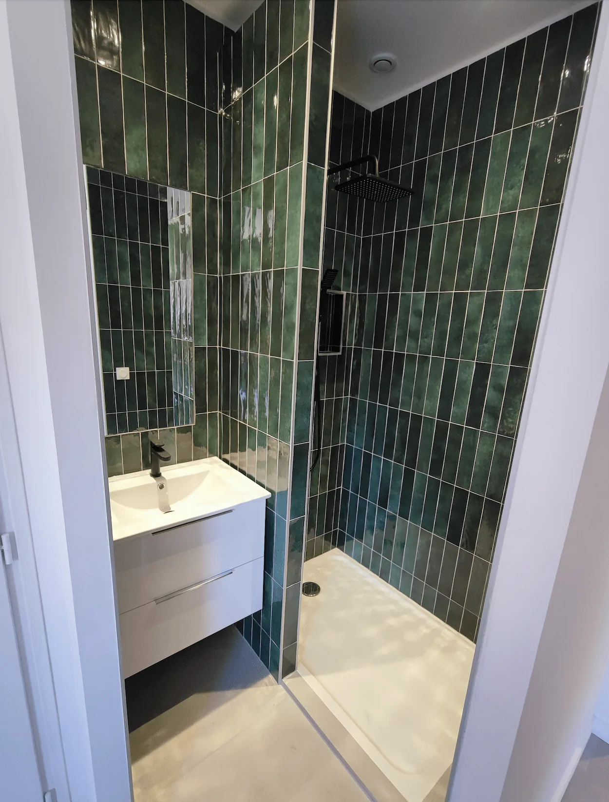
In the ensuite bathroom of that primary suite, green returns as rectangular zellige-look tile, set vertically to follow the wall height and underline the geometry under the roof. Its glossy surface bounces light from the roof windows, light that a matte paint would have absorbed.
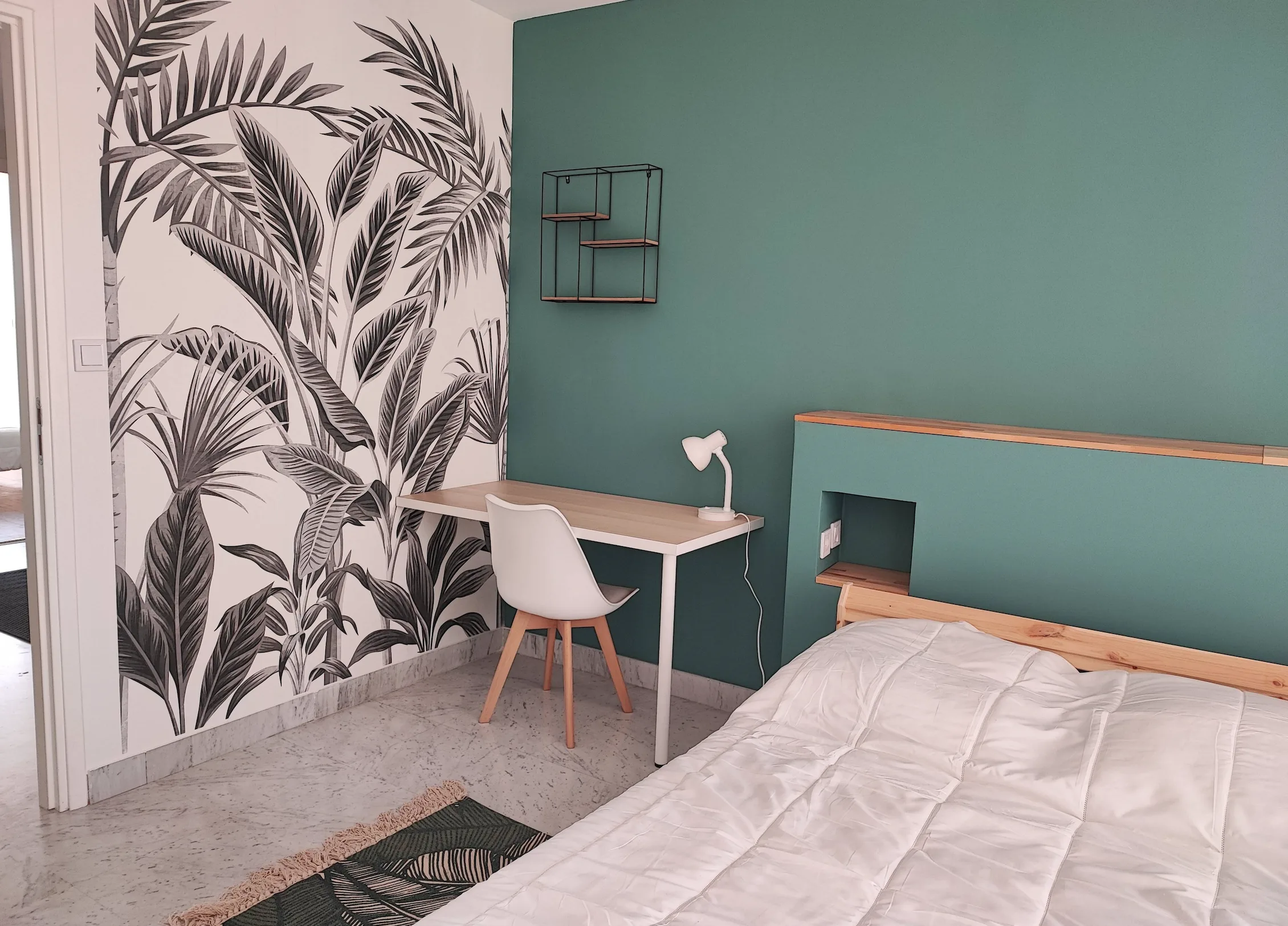
In a 110 m² (about 1,184 sq ft) three-bedroom apartment for high-end short-term rental, this bedroom combines green paint, black-and-white panoramic wallpaper and a built-in drywall headboard with storage niches and wood shelves. The original floor was cleaned and polished rather than replaced: it keeps some of the place’s character and focuses the work on walls and furniture. So green is never chosen for its hue alone, surface, neighboring materials, lighting and use matter just as much. Matte paint, glossy tile or botanical wallpaper read very differently, even in a similar palette.
Green is a generous color when you give it the right conditions: the right shade, the right surface, the right neighbors on the palette. It does not impose itself abruptly; it settles in. Done well, it gives an interior a character no other color produces in quite the same way.
More real projects, annotated floor plans and layout comparisons on the ArchiWorking YouTube channel.
Mathieu REY, interior architect specializing in renovation. See more design tips and projects

FAQ: green in interior design
Which green shade should I choose for an interior wall?
It depends on the light, the function and how the room is used. Aqua is the most accessible and versatile. Emerald is stronger and best kept to limited surfaces. Khaki is the most timeless and easiest to live with long term. In every case, test the shade on site at different times of day before you decide.
How do you pair green in interior design?
Green works very well with light wood, copper and terracotta. Light wood adds natural warmth. Copper creates a precious counterpoint. Terracotta builds a positive tension between two earth colors. What to avoid: matching everything in green, a forced monochrome lacks relief and flattens the composition.
Can you paint all four walls emerald green?
It is possible but risky. Emerald is a powerful color that needs space to express itself without saturating the room. On a single wall behind a headboard or as bathroom tile, it can be exceptional. On four walls, it can feel oppressive. Our usual approach: one wall or a ceiling, rarely both, even if a fully wrapped room can be a deliberate choice.
Does green get tiring quickly in a home?
It depends on the shade and the surface. Emerald on a full wall can tire faster than a well-paired khaki. To limit that risk, keep strong colors on precise zones and choose timeless shades such as khaki or sage for large surfaces.