

Yellow can be a small point of light or a surface that organizes an entire room. The useful choice is not simply yellow or no yellow, but which shade, on what material, and in what proportion. Pale yellow, mustard, ochre, saffron, and turmeric-like tones produce very different effects.
Clara AJMAR’s project experience, updated in October 2026, suggests starting with the room’s light and the occupant’s sensitivity. A person who enjoys yellow in someone else’s home may not want a saturated wall in a bedroom. Small accents can test the relationship before a larger commitment. See combining colors in an interior for the broader palette approach.
Start with an accent if the color feels risky
A vivid cushion on a gray sofa, a gold-toned frame on a white wall, or a lemon-colored vase on an oak shelf can introduce warmth without replacing principal furniture or painting the room. Neutral surroundings such as white, gray, and pale timber give those details room to register.
In a 60-30-10 palette, yellow can occupy the approximate 10% accent role. That proportion is a decorative reference rather than a measuring rule. A few well-positioned elements can change the reading of a room even when most of its surfaces remain untouched.
Clara’s practical guideline is to repeat the accent in at least three places. A single isolated cushion can look accidental; a few discreet echoes let the color travel. The objects need not match exactly, but their relationship should be visible enough to look intentional rather than like an unconnected leftover.
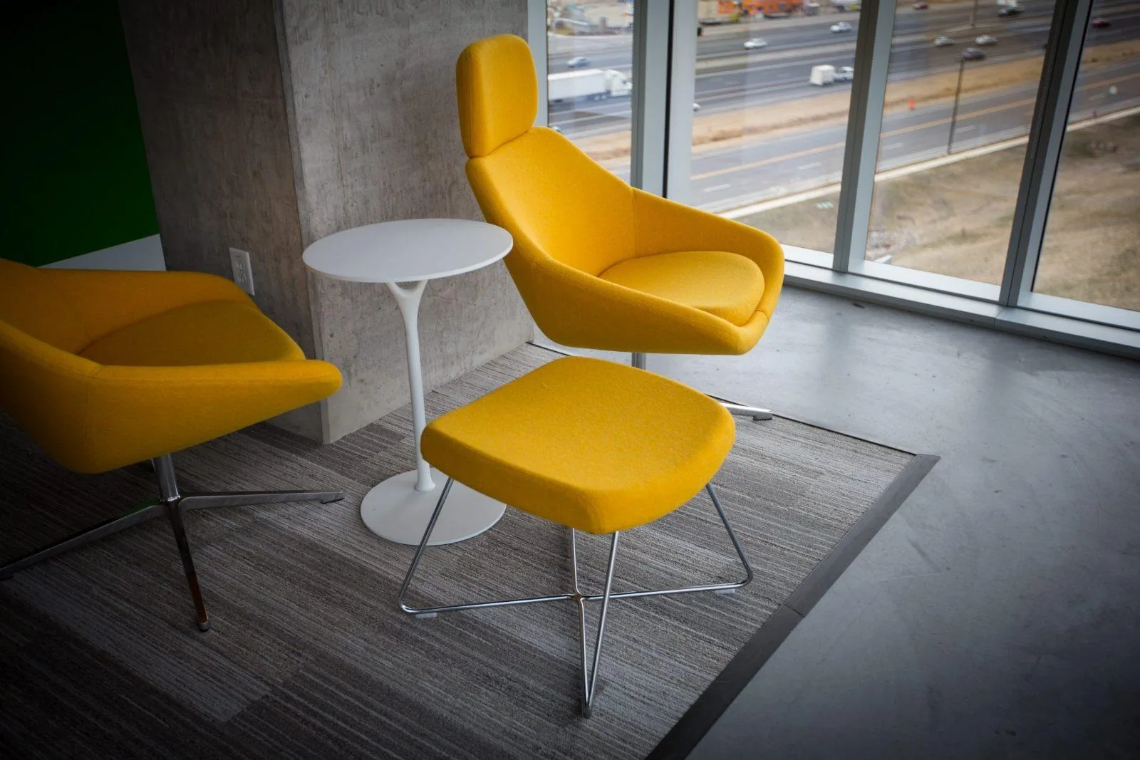
The opening photograph illustrates this modest entry point: yellow armchairs and a white side table in front of broad glazing. The surrounding setting stays relatively neutral, so the seats carry the color without requiring a whole yellow envelope.
Use mustard when the color needs to hold a surface
Mustard is one of the author’s preferred shades for character and warmth. Compared with a sharp bright yellow that immediately catches the eye, it can feel more settled and enveloping. A wall, a larger finish area, or a velvet armchair can establish that mood.
Velvet gives mustard a particular depth because the pile changes how it absorbs and returns light as the angle shifts. The same shade on smooth cloth or flat paint will not look identical. A mustard velvet chair with pale wood and a charcoal wall is one way to introduce a vintage note into a contemporary room.
Before choosing paint, test the undertone on a generous sample on the intended wall. Some mustards look greener under artificial light. Ochre- or orange-leaning versions may better suit a warm scheme, but they also need testing: no undertone remains visually unchanged under every light source.
Scale is part of the choice. A tone that is lively on a vase may be tiring across several walls, while a subdued yellow may gain presence on a large plane. Judge the actual support, finish, and surrounding colors instead of enlarging a small sample in your imagination.
Three projects, three roles for yellow
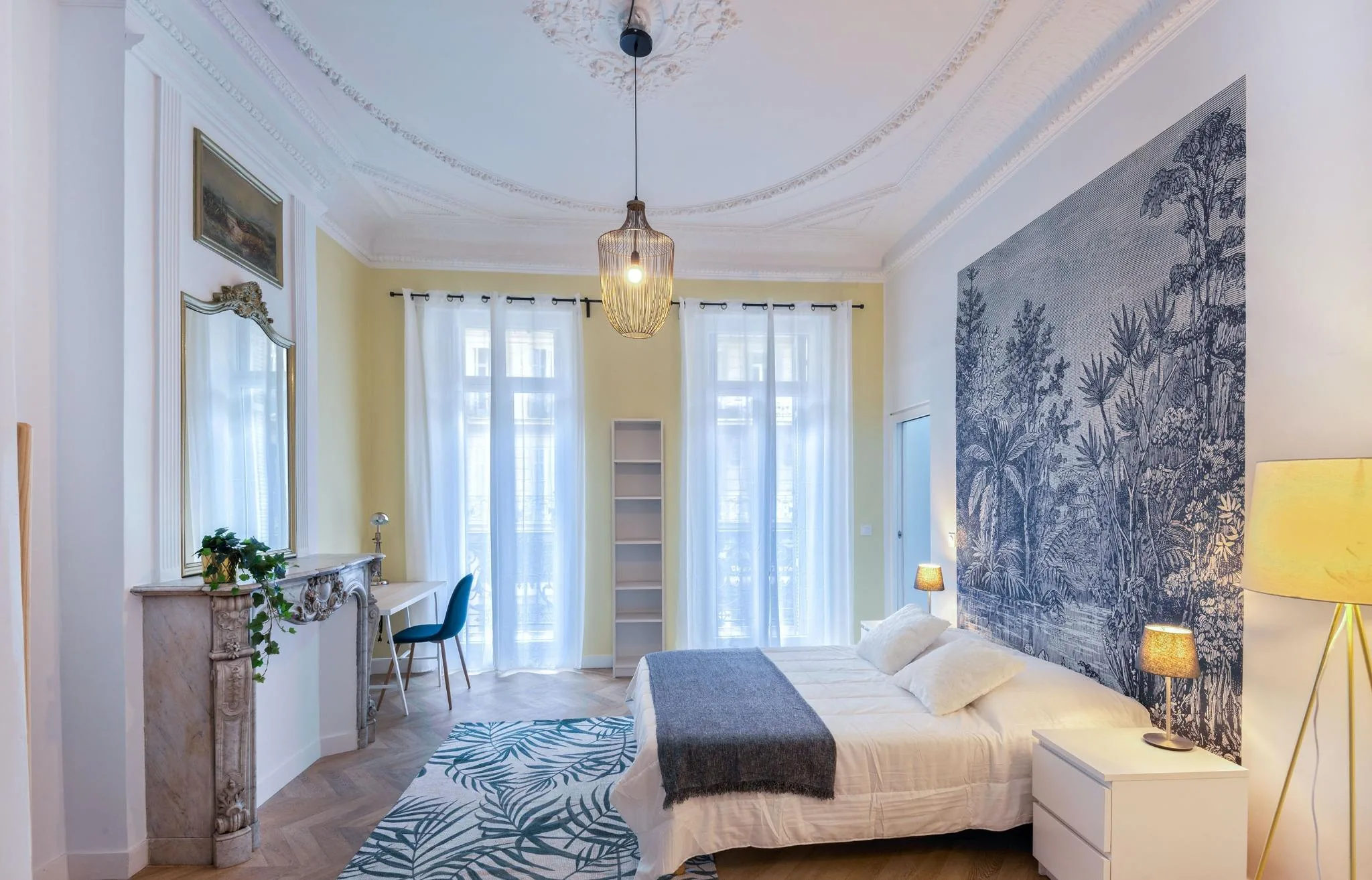
In an older apartment with exceptional ceiling height, a pale-yellow wall created depth and a visual link within a tall bedroom. The color returned in selected details and worked with graphic wallpaper behind the bed. Daylight from two windows played across the pale surface, producing a luminous, calm effect rather than the aggressive yellow the clients had feared.
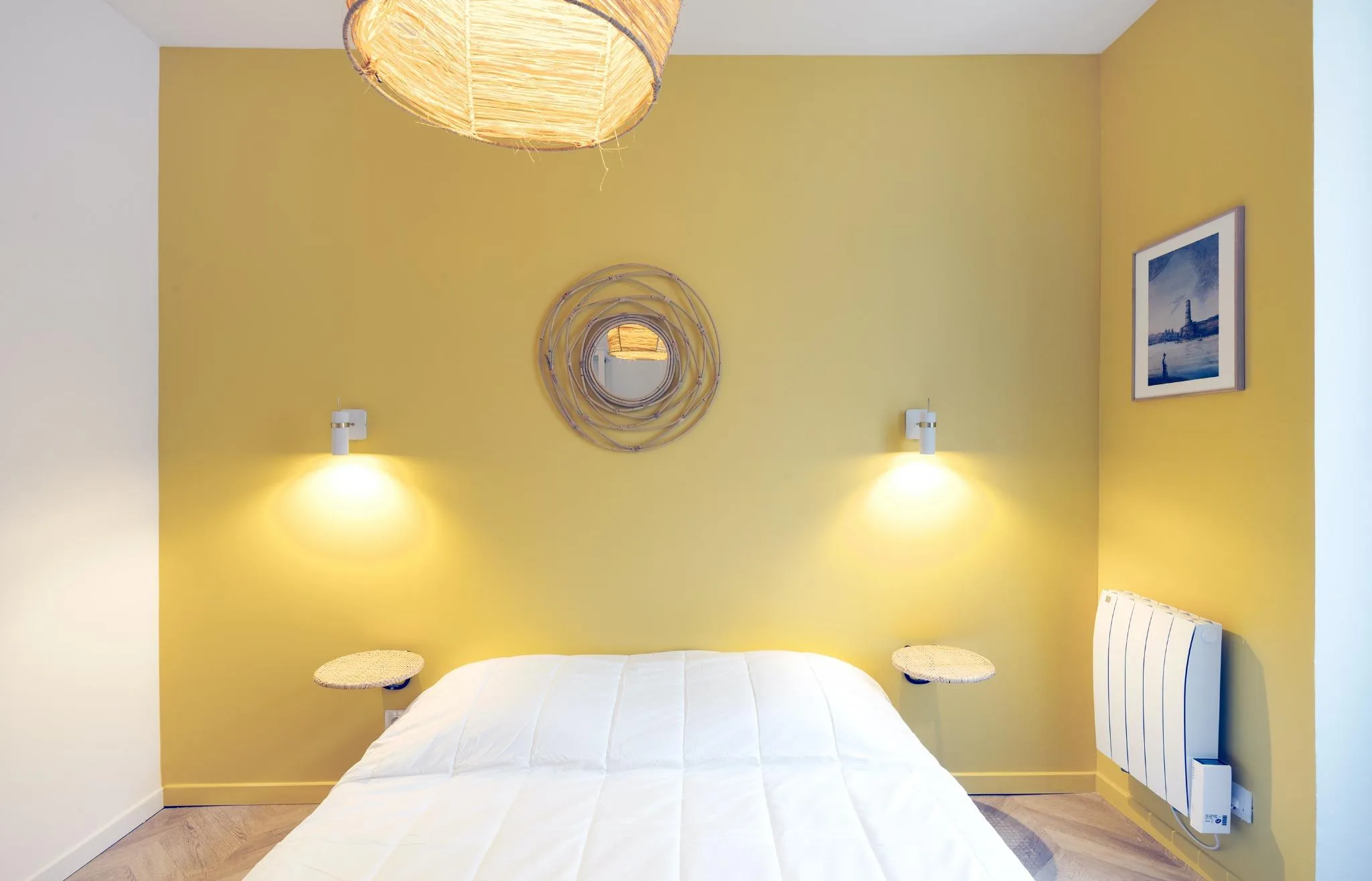
In an apartment intended for rental investment, a more substantial mustard separated the rooms visually and gave the property an identity. A suitable cleanable paint finish helped address maintenance. The color strategy was meant to help prospective occupants understand and imagine the space, not merely produce a striking photograph.
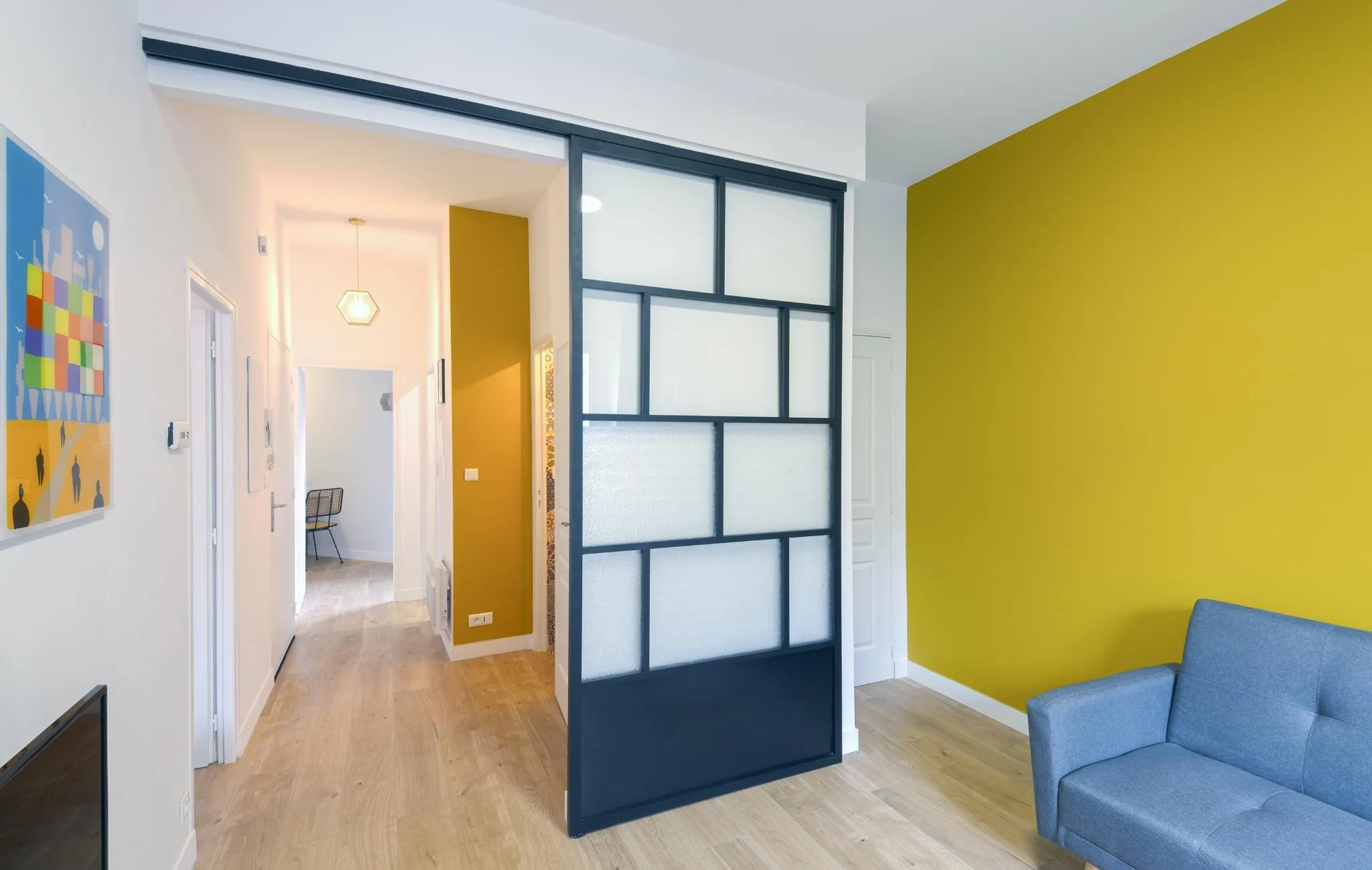
A short-stay rental used yellow as a thread through a composition with industrial touches and pale timber. The living room combined a mustard wall, anthracite sliding glazed screen, natural-oak parquet, and a powder-blue sofa. Each played a different role, with yellow connecting rather than dominating everything.
The author finds mustard useful in rental projects because it can photograph well and distinguish an interior. Those are design observations, not evidence that a color guarantees higher yield or occupancy. Its actual durability depends on the paint and use, not on mustard being intrinsically more resistant than white or gray.
See our projects in video
Real floor plans and renovations explained step by step on the ArchiWorking YouTube channel. Watch how spaces are reworked before the works begin.
Combine warmth and contrast without making the scheme harsh
Mustard works particularly well with petrol blue or teal in the source’s examples. It is a strong warm-cool contrast, although calling those hues strictly opposite on every color wheel would be imprecise. The actual shades and their proportions matter more than that label.
Natural pale timber mediates between them. It introduces an organic texture that can prevent the composition from becoming too graphic or severe. Charcoal, pale wood, and mustard form another effective trio where the aim is both warmth and a more sophisticated contrast. See working with pale wood for material choices.
Avoid leaving yellow entirely isolated. Repeat it through a picture detail, a textile, or a small object, perhaps with a related ochre rather than the exact same paint shade. Repetition establishes coherence, but the author’s three-location guideline is a way to compose, not a requirement to buy three matching accessories.
There is also no single best yellow for every orientation. A pale almost-white tint, deep saffron, ochre, and mustard differ substantially. Select with the room’s use, natural light, and personal preference in mind, then verify at different times before extending the color.
A 130 m² house: yellow marks the transitions
During the complete renovation of a 130 m² house, the chosen shade was Mimosa, reference CR4149-1. Rather than concentrate it in one room, the design carried it across the entrance wall, a ceiling near the staircase, a patio wall, and the low wall of the upper terrace.
Together those painted areas represented approximately 45 m². The number refers to colored surfaces, not an extra floor area or a yellow room of that size. The repetition allowed one tone to connect several architectural moments through the house.
Mimosa related to Klein blue in the patio, Bejmat tiles, and white surfaces with a low-sheen finish. White maintained restraint while yellow marked transitions and highlighted selected parts of the architecture. The patio photograph shows a yellow wall, blue floor tile, an olive tree, and the terrace setting.
This example demonstrates how a vivid color can travel without becoming a uniform coating. Repeated locations give it continuity, while the surrounding white and blue keep each place distinct. The reference number documents this project choice; it is not a substitute for testing a current sample on another building.
A family living room: color becomes an architectural element
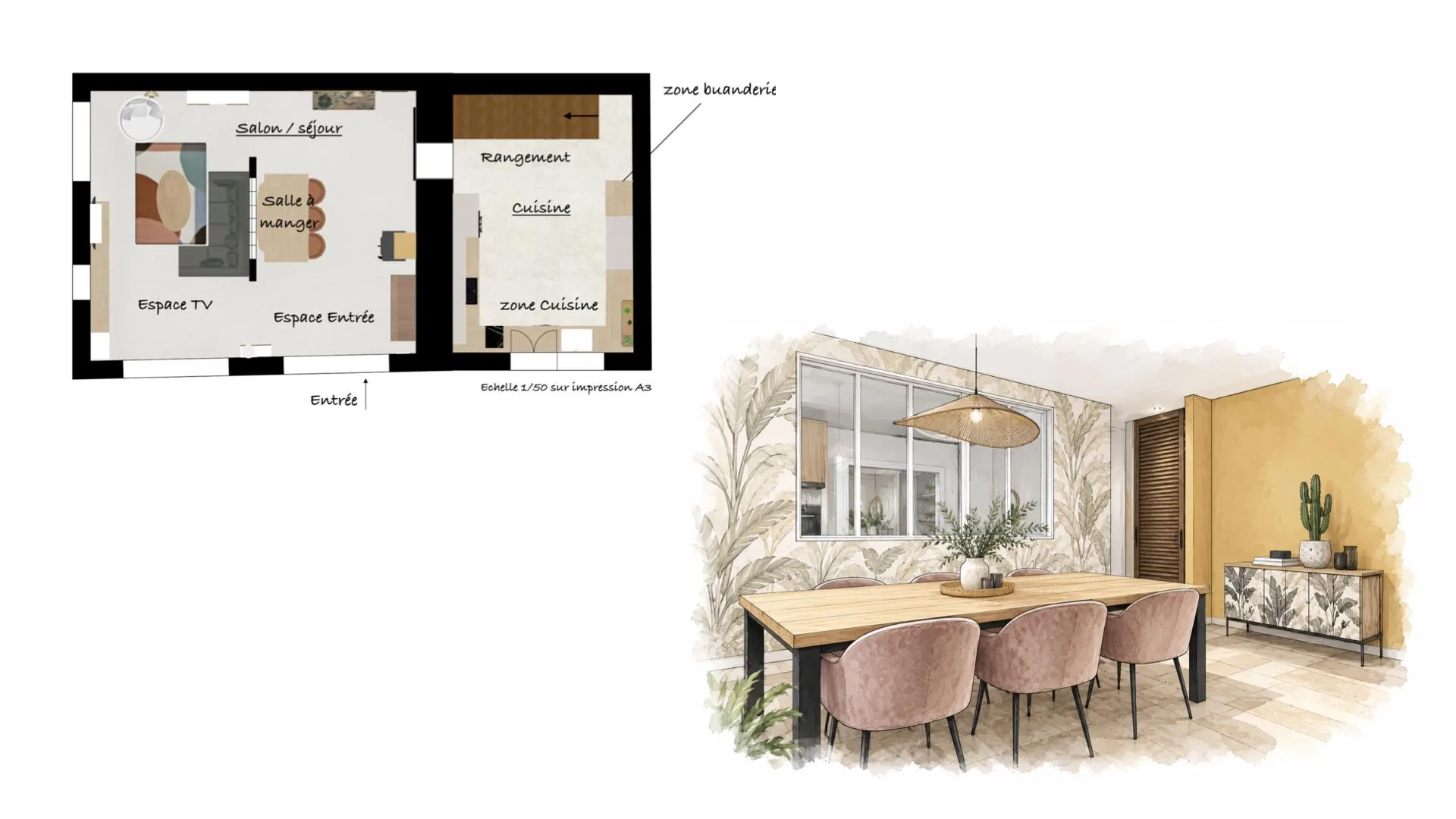
In another family-house reorganization, the open living area was structured with a 2.80 m partition and a glazed screen with six transparent panes. The aim was to distinguish functions without cutting off natural light. Yellow participated in that organization rather than arriving only as decoration afterward.
One living-room wall was painted mustard, with timber strips at the ends and along the lower part painted the same shade. These created relief without adding a contrasting material to the palette. The study image combines the plan and a perspective with that wall, a timber table, and pink chairs.

Mustard worked with black-and-white tropical wallpaper, off-white surfaces, and charcoal elements around the wood-burning stove. The result depended on the relationships among openings, wall relief, and finishes. The color was part of the architecture’s reading, not just an accessory placed in front of it.
Yellow can therefore work on a small object or across several dozen square meters of surface. What stays constant is the need to control intensity and contrast. Test on the final support in daylight and artificial light before generalizing the treatment.
Questions before introducing yellow
How can I keep it from feeling aggressive?
Begin with small accents, or choose a softer warm shade for a larger surface. Keep enough quieter surroundings for it to breathe. A pale or muted yellow can be more appropriate for rest than a very vivid one.
Which colors can accompany mustard?
Petrol blue, teal, charcoal, and pale wood appear in the source’s examples. The timber can bridge the contrast, while white or off-white provides breathing room. Judge the actual shades together rather than relying only on color names.
Is it suitable for a rental apartment?
It can establish a clear identity with an appropriate durable finish. The source uses it in both conventional and short-stay rental projects. It remains a design choice, not a promised financial return, and must suit the property’s light and intended occupants.
What yellow should I consider for a bedroom?
Pale yellow or a gentle mustard may create a calmer, enveloping effect than a sharp vivid yellow. Check a large sample at several hours, including under the bedside lighting, before deciding on the whole wall.