

A gallery wall begins with selection. Vacation photographs, children’s drawings, illustrations and meaningful words can make a home personal, but not every image needs to be displayed at once.
Choose a shared thread and relate it to the room. A work corner may need a quieter selection than a family stair wall. One frame on a console can be as deliberate as a full arrangement.
Choose an organizing shape
A grid uses equal formats aligned in rows and columns. It suits a consistent series, including black-and-white photography, when a clear graphic rhythm is wanted.
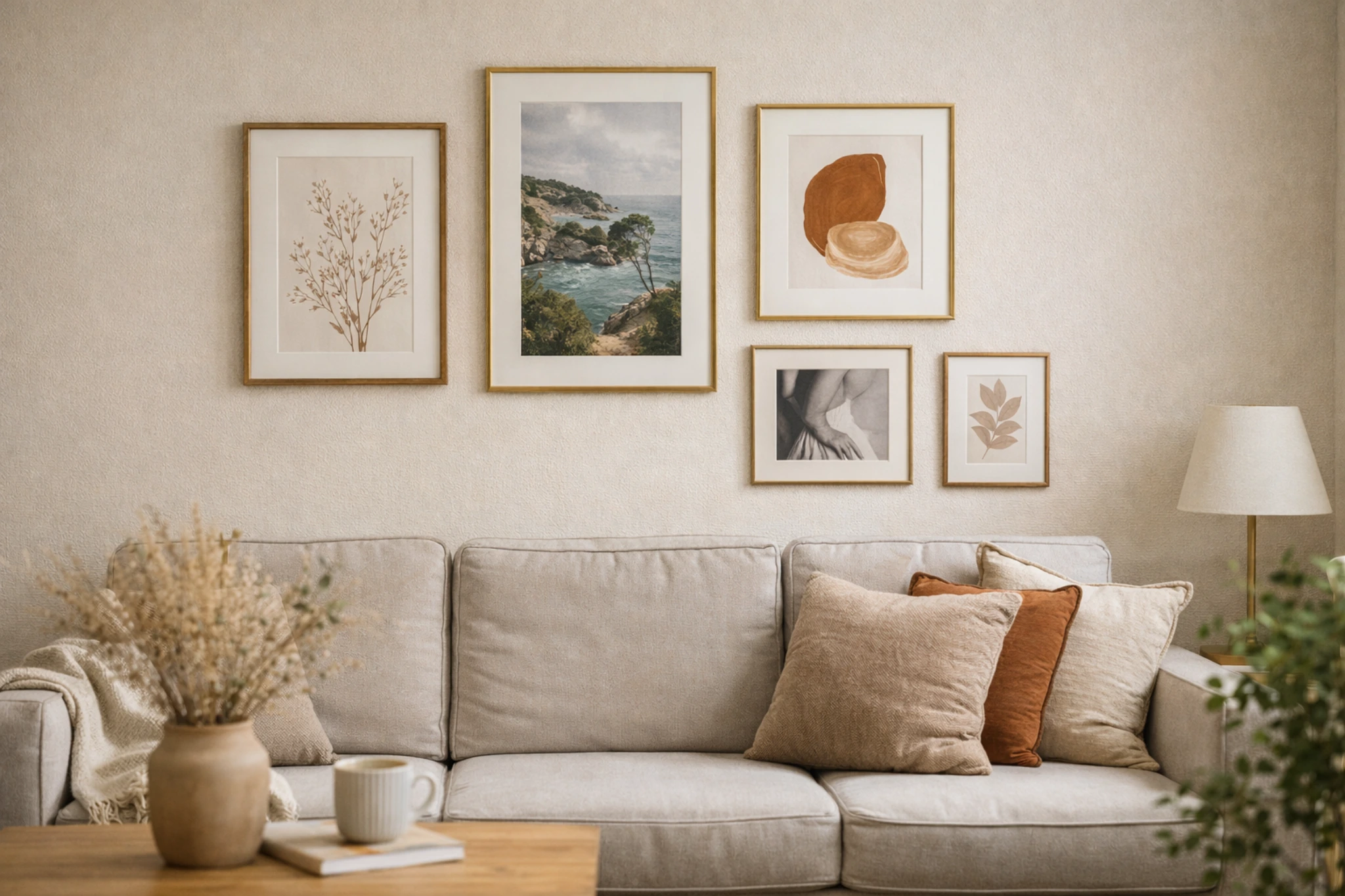
A looser cluster can mix squares, ovals, sizes and frame materials. Give it an imagined overall boundary, such as a rectangle or oval, so the grouping remains one composition rather than scattered objects.
Around 5 to 7 cm between frames is the article’s starting reference. A gap beyond roughly 10 cm can weaken the connection, though actual scale and layout still matter.
Round frames can interrupt an overly rectangular rhythm. A black-and-white content theme can also connect different formats without requiring identical frames.
For changing children’s drawings, a few securely installed clip-style hangers offer an alternative display. Keep the arrangement suitable for its users and location rather than treating a decorative fastening as adequate for any load.
Four project approaches
In a complete 75 m² apartment renovation, pictures accompanied the entry, living room and bedrooms. The entry used Tollens CR4113-3 Méditerranée blue and an irregular mirror while retaining its marble floor.
Chevron-pattern wood-look laminate marked the transition into the living spaces. The wall compositions followed those changing atmospheres without adding another floor or wall finish simply to define each zone.
In a different 50 m² combined living, open-kitchen and entry volume, pale timber beams, white walls, black and anthracite accents connected industrial and Scandinavian references.
Pale-wood graphic frames were proposed for the entry, repeating furniture colors. The frames gave the passage an identity without a partition or more objects on the floor. The 50 m² figure describes the whole combined volume, not the entry alone.
In the renovation study of a 1980s house with around 80 m² of interior space, existing paintings were retained with simpler proposed frames. A contemporary black-and-white photograph and adjustable lights complemented them, including near a bedroom entrance.
For a company’s reception area, photographs, framed awards and posters were assigned to different wall zones. A large magnetic-painted surface held internal documentation, separating that practical function from the framed display.
See our projects in video
Real floor plans and renovations explained step by step on the ArchiWorking YouTube channel. Watch how spaces are reworked before the works begin.
Test height from the way the room is used
A group center around 160 cm, or 1.60 m, is an initial standing-eye-level reference, not a universal mounting rule. Adjust for ceiling height, frame sizes, furniture and whether the viewer is seated or standing.
Over a sofa or chest, around 20 to 30 cm between furniture top and frame bottom gives another starting point. Consider both references together rather than force them into conflict.
A stair arrangement needs a visible guiding line related to the route. Test it from several steps and the landing instead of assuming a horizontal living-room arrangement transfers unchanged.
The fitted entry project develops the relationship between wall details, storage and circulation. Pictures belong to that overall organization, not just the gaps left after furnishing.
Use paper templates before fixing
Cut paper to each frame’s outer size and tape the templates temporarily to the wall. Move them until spacing, overall outline and visual balance work from normal viewpoints.
This also shows where a grouping might compete with a door, furniture or another focal object. A full wall is not automatically better than one carefully placed piece.
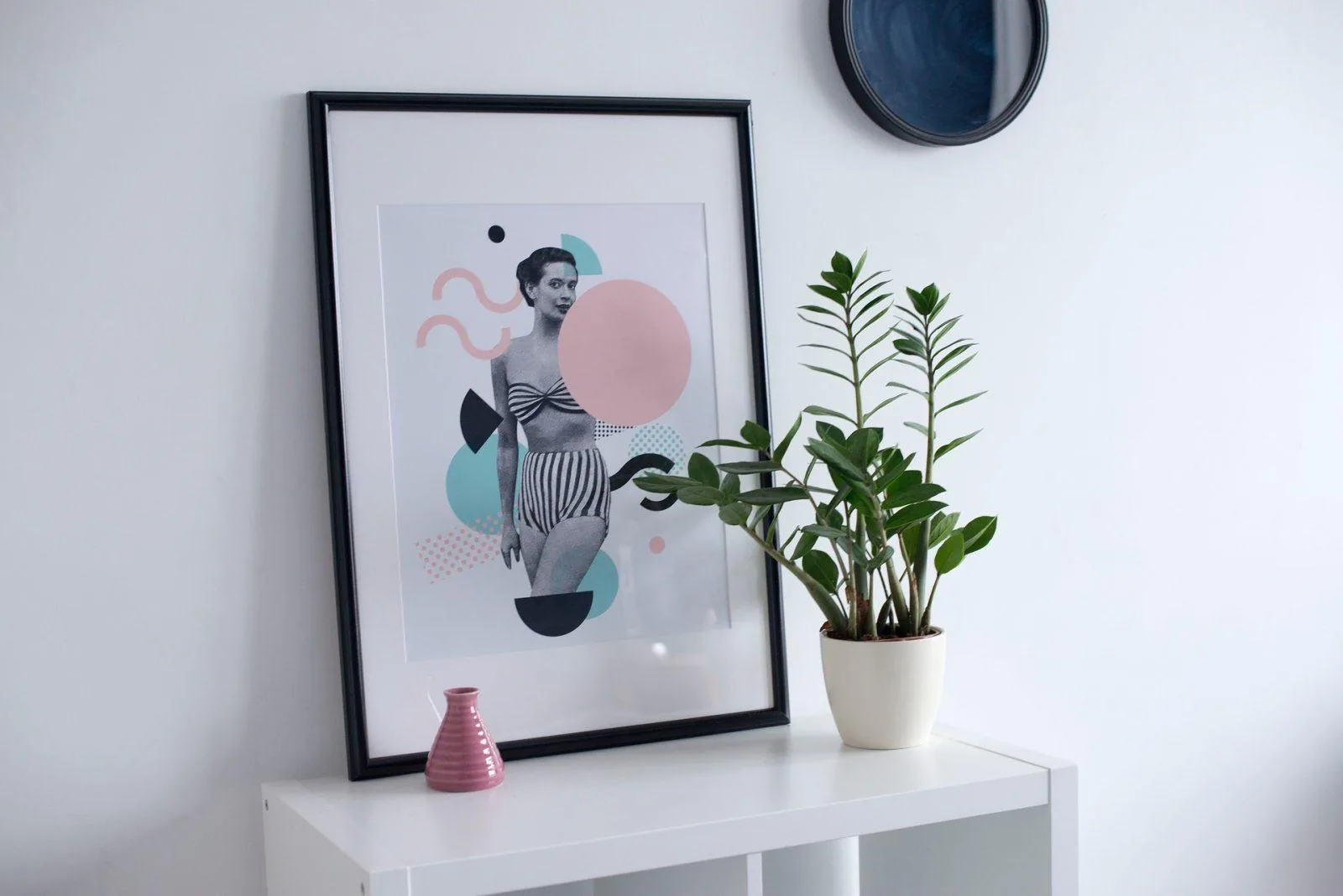
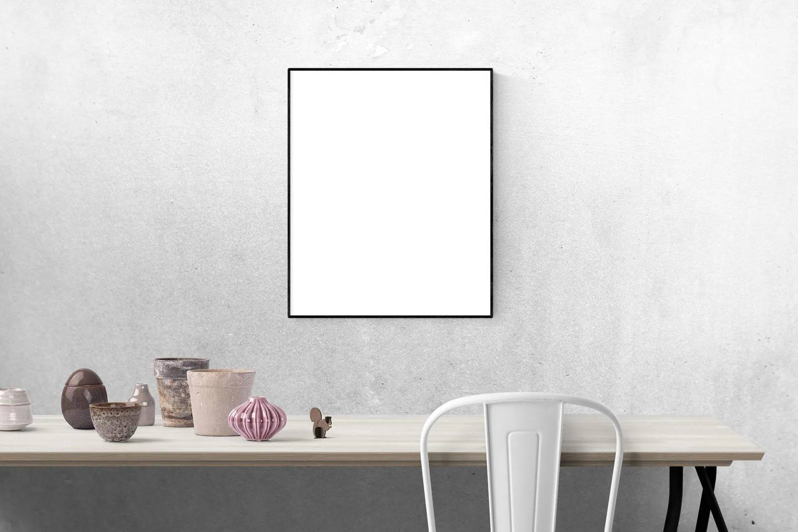
The source photographs retain both options: a framed illustration on a white console and a single empty white frame over a table, followed by a gallery above a pale sofa and the pale-wood entry display.
Match the fixing to the surface and load
Removable adhesive strips, including products sold under the Command name, can suit some lighter frames. Check the particular model’s load rating and approved surface.
Fresh paint, wallpaper and porous or weak surfaces change performance. “Removable” is not a guarantee of no paint damage or suitability for every rented wall.
Heavy works and mirrors generally need a properly designed mechanical fixing. Choose anchors, backing or structural connections for the actual plasterboard, concrete or brick, not simply one generic plug for each material name.
The frame’s own hanging points must also suit the weight. A strong wall anchor cannot compensate for an inadequate attachment on the object.
Light the pictures without making the room uncomfortable
A picture light can emphasize a composition. Plug-in fixtures or adjustable ceiling spots may be options where there is no suitable wall supply, with safe cable routing and installation.
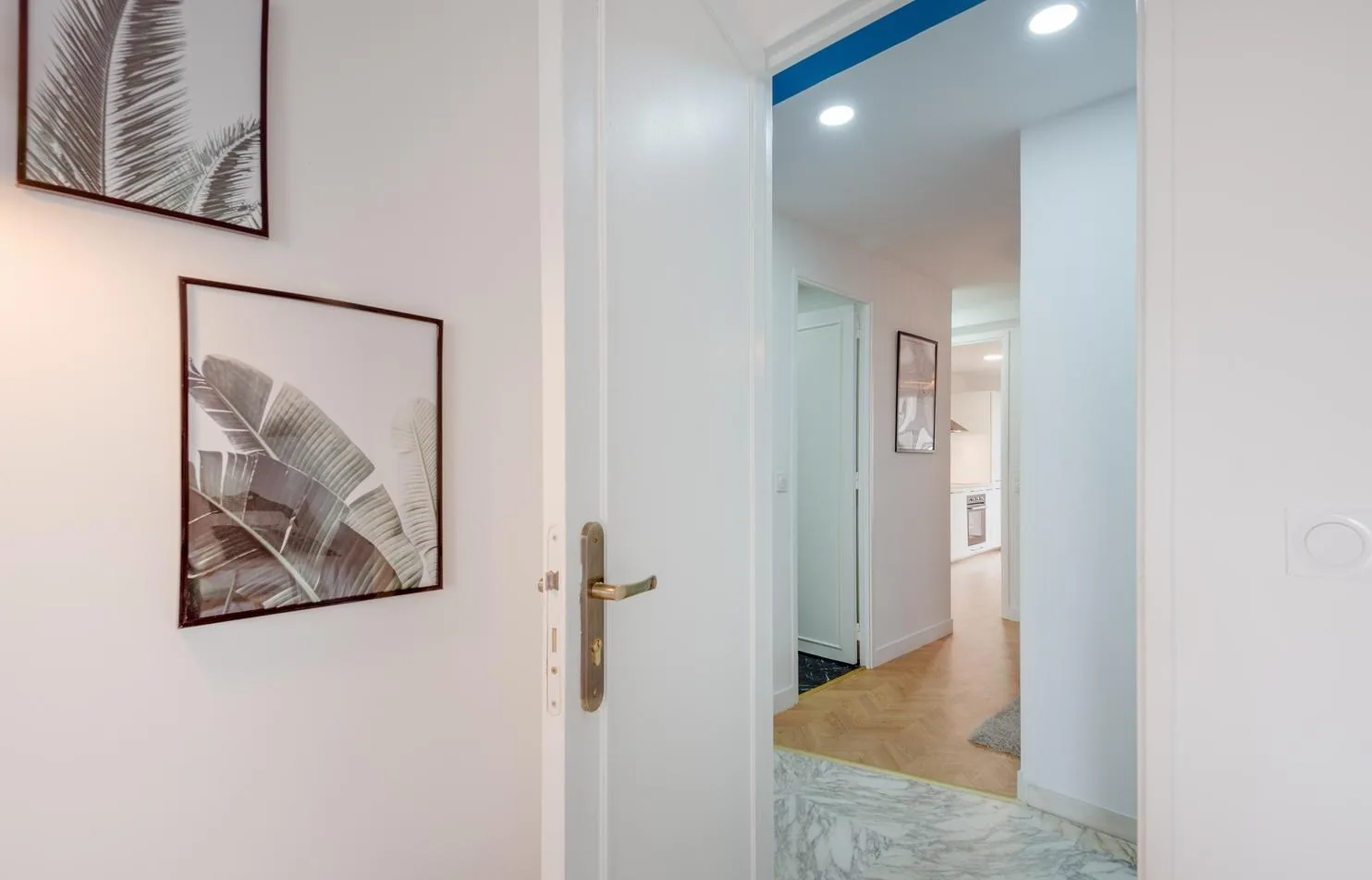
Aim and assess glare from the occupied room. An attractive evening effect should not leave bright reflections across the image or make the corridor harder to use.
Frequently asked questions
Must all the frames match?
No. Color, material or subject can provide unity. Keep a clear thread when shapes and formats differ rather than require a matching set.
Is 160 cm always the correct height?
No. It is a starting reference. Furniture, seated viewing, stairs and the actual people using the space can justify another position.
How much space should separate frames?
The suggested 5 to 7 cm range helps connect a grouping. Test the real sizes before drilling, and use the approximately 10 cm warning as a compositional guide, not a technical regulation.