
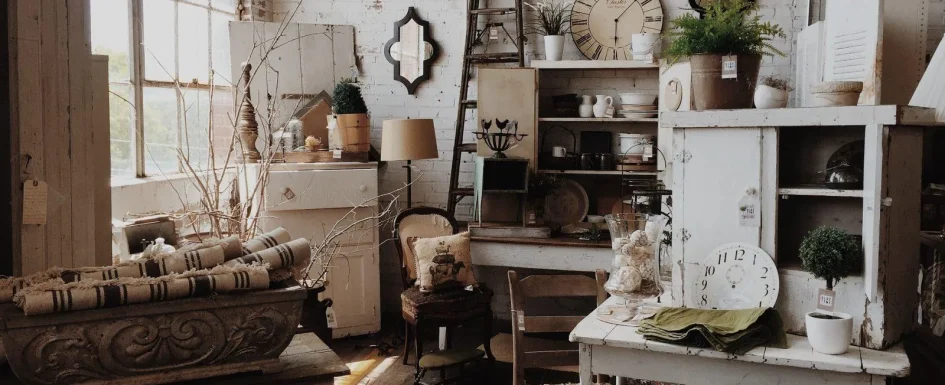
A vintage interior should feel lived in, not staged as a period museum. Its character comes from useful pieces with visible history, given enough room within a coherent contemporary setting.
The same color and material principles apply as elsewhere: hierarchy, intention and relationships matter more than the number of finds. A room can contain beautiful old furniture and still feel like an overcrowded sale if nothing has a clear role.
Decide what “vintage” means before choosing
The English word originally referred to a wine vintage, with roots in the Old French word for the grape harvest. Its wider use now covers objects and fashion associated with an earlier period.
A common working distinction places authentic vintage pieces between roughly 20 and 100 years old. Retro means newly made with an older visual reference; antique commonly describes an item over 100 years old. These are conventions, not a universal official chronology for every market.
A 1960s armchair, 1950s Formica table or original factory light can be vintage. A newly manufactured design inspired by that period belongs to a different category.
An authorized licensed reissue is not simply a counterfeit. It is a new object made from the original design, and may be practical for daily use even though it is not an old original.
Look for evidence, then examine condition
Manufacturer labels or stamps beneath a seat or behind a cabinet help establish provenance. Joinery and hardware should make sense for the period, with wear in plausible contact areas such as arms, handles and tabletop edges.
Those clues support an assessment; a convincing label alone does not guarantee authenticity. The aim is to understand what the piece is rather than buy a story unsupported by the object.
Before surface appearance, check structural stability. Distinguish solid wood from veneer, examine joints and look for signs of recent insect activity.
Chipped Formica edges and delamination can be difficult to repair. An old upholstered seat may need new webbing and foam, not just a fresh cover.
For replacement velvet, the source gives around 20,000 Martindale cycles or more as a reference for everyday abrasion resistance. That test is one selection criterion, not a complete guarantee of fabric suitability.
Have a secondhand light inspected and made electrically safe, including rewiring where necessary, before use. Care for patinated leather with a compatible treatment rather than assuming every old finish needs the same product.
Give one or two pieces the leading role
A strong cabinet, light or rug reads clearly against a quieter contemporary background. Trying to make every part of a room vintage can turn the result into a reconstruction rather than a home.
Ask whether a proposed piece has a useful role as well as visual interest. Decorative objects can have meaning, but indiscriminate accumulation makes the composition harder to read.
Mismatched chairs, a 1950s sideboard in a modern living room or aged leather beside a contemporary table can work. Keep the colors coherent and the materials in conversation so the contrast feels intentional.
The industrial interior guide describes another approach to characterful materials. Vintage is not simply a version of that look: it can be softer, more colorful and drawn from several periods.
Case study: a graphic floor and an existing fireplace
In a complete renovation of an 80 m² apartment, classified in France as T3, the ceiling height was close to 3 meters. The scheme combined vintage, boho-chic and classical references rather than reproducing one decade.
Changing a non-load-bearing partition opened the kitchen toward the living room. A recreated black-and-white checkerboard floor acts like a graphic rug alongside peacock-blue paint, glossy zellige-look backsplash tile, pale wood and brass details.
The equipment remains contemporary. Older references establish character without requiring a period kitchen or sacrificing everyday use.
In the living room, the existing marble fireplace became the focus. A flea-market candlestick and gilded bust emphasize it, with a frosted-glass pendant incorporating gold-colored elements.
The found objects belong within revised circulation, not a room arranged only to display them. Keeping the fireplace as the anchor also prevents every new addition competing for attention.
See our projects in video
Real floor plans and renovations explained step by step on the ArchiWorking YouTube channel. Watch how spaces are reworked before the works begin.
Materials and color can connect different decades
Wood, Formica, colored plastic, patinated leather, velvet, rattan, wicker and chrome each evoke different histories. Formica and pastels commonly recall the 1950s; deep color and velvet the 1970s; organic forms and translucent plastic the 1960s.
These associations guide a composition rather than authenticate an object. Judge construction and provenance separately.
Pastels can create a softer, country-influenced direction. Burnt orange, khaki and burgundy produce a stronger one. White and pale wood can provide a neutral frame that lets those colors stand out.
Contemporary furniture, geometric rugs and plants can keep the whole from feeling frozen in time. Mixing eras works when palette and texture connect them, not because variety automatically guarantees originality.
Flea markets and secondhand sales are useful sources of originals, with online resale offering another route. Good reissues and vintage-inspired pieces can complete a room without depending on a rare find.
Kitchen: retain what works or choose a strong period reference
Formica or raw-wood furniture, period dishes on open shelves, patterned backsplash tile and metal accessory tins can introduce the language. A sky-blue or mint-green Formica table may become the main feature.
A retro light over a preparation area can contribute too, provided actual task lighting remains adequate. Select what is displayed instead of treating every available shelf as an exhibition.
Another source project took the opposite approach by retaining the existing kitchen cabinets and marble countertop. Pastel-yellow fronts were repainted off-white with a soft matte finish.
New 80 × 80 cm floor tiles continued the living-room floor. An almond-green vintage-inspired light replaced the old ceiling fan, while a ceiling enclosure integrated independently controlled dimmable spotlights.
A partial opening toward the living room accommodated a supplementary family island. Keeping the furniture, changing color and adding a few retro references gave the kitchen a new identity without replacing it wholesale.
Living room: build around an anchor
A sofa or patinated leather armchair can establish the direction beside a contemporary coffee table and geometric rug. A 1960s teak or walnut sideboard, with slim legs and brass hardware, can organize a whole wall.
A retro pendant over the dining table completes that setting if it belongs to the same visual hierarchy. Not every seat, table and light has to come from the same period.
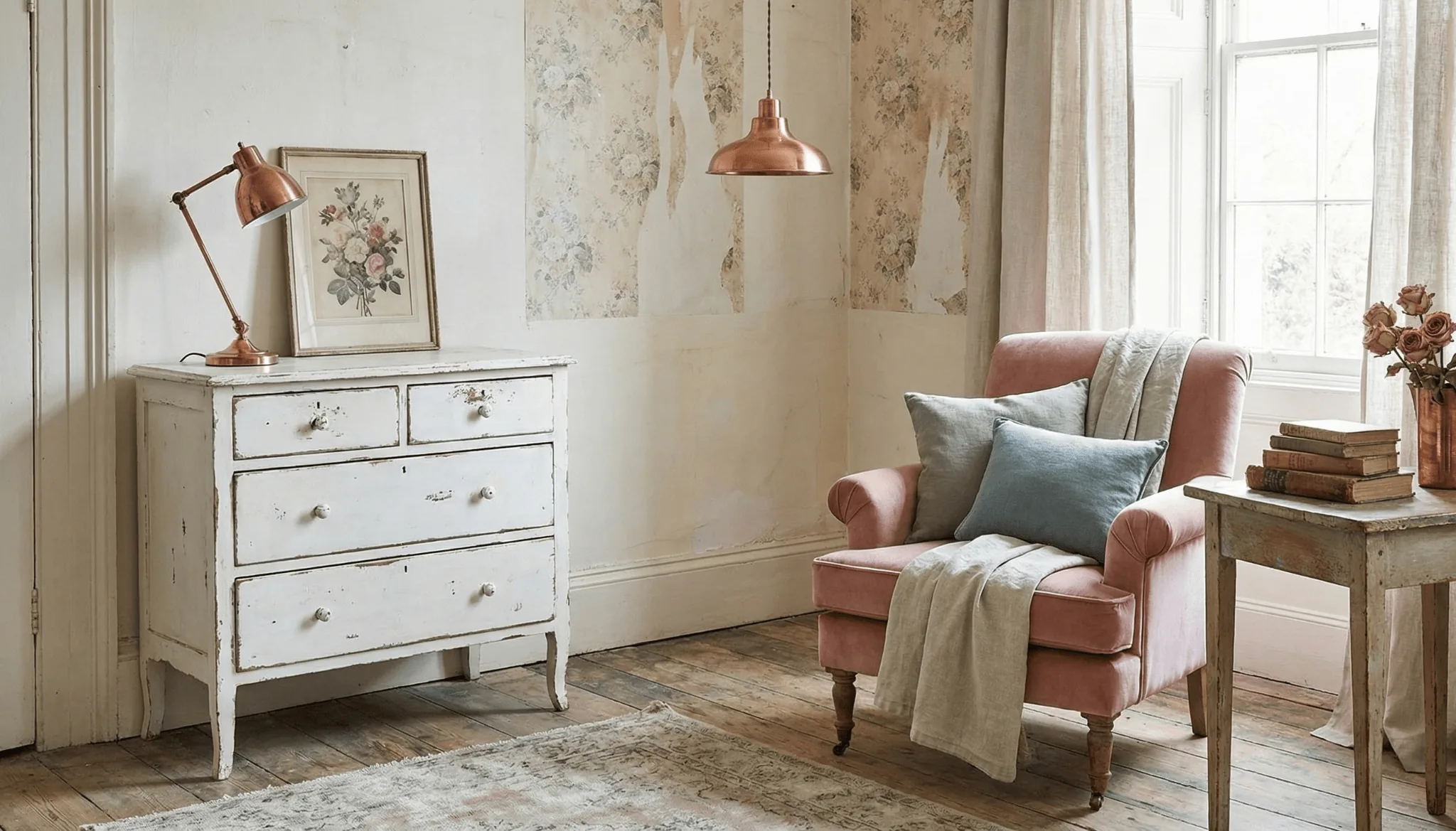
The source inspiration photograph shows a powder-pink chair, sage-green cushions and copper accents in a shabby-chic setting. It illustrates the effect of a colored focal seat against a light background, not the documented kitchen or fireplace case above.
Bedroom: personal history in a quieter setting
A rattan headboard, secondhand solid-wood chest, floral Liberty-style bedding or gingham can introduce vintage character. An old bedside lamp or beveled mirror can be more meaningful than a large coordinated suite.
This private room often allows more personal expression. Keep the same test of use, coherence and comfortable circulation rather than filling it simply because guests see it less.
The aim is an interior that reflects its occupants. New pieces are not incapable of character, but authentic older ones can bring a particular depth through their forms, wear and materials.
Frequently asked questions
How are vintage, retro and antique different?
Vintage commonly means an authentic object roughly 20 to 100 years old; retro is newly made with older references; antique generally means older than 100 years. Check provenance and market conventions rather than treating those boundaries as universal legal definitions.
How do I avoid a museum effect?
Start with one or two strong focal pieces and a quieter contemporary frame. Give them a useful place in the room. Mismatched forms are welcome when color and material still connect the composition.
Which colors work?
Pastels offer softness; burnt orange, khaki and burgundy are more assertive. White or pale wood can support either. A coherent palette matters more than copying a particular period color exactly.
Must every piece be found secondhand?
No. Markets, resale and secondhand shops can supply originals, while authorized reissues and thoughtful vintage-inspired pieces fill practical gaps. Choose condition and integration as carefully as appearance.
Which defects deserve attention first?
Loose joints, unstable construction, damaged laminate edges and signs of active insects deserve more attention than attractive surface patina. Upholstery and electrical condition also affect whether the piece can actually be used safely and comfortably.