

An accent wall can change how a whole room is read without a major construction project. Color may mark a place to sit, connect several rooms or bring an existing architectural detail into focus.
The aim is not to follow a favorite shade blindly. Start with the room’s light, materials and daily use, then test the color where it will actually be seen. This advice draws on more than 10 years of interior-design practice described in the French source.
Use color to organize, not simply decorate
A wall behind a sofa can give the living area a clearer position. A colored headboard wall can identify the sleeping zone, while an entry may support a more enveloping treatment.
An alcove or recess offers another focused location. Color can emphasize its depth, although the actual effect depends on contrast, lighting and the surrounding surfaces.
In an open kitchen, a deliberate shade can connect cooking and living rather than divide them into unrelated schemes. It is not necessary to coat every wall to establish that relationship.
The molding article develops another way to combine an architectural outline with color, while keeping the surrounding details readable.
A patio-to-interior project with a strong palette
In one interior-and-exterior project, electric-blue flooring and coordinated decorative touches were paired with a mimosa-yellow wall. Yellow was also repeated more subtly on the ceiling.
The combination linked the patio, living room and kitchen. The story matters because the palette was organized across adjoining spaces, not because blue and yellow are a universal formula.

The owner had initially resisted color. After seeing what a few deliberate placements did to the perception of the rooms, they wanted to introduce more of it.
That response is a project observation, not a promise that every person will feel the same way about a bold scheme. The relevant method is controlled repetition and a view of the whole home.
A different apartment: continuity without uniformity
In an older apartment renovation, a continuous colored lower-wall band linked the entry, living room, circulation and bedroom. Off-white upper walls kept the overall composition light.
Original glazed doors were retained and repainted to belong to the scheme. Preserving them was part of the design rather than treating every older element as something to replace.
A peacock-feather wallpaper punctuated one wall in the entry. In the bedroom, a black-and-white panoramic scene supplied a different expressive element.
Light surfaces and softly toned laminate flooring balanced those stronger features. The bedroom photograph preserves the dark-blue lower band and monochrome panorama, showing how one horizontal line can connect rooms without making them identical.
Keep the palette small enough to understand
The source suggests two principal colors, with balancing neutrals as needed. Treat that as a useful starting framework rather than a rule that forbids every smaller variation.

Petroleum blue with pale wood can create a contemporary warm contrast. Water green with off-white offers a softer direction; sunny yellow with light gray can give a living area a more energetic note.
Sage green is another possibility for a bedroom, and gentle or playful pastels may suit a child’s room. None of these labels guarantees calm or brightness independently of the room and its occupants.
The wallpaper and perspective guide considers patterned surfaces when a simple painted area is not the whole proposal.
See our projects in video
Real floor plans and renovations explained step by step on the ArchiWorking YouTube channel. Watch how spaces are reworked before the works begin.
Test the paint at a meaningful scale
Paint a 1 m² sample on the prepared wall rather than rely only on a tiny printed chip. Observe it in daylight and under the lighting used after dark.
If two close shades remain in contention, place two 1 m² samples side by side and compare them over 48 hours. The source uses this as a practical observation period, not a guarantee that every weather and seasonal condition will occur within it.
Look in the morning and evening, and consider the artificial light actually fitted in the room. A tone may look vivid at one moment and muted at another.
Pantone or Tollens references can help begin the conversation, but a professional color chart does not replace the on-site test. Verify the actual paint product as well as its named shade.
Match sheen and performance to the location
The source favors a low-sheen “velvet” wall finish in renovation and a matte ceiling finish in areas without contact. Product names and sheen categories vary between brands and markets.
A lower sheen may make some irregularities less conspicuous, but does not repair damaged preparation. Washability, durability and suitability for the room remain product-specific.
Choose the ceiling product for its actual conditions rather than assume every matte paint suits every ceiling. Similarly, a desired color does not override the needs of a frequently touched or moisture-exposed surface.
Repeat a signature color with restraint
Relate the wall to wood, stone, metal and textiles already present. A ceiling detail, door or niche may repeat a shade without turning the whole room into one flat field.
In a home connected to a patio or garden, those repetitions can carry the visual thread outdoors. Distinguish the color relationship from the technical specification: an exterior surface still requires an appropriate exterior system.
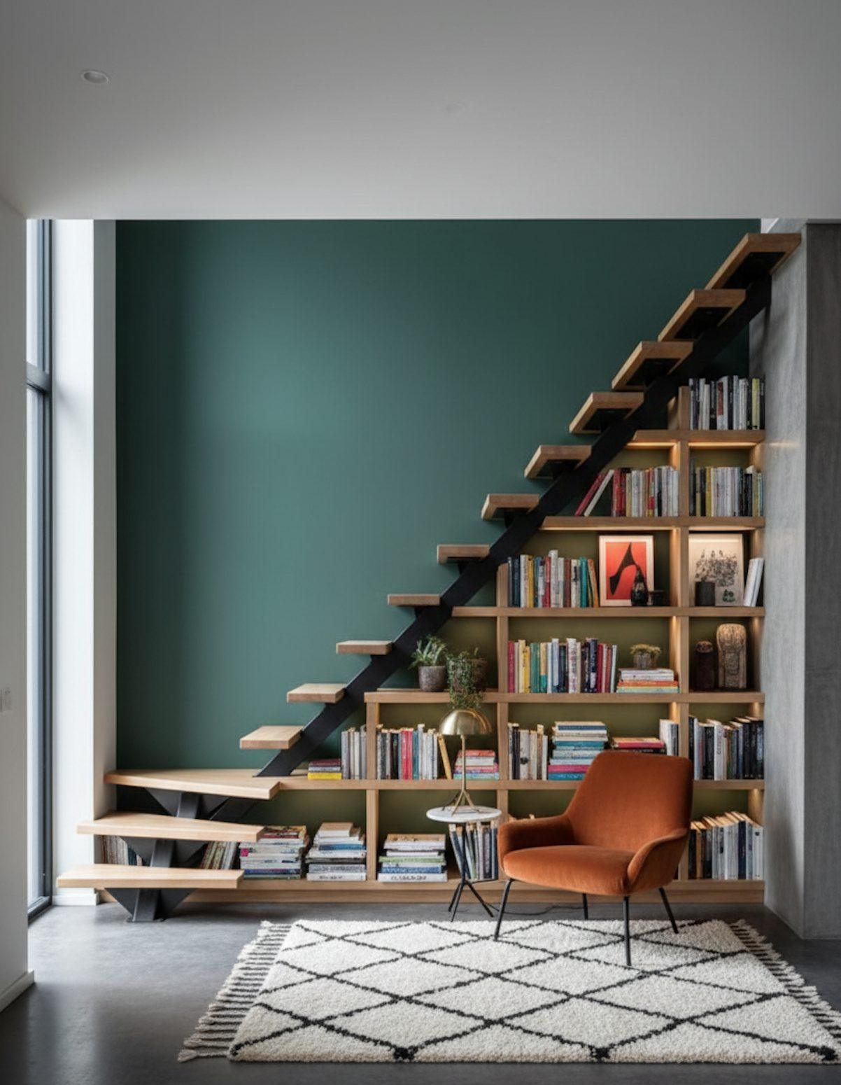
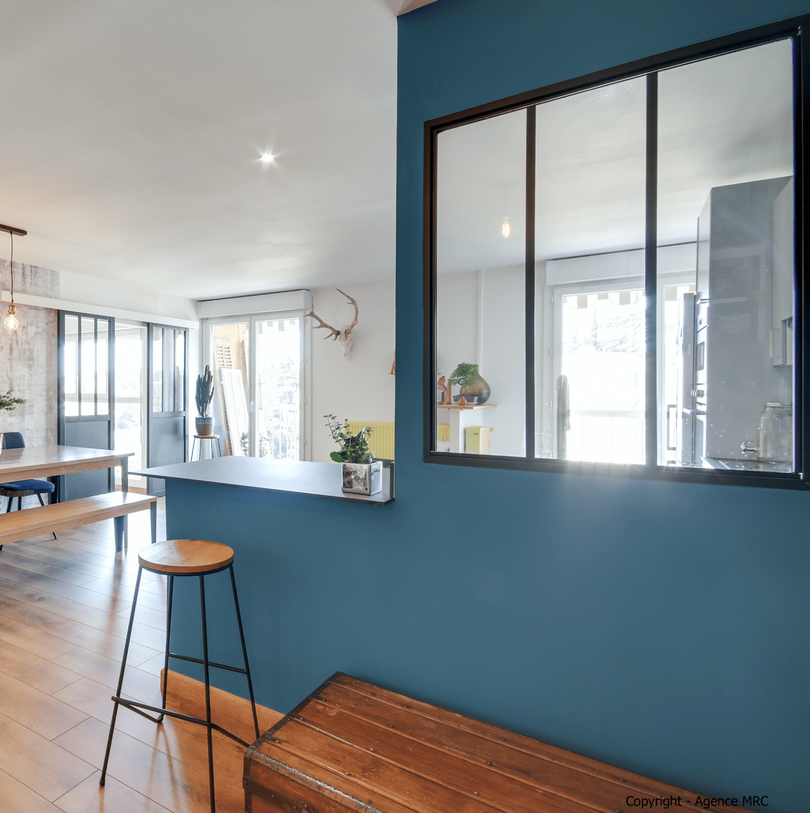
The retained images show a soft-green bedroom with white moldings, the continuous lower-wall band, a dark-green wall behind a timber stair and bookcase, and a petroleum-blue wall beside black glazing.
They demonstrate different placements rather than one correct accent-wall location. The best choice remains the one that supports the room’s use and your own preferences.
Frequently asked questions
Which interior wall color should I choose?
Petroleum blue, sage green and mimosa yellow are useful starting ideas for different intentions. Test the proposed shade in the actual room instead of assigning one color permanently to a room type.
Must the whole room be painted?
No. A sofa wall, headboard zone or recess may be enough. Consider how it appears from adjoining rooms before extending the treatment.
How should two similar shades be compared?
Use the source’s two 1 m² samples and 48 hour observation approach, including daylight and evening lighting, while allowing for conditions not captured in that short period.
Is a velvet finish always best?
No. It is the source’s preferred wall direction, not a universal product specification. Preparation, sheen, cleaning and exposure must be considered together.