
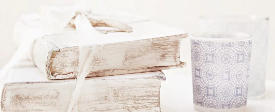
Shabby chic is a composition, not a collection of everything that looks old. Its appeal comes from bright backgrounds, carefully chosen weathered furniture, tactile materials, and warm light. The result should feel relaxed, authentic, and quietly elegant rather than theatrical or overloaded.
Soft pink, velvet, moldings, floral wallpaper, and patterned floors all belong to this wider decorative vocabulary. A copper light above a floral pattern, for example, can make a romantic detail feel more deliberate. But none of these ingredients needs to appear everywhere. What matters is the hierarchy between the calm background and the few elements given a leading role.
Build a clear framework before buying objects
Start with off-white, cream, or ivory on large surfaces. Choose one pastel accent, such as powder pink, sage green, or gray-blue, then a dominant material to connect the room. Wood, linen, or copper can provide that thread. The restrained palette makes separate objects feel related instead of turning the space into a display of competing effects.
As a working guide, one or two strong vintage or patinated furniture pieces are usually enough. Keep the rest simpler. Add warm light from more than one position, such as a pendant and a table lamp, so the pale palette has depth. A room that relies on one cold overhead light can look washed out despite carefully selected furniture.
Think in terms of a scene rather than an entire style makeover: a reading corner, entrance, or dining setting can be a manageable starting point. This is particularly helpful in a contemporary home where a small amount of vintage character may be more effective than reproducing a whole period interior.
Use pink as an accent, not an obligation
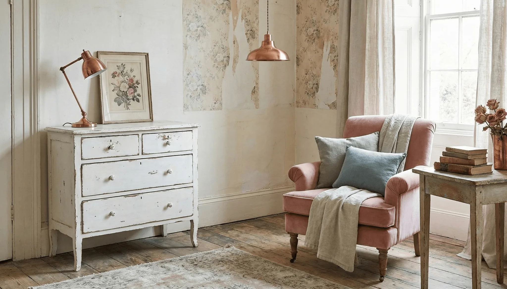
Powder pink works well when it appears in cushions, a picture frame, a lamp, or a chair. Pair it with a light base and a controlled green or natural-material relationship rather than putting pastel on every surface. A single dominant color, an accent, and a strong material are easier to read than an undifferentiated mix of pale shades.
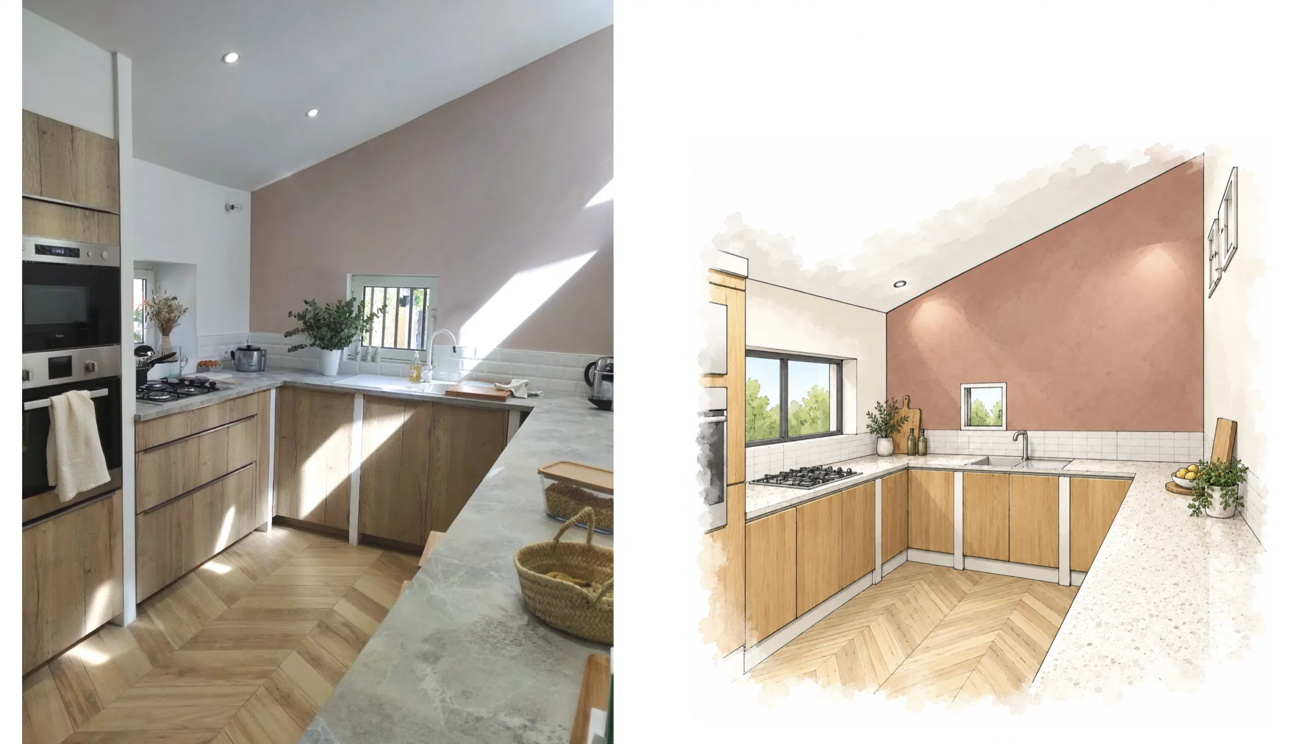
In a family kitchen renovation, we borrowed several shabby-chic codes to create a bohemian-chic atmosphere. A powder-pink wall sat alongside cabinetry with an aged, raw-wood effect. The floor was fully replaced with wood-look tile in a chevron pattern, with light-beige joints and white skirting boards.
Light was part of the project, not just the color scheme. A new two-leaf window was formed above the worktop, requiring masonry work and a lintel. The softer atmosphere therefore came from the relationship between daylight, finishes, and furniture, not simply from painting one wall pink. The kitchen photograph illustrates how those decisions work together.
Let texture provide depth
Velvet brings a cocooning quality, linen a natural one, patinated timber a sense of use and history, and copper warmth. Cotton can sit alongside linen, while velvet supplies the softer contrast. These differences allow a restrained palette to remain interesting without multiplying ornaments.
In a holiday-rental house in Provence, the author tested copper with linen to introduce this kind of warmth. Under evening light, the combination created a characterful atmosphere that guests responded to positively. It is a project observation, not a claim that one material combination will suit every rental or room.
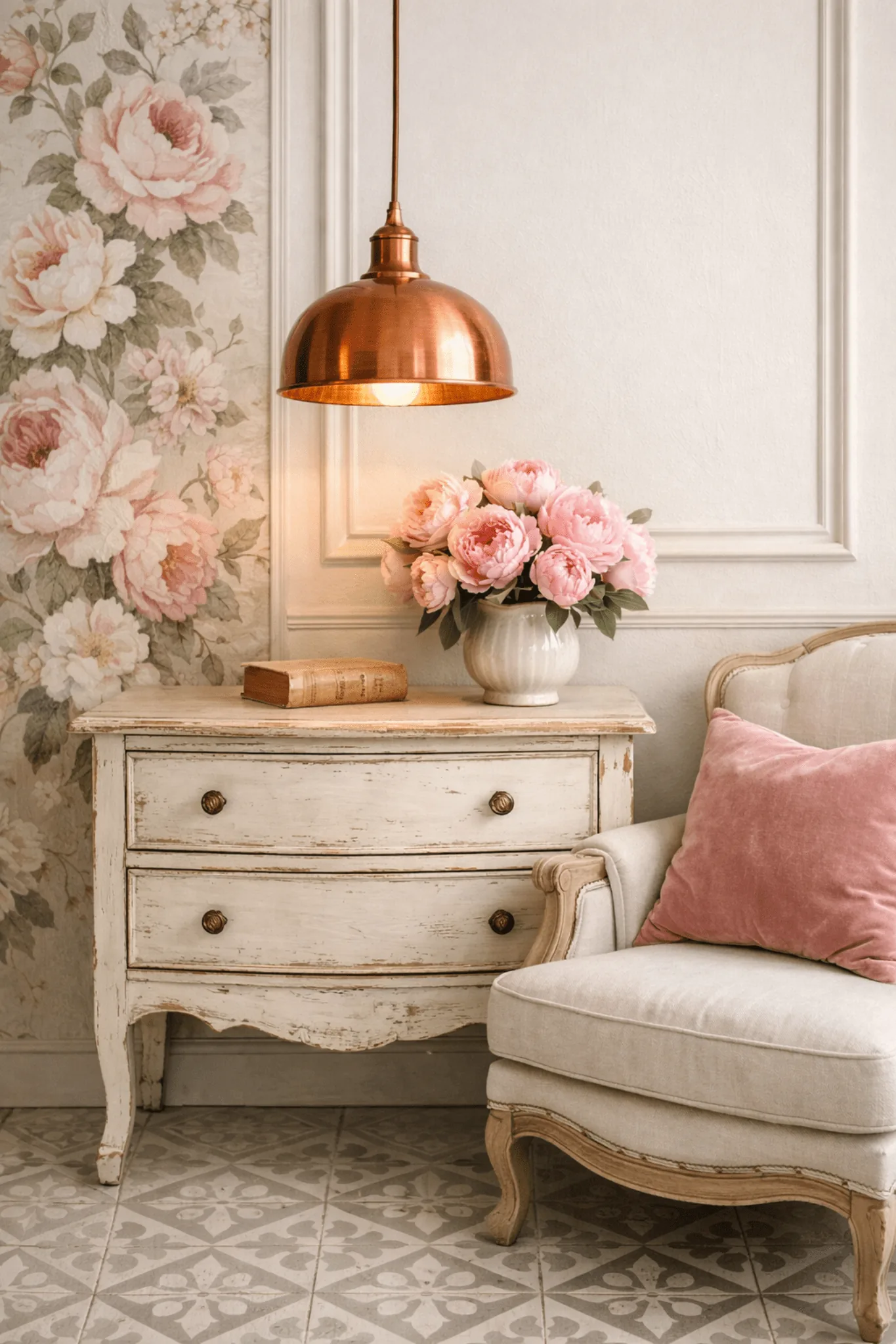
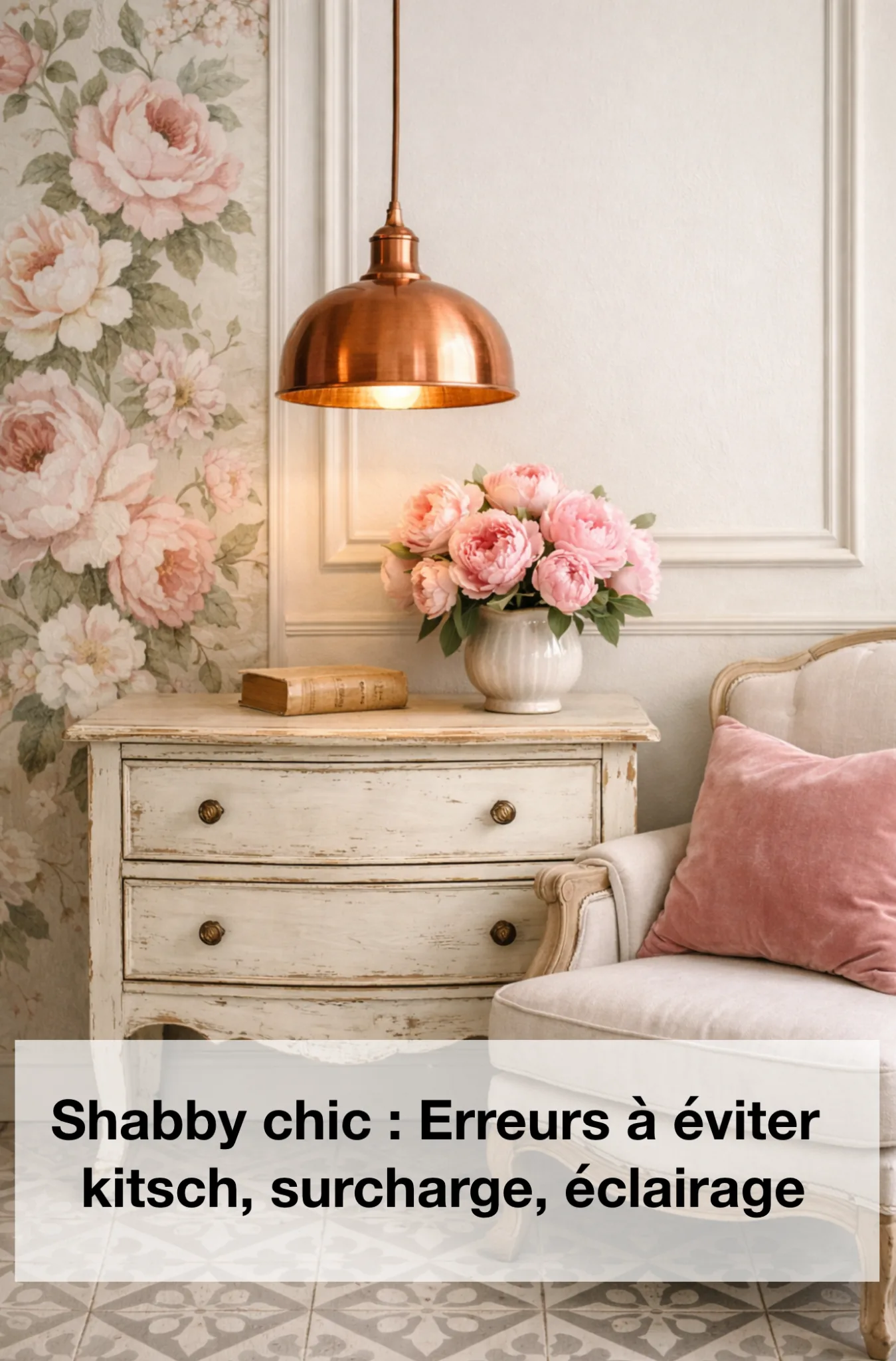
A copper pendant against floral wallpaper can balance romance with a more graphic presence. Brass can also appear in a small light fitting, handle, or object. Use these metals as accents, not as a requirement to replace every visible finish. For more comparisons of decorative surfaces, browse finishes and materials.
See our projects in video
Real floor plans and renovations explained step by step on the ArchiWorking YouTube channel. Watch how spaces are reworked before the works begin.
Give furniture a leading role without crowding it
A weathered chest, vintage armchair, or old table can establish the character of the room. Reworking an existing piece can be an effective alternative to buying an entire coordinated suite. What matters is its relationship to the palette, proportions, and surrounding space, not merely whether it has distressed paint.
On another house renovation, we designed a custom white-wood dressing unit with a painted patinated finish, rounded door lines, and charcoal-gray handles. It stood beside a more contemporary internal glazed partition. The furniture supplied character without forcing every neighboring element to imitate an old house.
That example shows how contemporary and older references can coexist. A single patinated piece, an old mirror, a copper lamp, and a carefully located pastel color can be enough. In a smaller room, closed storage keeps everyday objects from competing with that composition; concentrate decoration on one wall, console, or shelf.
Walls and floors: choose where the pattern belongs
Moldings, floral wallpaper, and selected retro motifs can give a pale room depth. Cement tiles can become a signature element when they structure a zone rather than cover everything indiscriminately. The same principle applies to a strong wallpaper: decide which surface should lead and let the others support it.
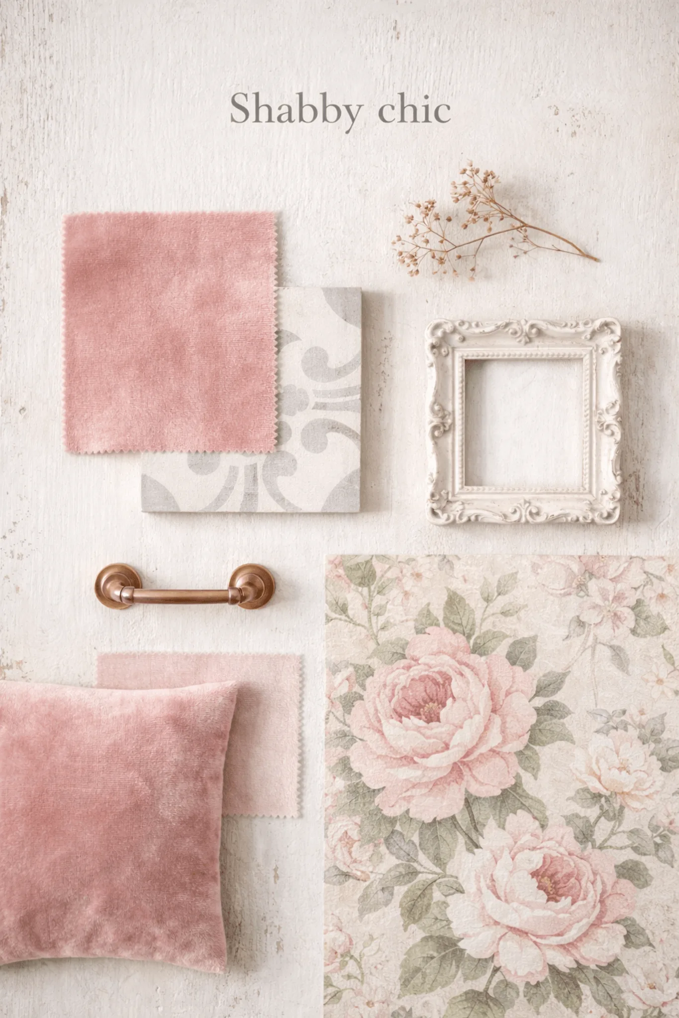
Matte walls paired with softly satin-finished woodwork or moldings create a subtle variation in reflected light without excessive shine. Pattern, texture, and sheen all contribute, so there is no need for each one to be equally prominent. The material-board illustration combines powder-pink velvet, a weathered frame, copper hardware, and floral paper as related ingredients, not a shopping list to reproduce literally.
A seven-part room check
1. Keep the wall background light, using off-white or cream as the main reference.
2. Choose one accent family: powder pink, sage, or gray-blue rather than every pastel together.
3. Combine natural linen or cotton with a softer texture such as velvet.
4. Limit the main patinated or vintage furniture statements to one or two pieces.
5. Introduce copper or brass in small, deliberate touches.
6. Locate one strong motif carefully, whether floral paper or patterned cement tile.
7. Use warm lighting from several positions, including an occasional lamp and a pendant where appropriate.
The common mistakes are the reverse: too many aged objects, pastel everywhere, a cold or poorly positioned light, and no common color or material. Remove the competing elements before adding another accessory. Browse interior decorating ideas for other ways to build a coherent room.
How do I avoid a kitschy result?
Create visual hierarchy. Keep the large surfaces calm, choose one main furniture statement and a dominant material, then let other objects remain discreet. Several warm light sources make the pale palette softer and more dimensional than one cold light.
Which colors and finishes age well?
Off-white, ivory, or cream with selected powder-pink, sage, or gray-blue accents. Matte walls, soft-satin moldings, natural textiles, and a little velvet add depth without excessive shine or clutter.
Can shabby chic work in a small or contemporary interior?
Yes, in a small dose. Start with one scene, such as a reading corner or entry console. Use closed storage, fewer visible objects, and a clear palette so a patinated piece or vintage mirror feels intentional rather than lost in accumulation.