

Blue changes how a room reads: a recess becomes more noticeable, a doorway can merge into the wall, and a deep backdrop can make pale wood feel warmer. It is more useful to think about those relationships than to select a fashionable shade in isolation.
Start with the room’s light, floor and proportions, then explore the range of blues and their combinations. The same paint can feel very different when its setting changes.
Decide what the color should emphasize
A dark blue on an end wall can suggest depth, especially beside lighter side walls. A pale sky blue can bring a fresher impression to a small bathroom. Neither effect is automatic: contrast, light and the size of the painted area matter.
An alcove or niche provides a small surface with architectural impact. Look at where the eye naturally lands on entering and decide whether color should draw attention there.
A lower band, around the bottom third of a wall, anchors the composition visually. A suitable durable finish can also make contact areas easier to maintain; color alone does not protect against impacts.
The source uses approximately 2.70 m as a reference when considering a deep-blue ceiling in a high room. A darker overhead surface can feel lower or more enclosing. In a lower room, a much lighter blue or a lightened version of the wall shade can preserve a more open impression.
The colored-ceiling guide develops the relationship between height, finish and the rest of the room. Treat the height as a design reference, not a rule that determines every space.
A 75 m² apartment: continuity without identical blues
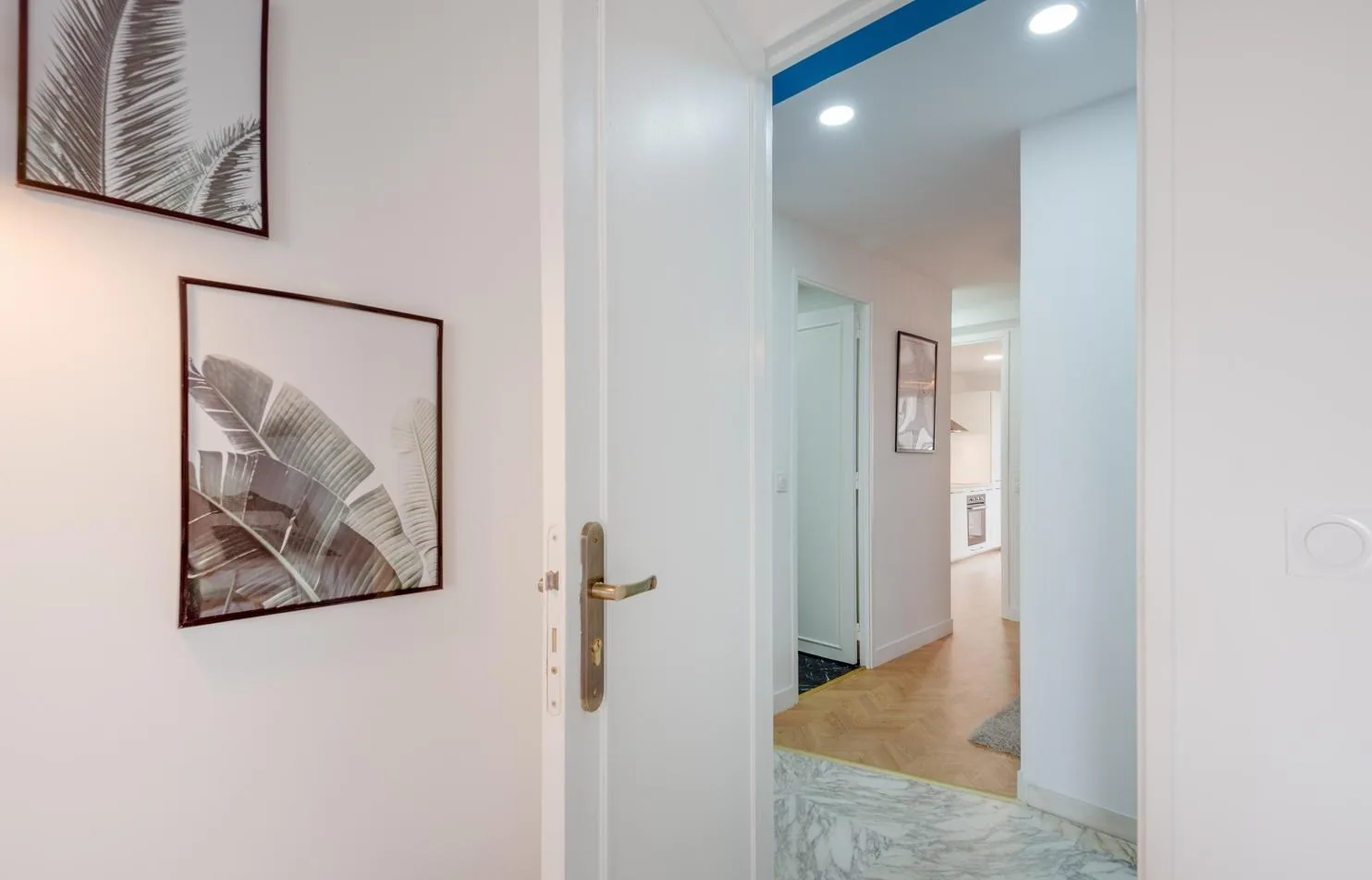
In a complete 75 m² apartment renovation, the entrance was painted Tollens CR4113-3 Méditerranée to lead the eye toward the living space. Part of the existing marble floor was retained and paired with a chevron-pattern wood floor covering.
The photograph shows the threshold between veined white marble and the wood-finished corridor, a white door with a brass handle, leaf-pattern pictures and blue above. The material transition is part of the composition, not merely a paint backdrop.
In the kitchen, the blue becomes brighter: an electric-blue backsplash of elongated shuttle-shaped tiles faces white fronts and a light-wood countertop. These shades establish a thread through the apartment without making every room identical.
The interior marble article looks at the retained material. The lesson is to coordinate what already exists with new choices, not to assume a coherent home needs one repeated paint reference everywhere.
Color drenching: work with boundaries and finishes
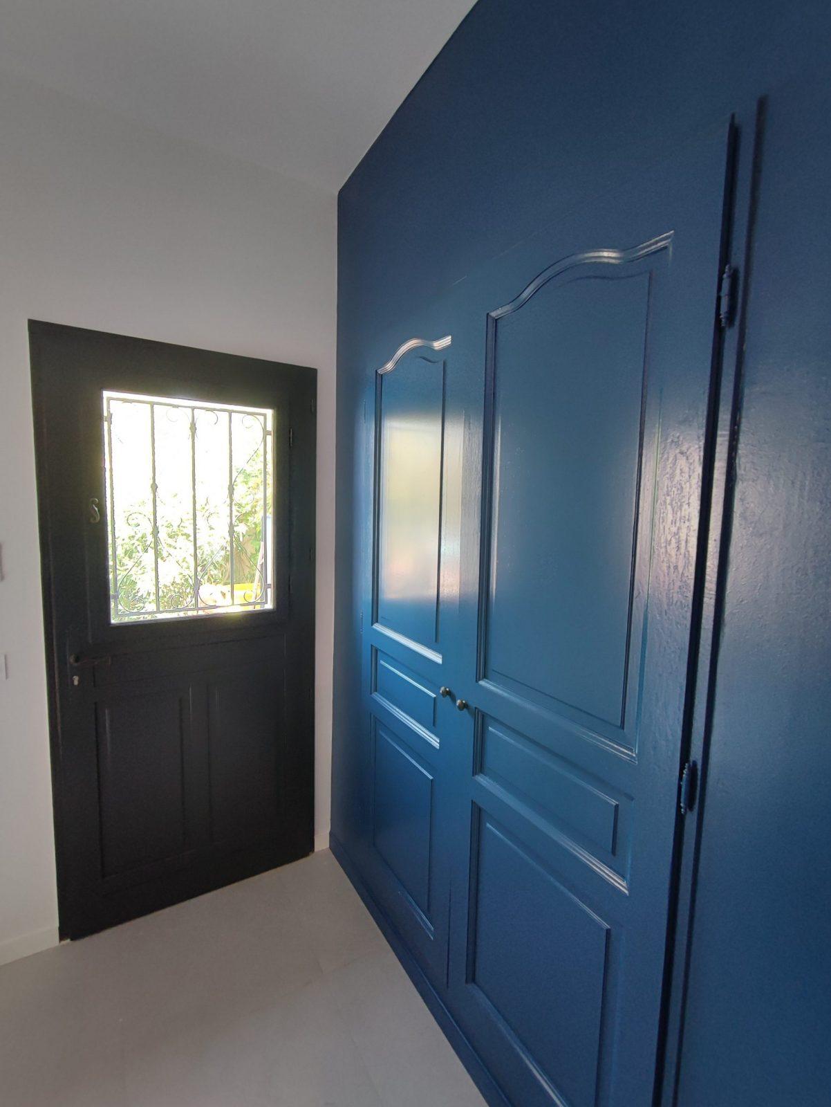
Painting walls, ceiling and sometimes doors, trim, baseboards and moldings in the same blue can create a cocoon-like atmosphere. Turquoise, cobalt or navy need not be restricted to one accent wall.
This approach can soften the reading of corners in an enclosed office, bedroom or powder room. In an open-plan living space, decide carefully where the color ends. An unresolved stopping point can make an otherwise strong idea feel accidental.
Vary the finish rather than introducing unrelated hues: matte on the ceiling, an appropriate soft-sheen wall finish and a more durable satin on trim. In the source’s tone-on-tone doorway photograph, the blue door merges into the wall beside a black glazed entrance door.
Prepare damaged walls before painting. The suggested sequence is smoothing repairs, a suitable tinted primer and two finish coats, adjusted to the paint system. Deep colors and critical lighting can make surface flaws conspicuous; no finish removes the need for good preparation.
Where height feels limited, a lightened ceiling version can be preferable to carrying a dark shade over every surface. Test the whole relationship rather than judging a tiny color chip.
See our projects in video
Real floor plans and renovations explained step by step on the ArchiWorking YouTube channel. Watch how spaces are reworked before the works begin.
Light keeps the composition readable
Blue, particularly a dark shade, must be studied with both daylight and the floor. Without that review, a refined idea can become an unexpectedly dim room.
Use three lighting layers: gentle general illumination, task light where someone reads or works, and accent or indirect light that reveals the walls. The layers support different activities rather than flooding every surface equally.
The source favors warm-white lamps around 2700 to 3000 K and a color-rendering index of at least 90. These are useful selection references, but they do not guarantee that every blue avoids a gray cast. Check the actual paint under the chosen lamps as well as daylight.
A light-oak floor or another pale finish can return more light toward dark walls than a dark floor. Room orientation also changes the result. In the French, Northern Hemisphere context, north-facing light may call for a warmer undertone, while stronger southern light can support deeper blues.
The guide to choosing lighting by use helps select fixtures. Do not confuse a pleasing lamp with an adequate lighting plan for the room’s activities.
Blue and wood in a primary suite
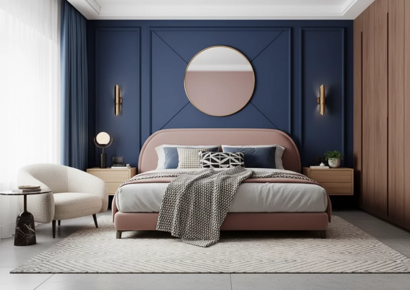
The bedroom case pairs blue with substantial wood elements to create a softer, more restful impression. That is visual warmth, not a claim that wood changes the room’s temperature or that a particular color guarantees sleep.
Light oak with an oiled or matte-varnished finish can keep the combination bright. Darker walnut creates a more subdued effect and needs suitable illumination. Veneer or wood-effect melamine offers another option for storage fronts where solid wood is not appropriate to the budget or construction.
Limit the room to one or two wood species or coordinated finishes, then repeat them deliberately: headboard, bedside elements and dressing-area framing. Brass light fittings and linen textiles extend the warmer palette.
The navy bedroom photograph includes molded walls, a rounded headboard, a round mirror, brass sconces and wood storage. It illustrates how several textures can balance a strong wall color without competing hues everywhere.
The technical custom-headboard guide develops integrated construction and fittings. A related video lasting 11 minutes 06 seconds follows a 25 m² suite from plan to finishes, including dressing, shower room and a fitted headboard.
See the 25 m² lower-level suite project for that layout and the primary-suite planning guide for the broader method. These examples connect color to space planning rather than presenting blue as a substitute for it.
Questions before choosing a blue
Can a dark blue make a room feel larger?
It can suggest depth on an end wall, particularly against pale side walls, but the effect depends on light and contrast. Try the intended surface in context rather than assuming every dark wall recedes.
Is an all-blue room necessarily gloomy?
No. Floor reflectance, daylight, layered lighting, finish and the chosen shade influence the result. An enclosed cocoon and a bright open living room may need very different treatments.
What makes the wood combination work?
A controlled choice of one or two wood tones, repeated in useful elements, creates continuity. Light oak and darker walnut give different results; neither removes the need to study the lighting.
Can the ceiling be blue too?
Yes. Consider height and the desired sense of enclosure. The source’s roughly 2.70 m reference is a starting point, with a lighter or lightened matte ceiling as another option for lower rooms.