
Black does not have one fixed effect on a room. It can make a poorly lit space feel heavier, but a carefully positioned dark surface can also create depth, frame a function, or reveal pale timber and other materials. The result depends on area, location, finish, and light rather than the color name alone.
Clara AJMAR begins by checking four things: orientation, available daylight, the surface finish, and the accompanying materials. A black wall that looks elegant on a drawing may feel harsh in the actual room if those relationships are ignored. For the larger approach, see working with color on an interior wall.
Use black to reveal rather than cover
A dark background can make the things in front of it more legible. Pale furniture against a black living-room wall, for example, gains a clear outline through contrast. The dark value is working for the rest of the room, not simply asserting itself.
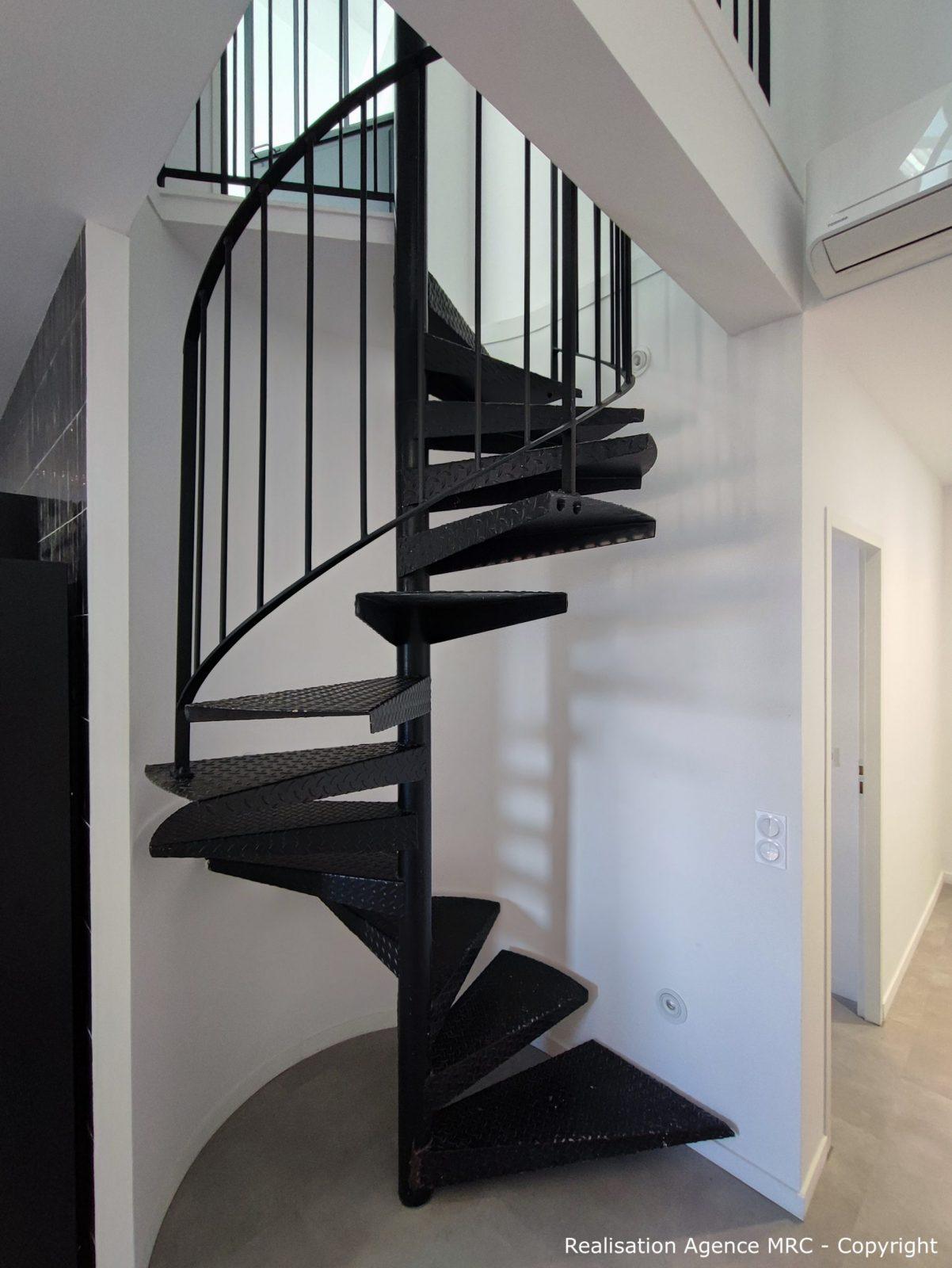
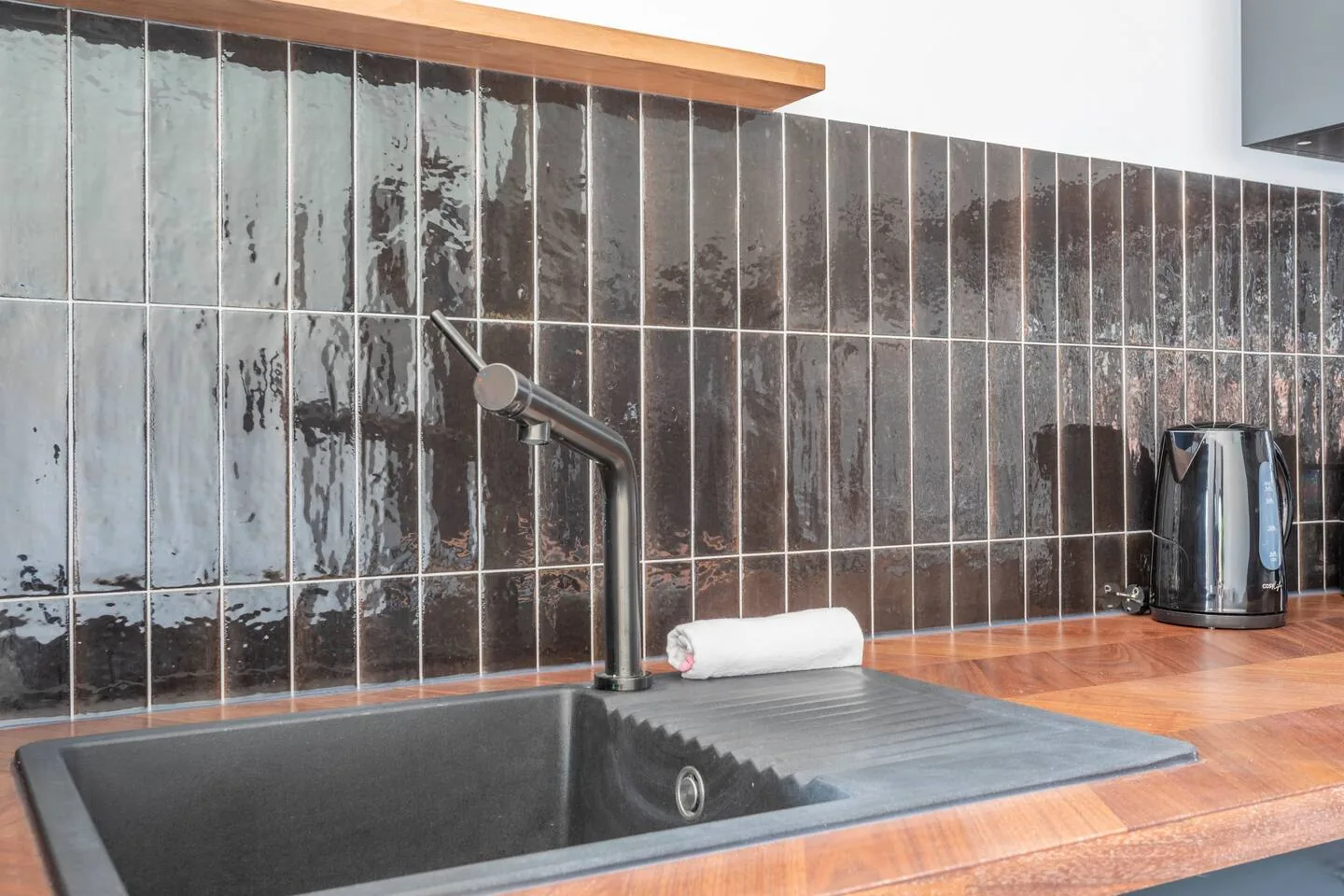
The source uses a RAL 9005 black metal stair, a bed niche, and a kitchen backsplash as examples. Each gives black a defined architectural role. A stair can organize a volume without requiring dark walls on every side; a niche can frame what it contains; a backsplash can establish character over a limited area.
This is often a more approachable first step than painting an entire room. Choose a function to emphasize, then give it a deliberate boundary. An alcove, headboard zone, lower wall band, or fitted cabinet can introduce the effect while leaving the surrounding surfaces quieter.
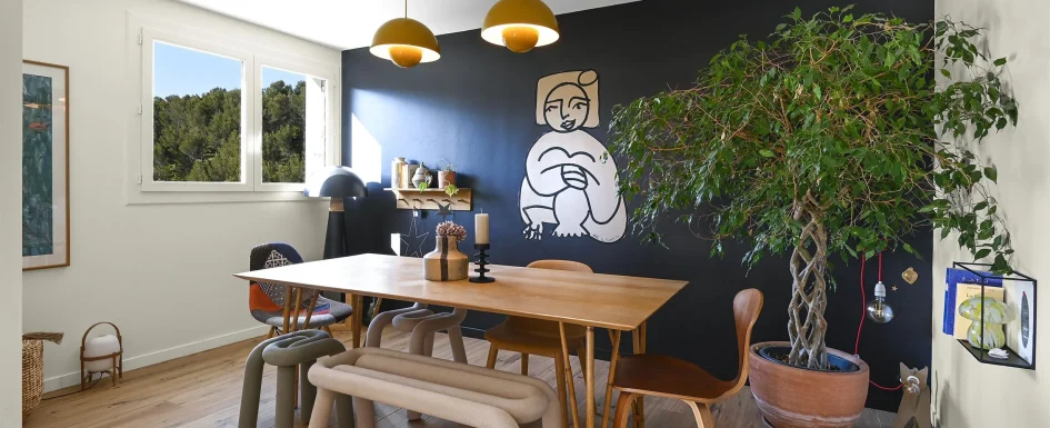
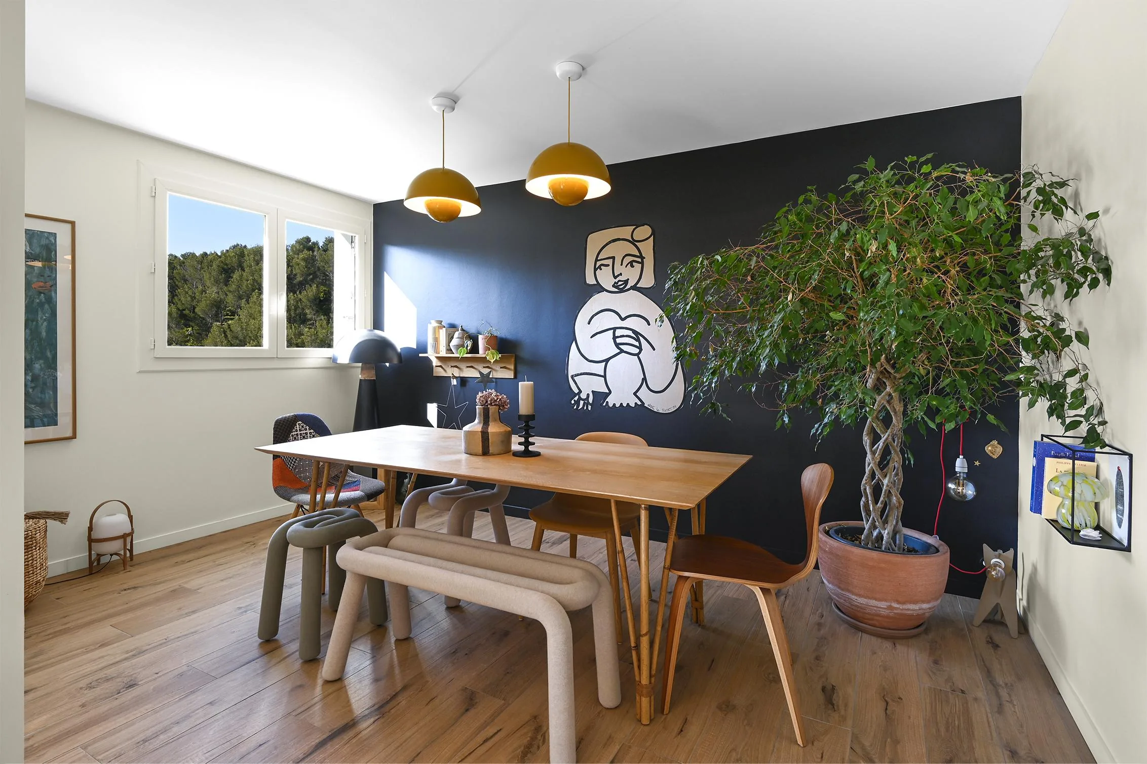
The spiral-stair photograph shows a substantial black element within a contemporary loft. Another image shows pale timber and ochre pendants against a dark dining-room wall. In both, the relationship between dark and light is the subject, not black used without a counterweight.
Choose the surface and the shade together
A full wall behind a headboard can feel enveloping; a small black niche may act almost like a picture frame. A kitchen backsplash introduces another scale entirely. The same tone should not be expected to behave identically in all three positions.
In one kitchen-living project, Clara used Tollens Cachou T2130-5. She describes it as a warm, very dark tone rather than an absolute black. Continuing it across furniture and wall created a strong graphic connection while pale kitchen timber remained distinct.
That reference documents a project choice, not a recommendation to apply the same product everywhere. A pure black such as RAL 9005 may suit a metal structure, while a warmer near-black may be easier to live with over a broad wall. Test the actual material and finish, because paint and powder-coated metal do not produce the same surface effect.
Observe the room in daylight and at night. A balanced wall under natural light can feel much denser when evening lighting is badly distributed. Before changing the color, check whether the artificial lighting leaves the dark area unsupported or creates uncomfortable glare elsewhere.
Proportion changes the perceived effect
A black ceiling in a low room may appear closer, while a dark end wall in a narrow passage may suggest depth. These are perceptual possibilities rather than promises: geometry, adjoining values, and light influence the outcome.
The source recommends a sample at least the size of an A4 sheet on the real support, observed during the day and evening. A larger sample may be useful for a broad surface. Do not judge a full wall solely from a tiny printed chip or a screen photograph.
If a complete wall feels too much, start with the back of an open cabinet, an alcove, or a niche. This gives an immediate dark frame at limited scale and allows a more informed decision about extending it. There is no requirement to progress to a larger area if the smaller intervention already works.
Finish determines both atmosphere and maintenance
Black velvet, matte ceramic, glazed lava stone, mineral render, and quality paint each catch light differently. Velvet gives a soft depth; a restrained hard surface may read as more architectural. The appropriate material depends on the location and the intended touch, cleaning, and wear.
A matte appearance is not a guarantee of easy care. Glazed matte ceramic may clean readily, while a poorly washable paint or porous stone can mark. Similarly, a high-gloss black surface may reveal fingerprints, dust, splashes, reflections, and unevenness more readily than expected.
For paint, check verified performance as well as the finish name. The French source refers to NF EN 13300 wet-abrasion classes 1 to 5, with class 1 the most resistant and particularly relevant to entrances, corridors, and kitchens. Match the product and substrate to the real cleaning needs.
On metal stairs, glazing frames, lights, and furniture legs, a matte or fine-textured powder coat may be visually more forgiving than a glossy lacquer. The actual coating, exposure, and cleaning instructions still matter. A fine texture should not be assumed suitable for every use merely because it disguises marks.
Black taps and hardware can show pale limescale conspicuously in hard-water areas. Use the supplier’s recommended gentle, nonabrasive cleaning method rather than trying to remove deposits with products that damage the finish. Color does not remove the maintenance implications of the material beneath it.
See our projects in video
Real floor plans and renovations explained step by step on the ArchiWorking YouTube channel. Watch how spaces are reworked before the works begin.
Let a light surface answer a dark one
Clara’s practical counterbalance is simple: a strong dark plane should have an appropriately light or natural counterpart. A black wall may face a pale floor; a black niche can contain white or timber furniture; a dark backsplash can sit between more neutral walls and worktops.
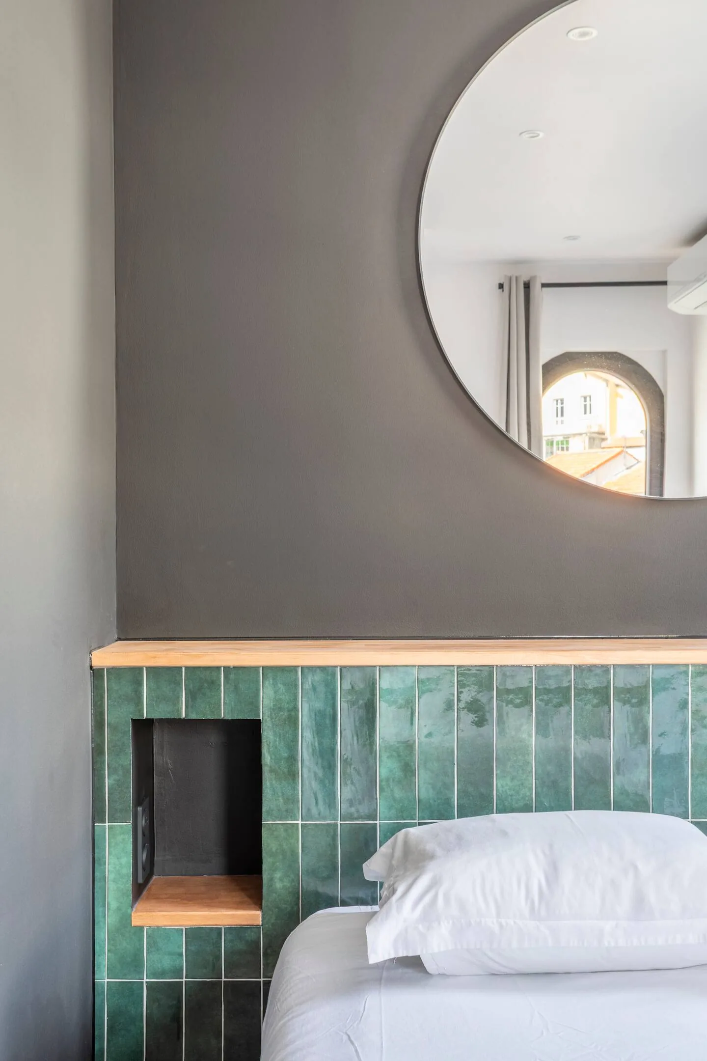
This is not an exact area formula, but a way to avoid using matte black everywhere without relief. In a poorly exposed room, extensive black may be inappropriate unless an intentionally cocoon-like atmosphere is the brief. Consider flooring, joinery, textiles, and lighting as one group rather than trying to fix the balance with a final cushion.
Pale bed linen against a black headboard is one illustration of that relation. Dark headboard niches offer another, more limited version. In each case, the dark area gets enough contrast to remain a frame rather than a visual void.
A 1970s apartment: black as an architectural accent
In a complete apartment renovation, partitions were removed to open the living space toward the kitchen. The entrance was enlarged and the kitchen repositioned to improve movement. A large glazed screen visually separated functions while retaining daylight through the room.
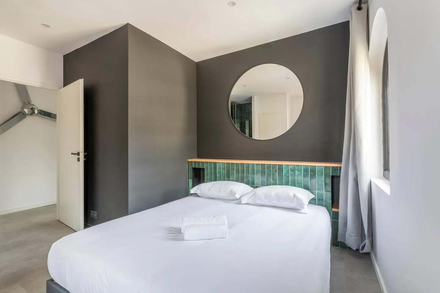
The palette combined off-white, matte gray, black accents, and electric blue. Matte-gray kitchen fronts, honey-toned parquet, a concrete-effect wall visible from the entrance, and a large exposed-track sliding door gave the space texture and identity.
Black was concentrated on glazing profiles and selected metal details. It outlined the architecture without dominating the volume. The photograph of the sliding glazed screen, timber table, concrete-effect wall, and exposed-bulb pendant shows how several materials can share that role.
The point is not that a whole black wall would always be wrong. It was simply unnecessary here. A divider, cabinet, backsplash, or a few structural-looking details may already provide the definition the room needs.
Color combinations need a hierarchy too
Black with pale wood creates a warm contemporary contrast; with white it becomes sharply graphic. With charcoal or a dense brown it can form a more muted, enveloping setting. The latter needs particular attention to light and texture so neighboring dark surfaces do not become indistinguishable.
More assertive combinations include mustard yellow for warmth, sage green for a softer botanical direction, and terracotta for an earthy contemporary palette. Avoid giving two equally intense colors similar areas without deciding which leads. A clear hierarchy makes the combination easier to read.
Our guide to combining interior colors explains the broader method. It is not a matter of declaring black compatible with everything and ignoring proportion. Each accompanying shade changes what the dark surface does.
A 50 m² apartment: work with irregular geometry
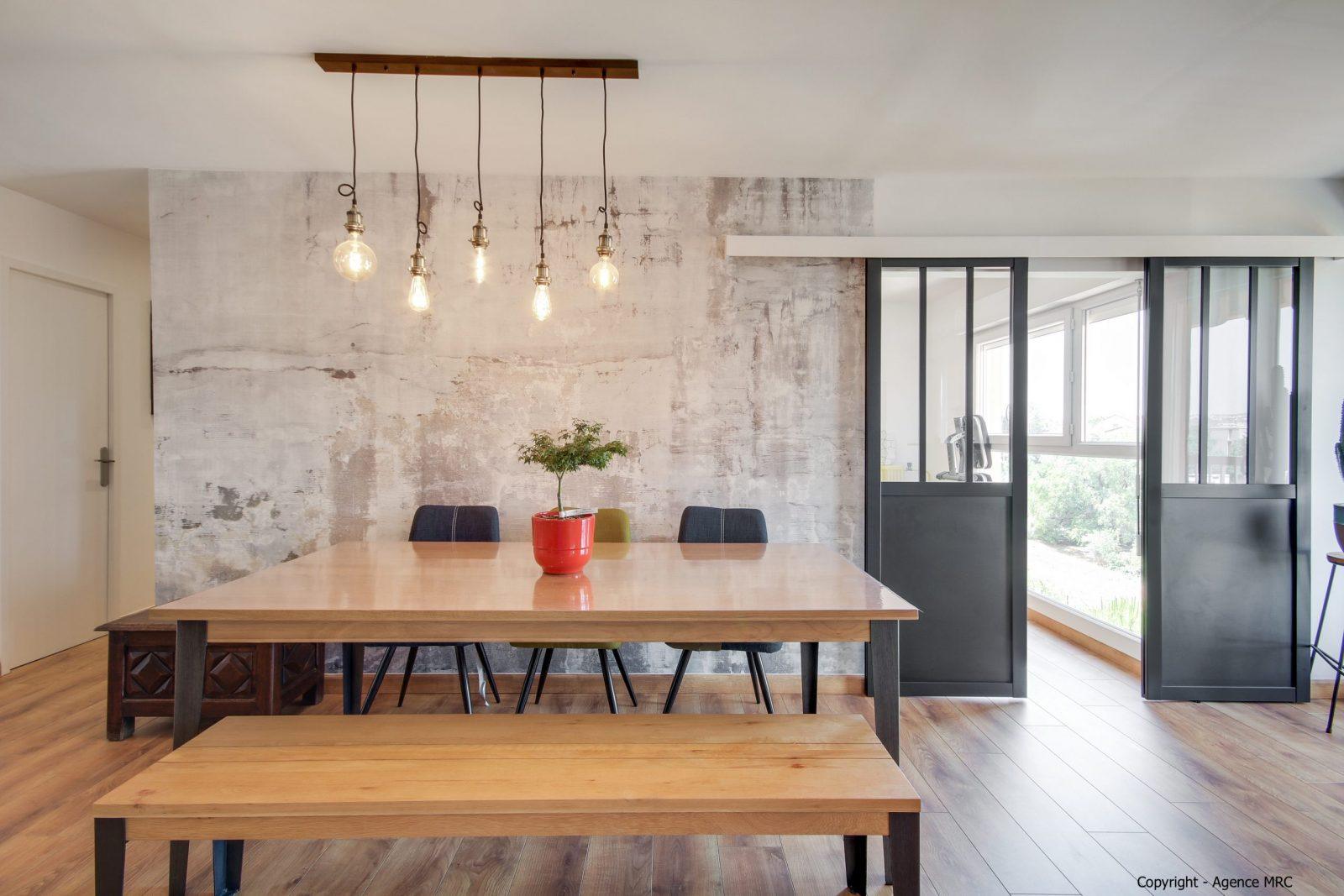
In a complete renovation for a high-end rental, the 50 m² apartment contained angled walls and triangular spaces. Rather than conceal all of them, the project made their geometry part of the identity. Black was used with khaki green and natural materials, not as an uninterrupted dark envelope.
Khaki kitchen fronts met black elements and a scalloped backsplash mixing pale green, off-white, and blue-gray. Retained exposed timber beams warmed the ceiling. In the living area, a large industrial-style sliding glazed door allowed light toward the kitchen entrance.
Small black elements clarified the volumes while the timber and lighter surfaces remained visible. This is a practical example of using an irregular plan as a design resource rather than trying to make every wall look square through dark paint.
Questions before choosing black
Does it necessarily make a room smaller?
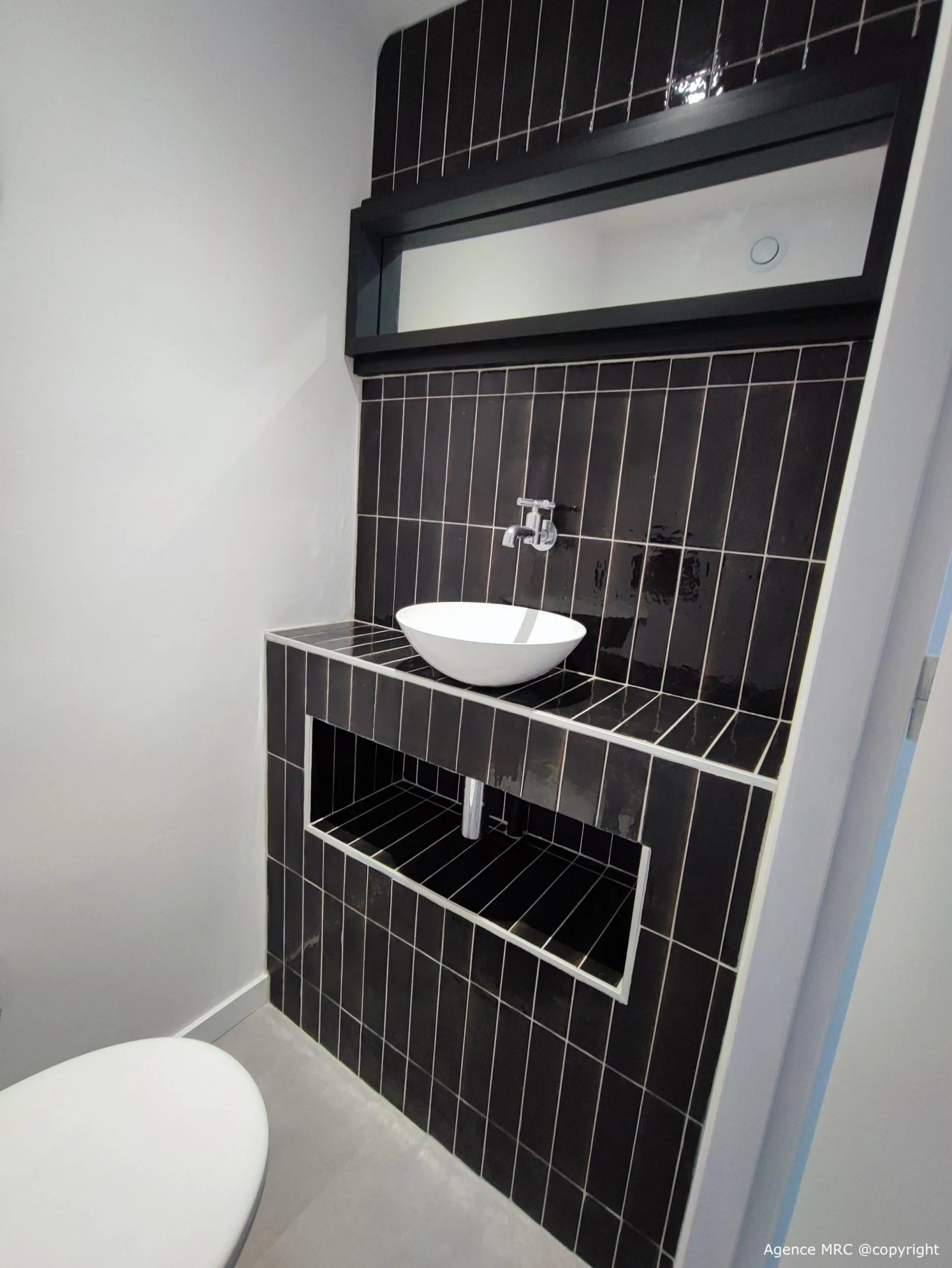
No, but neither does it automatically enlarge it. Its effect depends on location, proportion, finish, light, and the values around it. A targeted dark frame can reveal a room; an unsupported mass of dark surfaces may feel heavy.
Which finish is safest for a wall?
Matte often reduces distracting reflections and visible surface defects. Satin may be useful where maintenance requires it. Check washability independently, since matte appearance alone does not establish cleaning resistance.
Which shade should I test?
A pure structural black and a warm near-black can serve different purposes. The source examples include RAL 9005 metal and Tollens Cachou T2130-5 on furniture and wall. Test on the actual support in the actual room before covering a large area.