
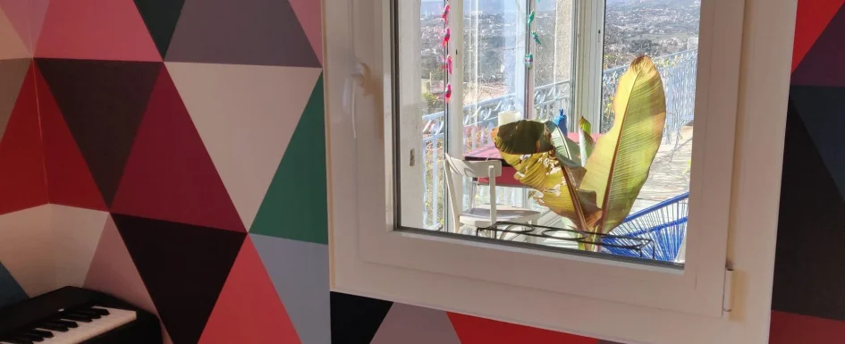
One well-placed geometric shape can give a room character. A circle, triangle, or diamond may be enough; the challenge is usually not finding more patterns, but deciding where the strongest graphic element belongs and what should remain quiet around it.
In Clara AJMAR’s project approach, geometry connects to color, materials, and architectural proportion. It can appear in paint or wallpaper, but also in a kitchen backsplash or the junction between two floors. For the broader background, see using color on an interior wall.
Choose the energy as well as the shape
Triangles and diamonds introduce direction and visual tension. The source favors them in entrances, corridors, bathrooms, or restrooms, where a strong impression can work well in a place occupied briefly. In a bedroom, that energy may be less suitable if the aim is a restful atmosphere.
Circles and arcs soften an environment dominated by right angles. Several overlapping circles of different sizes can create a contemporary, almost pictorial composition in a living or dining room. These are perceptual tendencies, not scientific rules that a particular shape necessarily improves or prevents sleep.
Even an angular pattern can work in a bedroom when scale, contrast, and placement are controlled, as one project below demonstrates. Judge the whole composition and the occupant’s response rather than classifying every triangle as forbidden.
Geometry also belongs in fixed finishes. Scalloped kitchen tile, hexagonal terracotta-like forms, and an irregular tile-to-parquet edge can establish an enduring architectural rhythm. Those decisions are best made early, when the layout and material junctions can still be developed together.
A scalloped backsplash: movement without another color
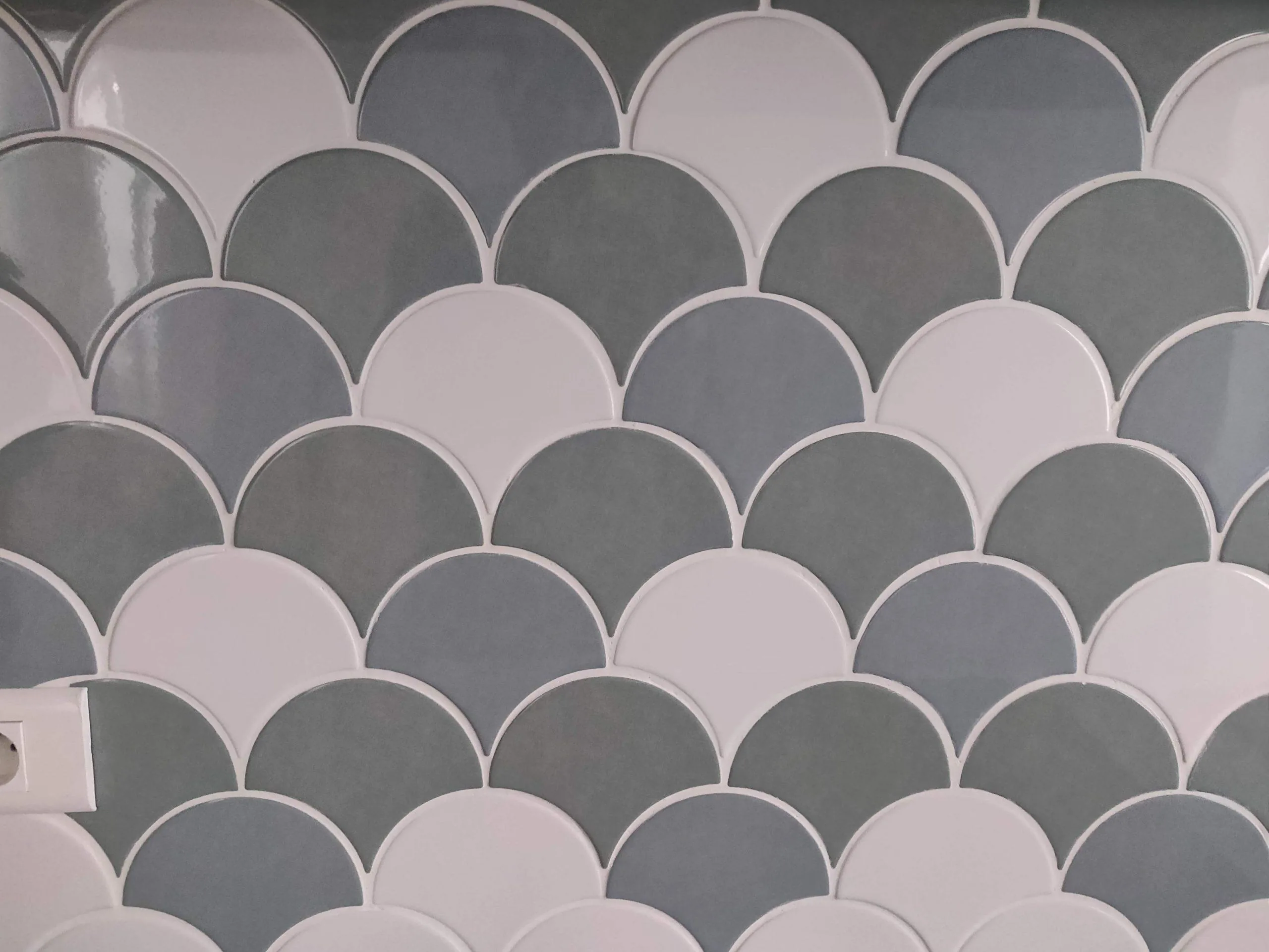
When a former commercial premises was converted into a French T4 apartment, the kitchen received scallop-shaped tiles in shades of gray and white. Against matte-white cabinet fronts, the rounded outline brought movement without introducing a new vivid color.
Setting out the pattern was crucial. Perimeter cuts and electrical outlets had to fit the tile geometry so the surface remained visually continuous. The result was not simply the effect of buying a distinctive tile; its installation details helped make the pattern readable.
The complete renovation took approximately three months and also included finishes, joinery, and interior equipment. That duration describes the documented project, not a schedule promise for another conversion. It illustrates how a decorative choice sits within a larger construction sequence.
Hexagons can mark a boundary without building a wall
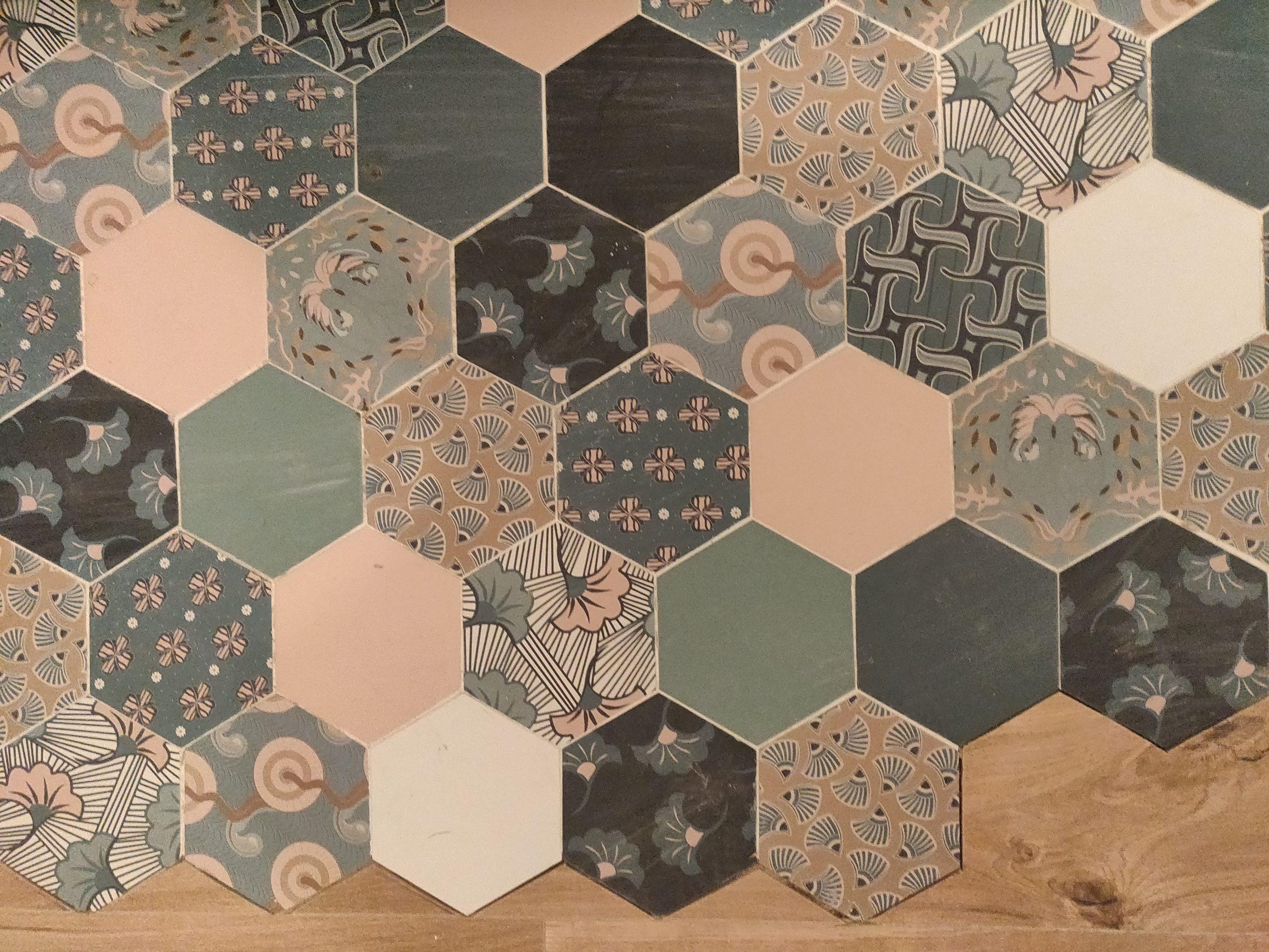
In a complete house renovation, patterned hexagonal tiles in pale green, gray, and white met natural-timber parquet. Their edge created an irregular division between kitchen and living area rather than a straight threshold or a partition.
The junction required advance setting-out. Timber cuts had to follow the hexagons, with an appropriate transition detail between materials. Floor levels, tolerances, and the chosen systems should be coordinated rather than left for the installer to improvise at the end.
Almond-green kitchen fronts, timber worktops, and an open volume beneath a cathedral ceiling formed the wider context. The floor shapes distinguished functions while preserving continuity through the room. The pattern was part of the layout, not a separate decoration competing with it.
Keep one strong graphic zone
The common mistake is to put geometric forms everywhere. A strong patterned wall can lose its effect if all neighboring surfaces compete. Clara’s working guideline is one assertive graphic area with the surrounding walls kept plain, whether white or another quiet solid color.
Simple furniture and natural materials help balance a colorful pattern. Timber, linen, and suitably restrained mineral finishes introduce texture without another forceful motif. The room needs enough calm for the selected geometry to remain legible.
This does not mean every other object must be featureless. It means that the eye should recognize a hierarchy. A concentrated pattern with a related solid color is usually easier to read than a collection of unrelated graphic statements.
A rental apartment: distinct bedrooms within one composition
For a central-city investment property intended to serve conventional and short-stay rental use, each headboard wall received a geometric wallpaper with its own shapes and colors. A shared color reference gave the apartment overall unity while allowing the rooms to remain different.
The source reports that the property worked well in both rental markets. That is a project account, not evidence that geometric wallpaper guarantees easy letting or financial performance. The transferable design point is coherence across rooms rather than a promised commercial result.
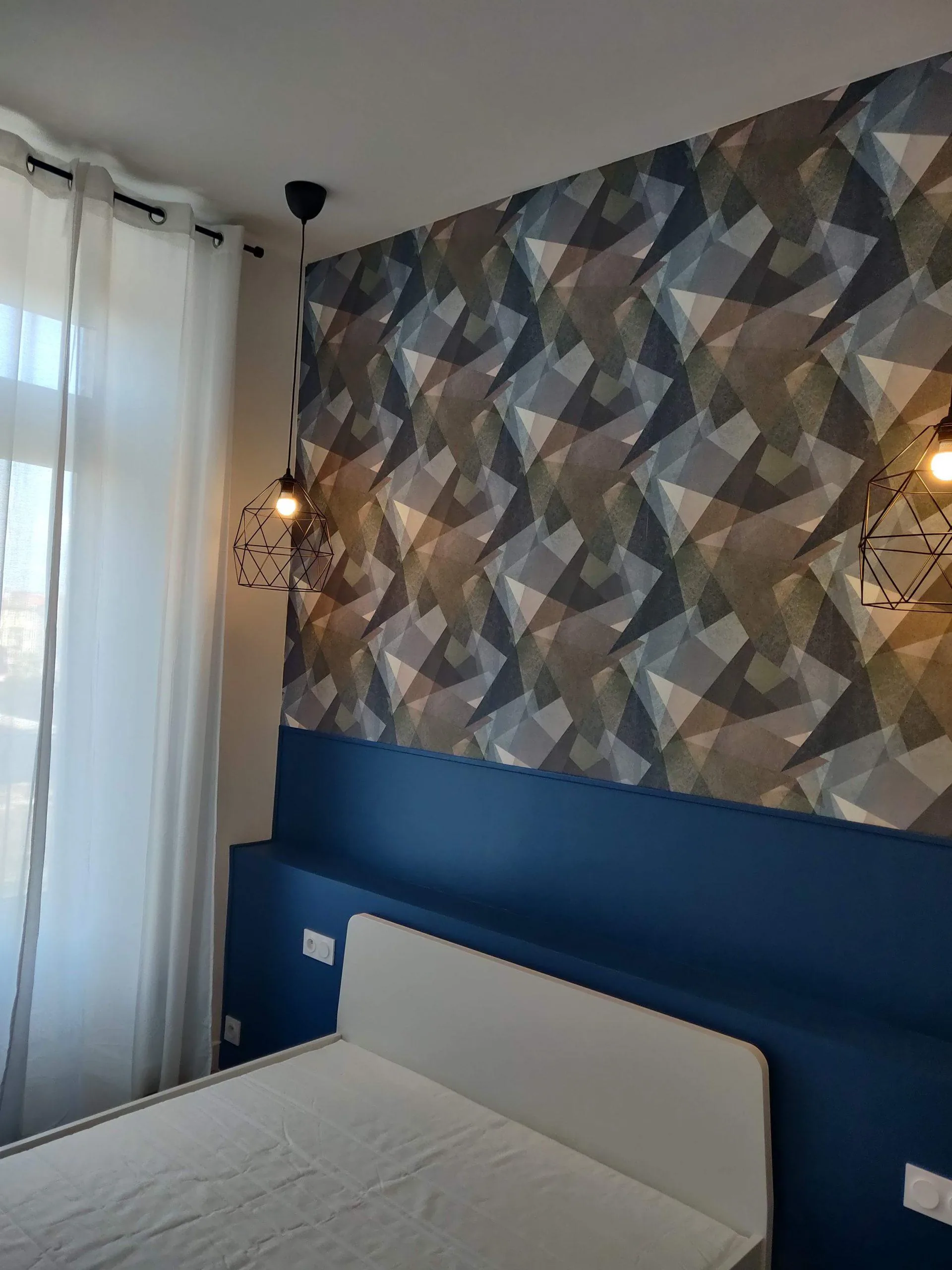
In one bedroom, triangles and other shapes overlapped in gray, blue, and beige. A deeper blue lower wall band and a horizontal shelf behind the bed grounded the composition. Black metal pendants added related geometry, while white curtains and pale furniture moderated the wallpaper’s density.
The pattern remained concentrated at the headboard instead of spreading across every wall. The blue solid area gave it an anchor. This is also why the earlier advice about softer shapes in bedrooms should be applied with judgment rather than treated as an absolute ban on angles.
See our projects in video
Real floor plans and renovations explained step by step on the ArchiWorking YouTube channel. Watch how spaces are reworked before the works begin.
Use either a tonal family or a deliberate contrast
One approach is a tonal composition: variations of one color distributed across the shapes. It can feel quiet and almost sculptural because the geometry registers without extreme color contrast. The second is a more assertive palette, such as medium gray, mustard, and deep black, or coral, mouse gray, and pastel yellow.
In the stronger approach, limit the number of competing colors and retain white or another neutral. Visible gaps allow the forms to breathe and help the eye distinguish their outlines. Without that breathing room, separate shapes may merge into a visually busy field.
The same logic applies to choosing a colorful rug: relate new colors to the existing room rather than making a separate palette for every object. Tone, texture, and scale need to work together.
Start with the level of commitment that suits you
A framed graphic composition, a single painted shape, or an object with a clear geometric line can be enough to begin. These are relatively limited interventions. They let you explore the visual language without committing every wall or an expensive fixed finish.
For a larger step, a geometric backsplash or floor treatment in an entrance, restroom, or small bathroom concentrates the effect within a manageable area. Unlike a loose picture, tile is a more permanent choice, so check the layout, cuts, and practical requirements before treating it as a risk-free experiment.
A small room can deliver a strong impression without requiring one idea to coordinate an entire 30 m² area. The source uses that comparison to explain scale, not to set a maximum size for pattern. The right extent depends on the room and the intended emphasis.
For a more architectural effect, a painted composition can run across the ceiling and descend onto part of a wall without altering the structure. Prepare a measured layout and test the composition before painting. A full-size set-out or floor mock-up can reveal misalignments that are hard to see on a small sketch.
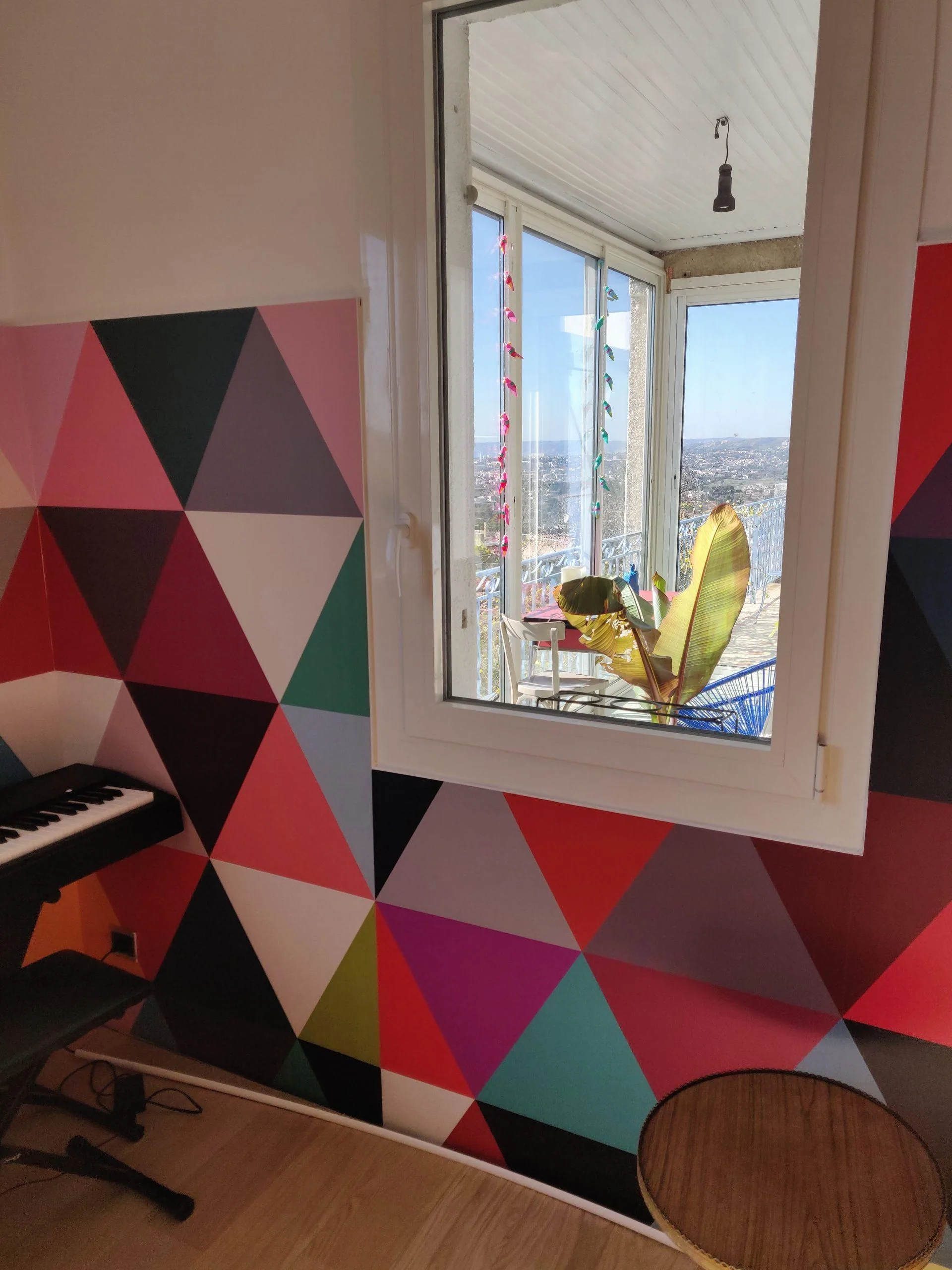
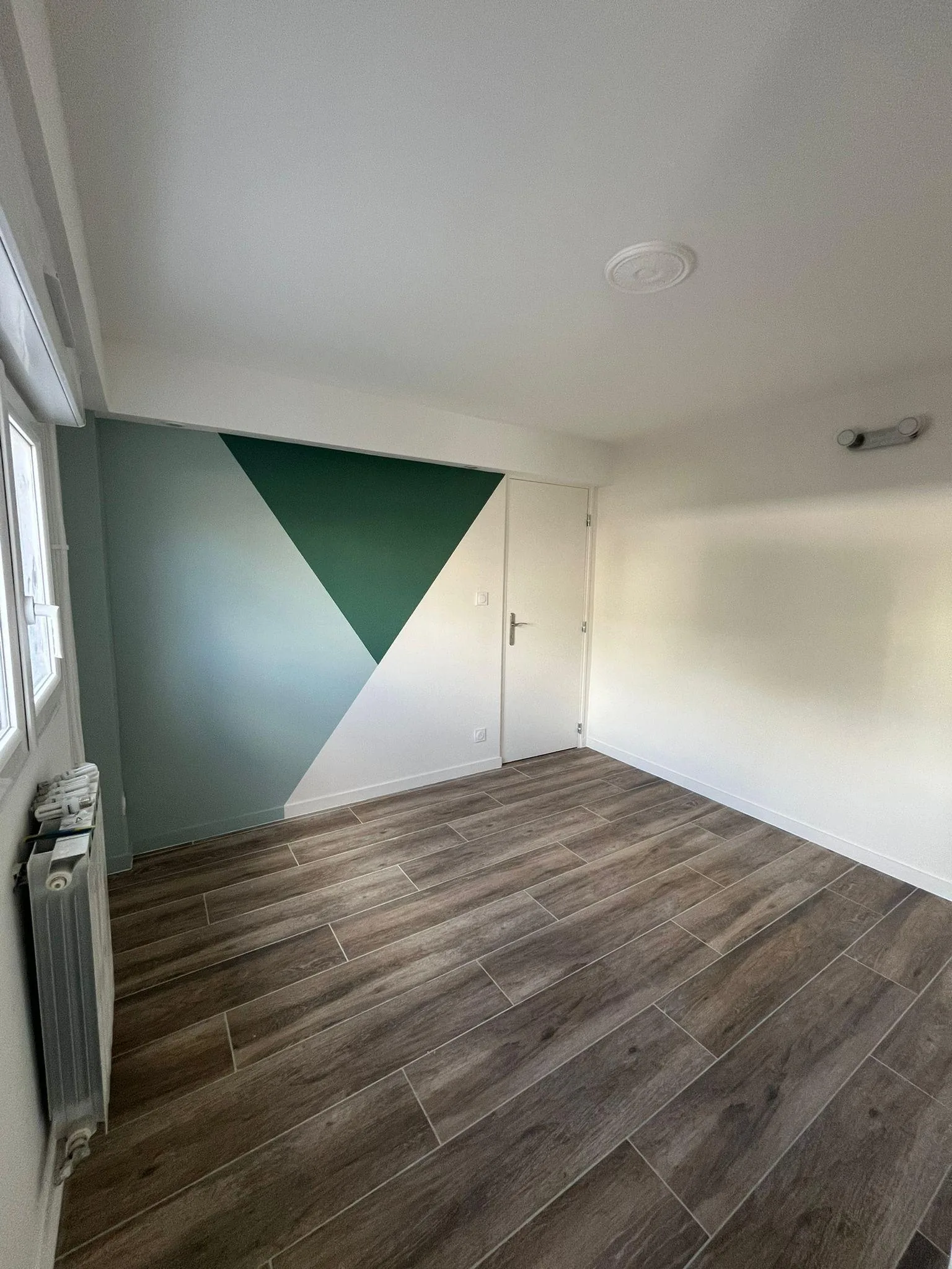
The illustrations of colored triangles around a window and a simple green-and-white triangular wall show two different levels of expression. Neither requires wallpaper. The important part is where the shape starts, stops, and relates to the room’s openings.
Common questions
What is the safest way to avoid overload?
Choose one main graphic zone and leave enough plain surface around it. Simple furniture, restrained materials, and a repeated solid color can support the motif without duplicating it everywhere.
Can geometry work without painting?
Yes. Pictures, wallpaper, tile, rugs, and selected objects can all carry it. They differ in permanence and installation demands, so choose according to how much change you actually want.
Which forms suit a bedroom?
Circles, arcs, and calmer compositions are useful starting points. A subdued geometric headboard wallpaper can also work when limited to one area. Personal response, contrast, and scale matter more than the shape name alone.