

White is a useful starting point for an interior, but it is not a neutral decision that can be made without the room. Undertone, daylight, artificial light and surrounding materials can change the result completely.
Start with the atmosphere people actually want. If white feels clinical to someone, that perception is not an error to argue away. A softer off-white, a little ivory or a sand undertone may preserve the intended brightness while making the room more comfortable.
Our color-combination guide develops the wider palette. White works best as part of that palette, not as a way to avoid making other decisions.
Test the real wall before ordering
A store swatch cannot reliably predict a whole room. Warm yellow or pink undertones and cooler blue or gray ones may be hard to distinguish under showroom lighting, then obvious across a large surface.
Paint a sample at least 50 × 50 cm on the actual wall. Observe it in the morning, afternoon and evening with the intended artificial lighting on. A white that appeared neutral in the store can read creamy or milky under the home’s lamps.
In one project, a client approved a supposedly pure white on a swatch. In the north-facing room, it looked blue-gray in the evening. A slight sand undertone made a substantial difference on the wall even though the two swatches looked very similar.
That example is not a universal prescription for sand-colored white. It shows why a small change should be judged at room scale, with the light and materials that will remain around it.
Use orientation as a clue, not a complete diagnosis
In the Northern Hemisphere conditions discussed here, north- or northeast-facing rooms often receive cooler light. A pure or cool white can strengthen that impression; sand, eggshell-toned or light linen undertones may provide a more balanced alternative.
South- or west-facing rooms can receive stronger, warmer light, especially later in the day. A cleaner white or a slightly cool gray undertone may then work well. Check the actual room rather than assuming every exposure behaves identically.
The way light passes through the home also matters. Partitions, glazing, materials and circulation can affect perceived brightness as much as the paint itself.
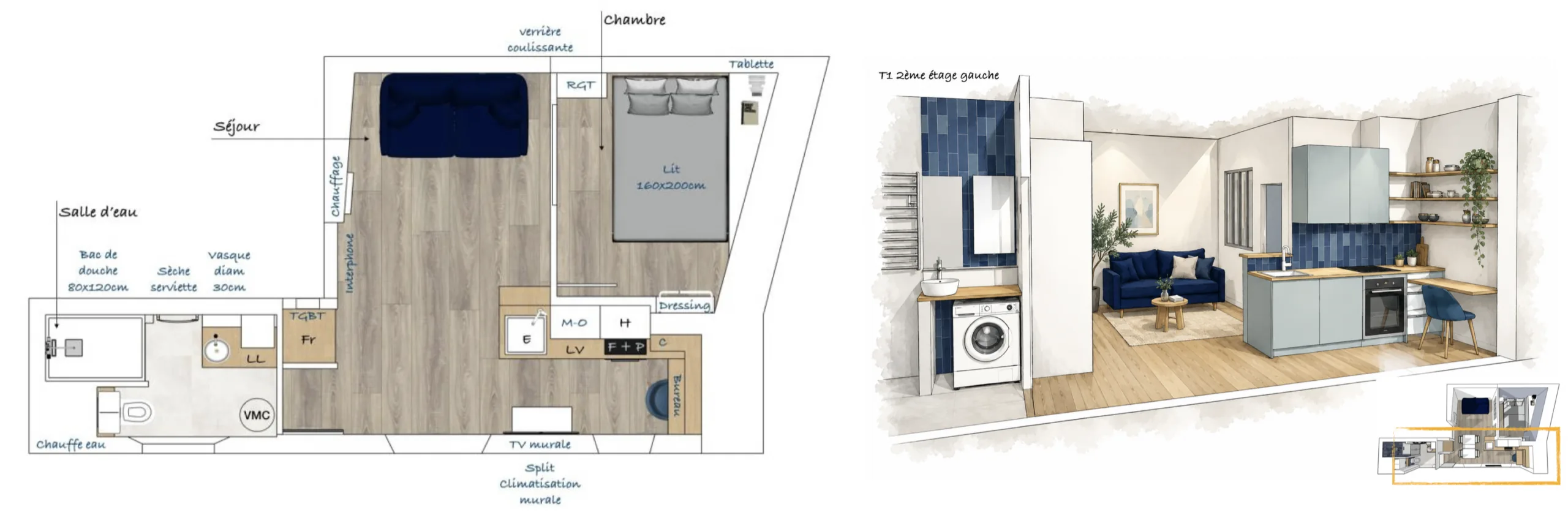
A 27 m² apartment: white and a sliding glazed partition
In a 27 m² apartment renovation, walls and ceilings received a white soft-sheen finish alongside a wood-look floor. The main challenge was creating an independent bedroom without depriving the living area of daylight.
A sliding glazed partition separated the two spaces. Light and views could pass through while the bedroom could be closed. Storage was designed at the same time as the new partitions, and the laminate flooring was installed over acoustic underlay.
The accompanying plan and perspective show that relationship. White did not create space by itself: the position of the partition and the way glazing shared the available light were equally important.
The case also distinguishes an actual project choice from general advice. Although these walls and ceilings used soft sheen, a dedicated flat ceiling paint can be preferable elsewhere where reflected light and lap marks need controlling.
Read the technical sheet as well as the color name
Light reflectance value, often abbreviated LRV, indicates how much visible light a surface reflects. Many whites have values above 80, and relatively small differences may become noticeable across a large wall.
Finish also changes the reading. Flat paint can soften a surface and make some substrate imperfections less apparent. Soft sheen or satin can reflect more light, but cleaning resistance should be checked on the actual product rather than inferred from sheen alone.
The French source refers to NF EN 13300 wet-scrub resistance classes from 1 to 5, with class 1 the most resistant. This is a European testing reference, not a universal US paint-grade label. It can help compare suitable products for an entry, hall or child’s room where declared.
A dedicated flat ceiling paint can reduce distracting reflections and visible application marks. The right wall finish depends on use, support condition and the product’s performance, not simply on whether its color is called white.
Give dominant white something to relate to
The 60/30/10 approach is a design guide rather than a measurement rule. Around 60% represents the dominant color on larger surfaces, 30% a supporting tone and 10% accents.
With white dominant, the secondary material or color might be natural oak, linen, soft gray or restrained terracotta. Cushions, vases, accessories or a graphic detail can supply the smaller accents.
The point is hierarchy. A nominally 100% white setting can feel difficult to inhabit when there is no tonal or material anchor. White does not need to disappear, but it benefits from something that gives it depth.
See our projects in video
Real floor plans and renovations explained step by step on the ArchiWorking YouTube channel. Watch how spaces are reworked before the works begin.
A period apartment without floor-to-ceiling sameness
In another renovation, off-white remained dominant while a colored lower-wall band continued from the entry to the bedrooms. That continuity linked the rooms without requiring every wall to be entirely white.
One bedroom combined white walls with a black-and-white botanical panoramic wallpaper, a timber-and-rattan headboard and wall sconces providing dual light effects. The original glazed doors were retained and repainted.
A pale laminate floor accompanied the light. The white kept the overall clarity, while the color concentrated on the lower part of the walls established a connection through the apartment.
This illustrates the palette’s role more usefully than applying a percentage mechanically. The secondary element can be a continuous architectural gesture, not just a separate piece of colored furniture.
Our white-interior guide develops finish choices and off-white in different rooms, including rental settings.
Use texture to make white feel inhabited
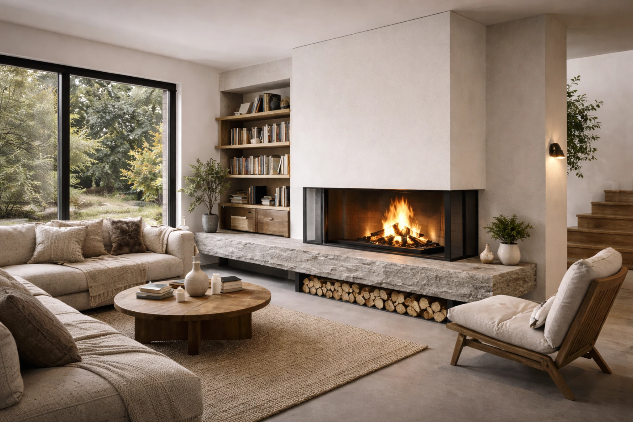
White with timber and white with stone are two recurring combinations. An off-white often gives a gentler relationship with natural materials than a stark, cold white, although the actual combination should still be tested rather than treated as an absolute taste rule.
Natural linen or cotton in curtains and bedding softens smooth planes. Stone, microcement or large neutral tiles can anchor the floor without adding a strongly competing color.
Avoid relying on glossy white against more glossy white. Under direct light, repeated reflective surfaces can become uncomfortable. Vary the finish deliberately: softer walls, a suitable satin on trim and natural-looking furniture surfaces.
Using the same white on walls and woodwork with different finishes can create a subtle hierarchy without introducing another color. It is a finish strategy, not a requirement that every surface use the same paint product.
Check timber, tile and textile samples together
Light oak, ash or beech can support the intended atmosphere. A suitable clear oil or raw-wood-effect finish may preserve the desired appearance more closely than an amber-toned product, but assess a cured sample: finishes and timber can change color over time.
For stone-look porcelain, a suitable rectified product can support fine, correctly specified joints. A matte finish may reduce reflections beside pale walls, while product suitability remains a separate technical decision.
Washed linen or heavier cotton provides visible texture. Check machine-care requirements and, for curtains, the fabric weight and how much light it filters. These everyday characteristics matter alongside the first impression.
Avoid unplanned whites and unplanned lighting
White does not automatically communicate cleanliness or care. A cold, uniformly smooth room may look unfinished rather than considered. Maintenance, furniture and coherent accessories distinguish an inhabited white interior from an empty one.
Do not accumulate several whites by accident. The source recommends a restrained starting palette of two, for example one for walls and one for trim or ceiling, rather than five unrelated tones. This is a practical design discipline, not a rule that more complex schemes can never work.
Artificial light can alter the result as strongly as paint selection. The source contrasts 4000 K with a warmer 2700 K approach for a bedroom or living room and recommends dimming. These are atmosphere choices, not legal requirements or a guarantee that one temperature suits every person.
Choose lamps and test samples together. A white selected under one light may not look the same under another, so the final color decision belongs with the lighting design.
Questions before choosing white
What helps in a north-facing room?
Test warmer undertones such as sand or light linen against the actual daylight and lamps. Orientation is a useful starting clue, but the room’s glazing and surrounding surfaces also affect the result.
How can the clinical effect be avoided?
Respect the occupant’s reaction. Try a softer off-white, add timber, stone or textiles and review artificial light. Texture and a supporting tone can do more than insisting on pure white.
Is off-white always better with timber?
It often gives the gentler contrast favored in these projects, but test the specific timber, finish and paint. The objective is a coherent relationship, not a universal prohibition on pure white.
What is the essential sample test?
At least 50 × 50 cm on the real wall, checked morning, afternoon and evening with the intended lighting. A swatch in a different building cannot replace that observation.
Which finish belongs on each surface?
Choose wall finish for use and support, dedicated flat ceiling paint where appropriate, and a suitable trim finish. Check declared cleaning performance rather than assuming every satin is durable and every matte is delicate.