

Deep teal brings the depth of blue together with a green undertone. That makes it expressive and enveloping, but also sensitive to daylight, neighboring materials and the amount of wall it covers.
The question is not whether the color is fashionable. It is what role it should play in this particular room: framing a sofa, defining a reading corner, emphasizing a division or giving a piece of furniture more presence.
Our guide to different blues helps distinguish teal from navy, petroleum blue and turquoise. Commercial names can overlap, so compare the actual samples rather than treating all dark blues as interchangeable.
Decide where the color belongs
A living room often offers the most room to balance teal with a sofa, timber, curtains, lamps and lighter objects. The result can feel sophisticated and intimate without requiring every surface to be dark.
An entry can use a smaller painted area or a lower-wall band for a strong first impression. In a bedroom, an enveloping effect may work if the intended lightness is retained elsewhere.
In a kitchen or bathroom, a cabinet, backsplash, niche or selected accessories can be enough. The color does not have to occupy an entire wall to contribute.
The article on blue and architectural volumes considers the wider relationship between color and space. The useful decision is the color’s function, not simply its location on a trend list.
Check daylight and lamps together
Teal can appear fresher in the morning and deeper later in the day. That changing reading is part of its interest, but depends on the room and paint rather than happening identically everywhere.
The source uses warm light around 2700 K to illustrate a softer, more green-toned reading, compared with a clearer blue impression under roughly 3000 to 4000 K. Test the intended lamps: color temperature alone does not describe every aspect of their output.
A color-rendering index of 90 or above is a useful reference for good rendering, not a promise that every shade will look identical to daylight. Compare the sample under the actual light sources.
Several lower-level lights, such as a floor lamp, table lamp and wall light, can reveal a dark surface more comfortably than one central ceiling light. The lighting should support the atmosphere as well as make the room usable.
Choose the wall by testing, not by a fixed rule
A wall perpendicular to the window can be a useful starting point because it receives light from the side. But orientation, room depth, opening size and the wall’s role may lead to another choice, including the wall opposite a window in a very bright room.
Try the color in place. A poorly positioned dark wall or an all-over treatment in limited light may make the room feel heavier than intended.
Behind a sofa, within a reading area, around a bookcase or behind a cabinet, the color can frame an activity. Give it that clear purpose rather than painting the only wall left after the furniture is chosen.
For a gentler intervention, consider a lower section, door, niche, painted furniture or textiles. These can bring the same family of color without making it the dominant surface.
A house-renovation study using a different strong blue
One real design study used Tollens CR4104-5 Nuptial on just two wall sections, one in the entry and one in the living room. It is important not to label that example teal: it was a stronger straightforward blue without the same green component.
The surrounding level was kept calm: light-gray soft-sheen walls, white ceilings and gray stone-look 60 × 60 cm tile across the level and the staircase’s 18 steps.
The study also proposed enlarging the living-room-to-kitchen opening to about 270 cm, with an IPN steel beam specified to carry the loads, alongside interior glazing and integrated storage. Actual structural work requires the appropriate engineering, not a beam selected solely from the opening width.
Restricting the strong color to two strategic locations gave character to the route through the home. The example demonstrates controlled placement and contrast, not a claim that every blue produces the same result.
See our projects in video
Real floor plans and renovations explained step by step on the ArchiWorking YouTube channel. Watch how spaces are reworked before the works begin.
Pair teal with warmth and quieter colors
Off-white, beige, sand and warm ecru can calm the depth of teal. Terracotta creates a particularly useful contrast between a cooler, dense color and an earthy warm one.
Pink-beige, muted rose, ochre and warm brown can also contribute in measured amounts. A cool gray needs more care, especially where daylight is limited, because it may make the composition feel harder or duller.
That does not forbid gray. Some warmer or deeper grays can work; compare the actual relationship instead of choosing a generic color name. Our color-wheel guide explains the logic behind contrasting and related palettes.
A clear hierarchy is usually easier to manage than several equally saturated colors. Start with the strong blue-green, supporting neutrals and a warm material, then add a few deliberate echoes.
Use walnut, brass and texture with intention
Dark timber, particularly walnut, can reinforce the rich character. Brass on a lamp, handle, base or small detail brings a brighter note, especially in contemporary, Art Deco or gently vintage settings.
Leather, linen, velvet, matte ceramics and terracotta add different textures. The objective is not to leave the color facing only cold, smooth surfaces.
The familiar combination of teal, walnut, brass and terracotta works through different roles: timber gives weight, brass catches light and the earthy tone brings warmth. The materials need not be distributed equally.
Check actual samples. Solid walnut and walnut veneer show the wood’s grain, while a light timber stained walnut may give a different, more uniform effect. A stain name does not establish the underlying material.
Read upholstery and metal specifications
Solid brass, plated metal and a brass-effect finish are different products. Unlacquered brass develops patina; lacquer can retain a brighter appearance for longer, with its own maintenance and wear considerations. Do not expect a thin decorative coating to behave like solid metal.
For everyday velvet seating, the source uses at least 20,000 Martindale abrasion cycles as a reference. That test is one selection tool, not a prediction of how many years a sofa will last.
Full-grain leather is favored here for its developing character. Compare the actual leather and finish rather than assuming a label alone establishes quality; corrected leather and split leather have different constructions and appearances.
Material decisions are part of the color scheme. Durability, texture and the way a finish ages matter alongside the initial photograph.
A deep-blue partition that preserves the light
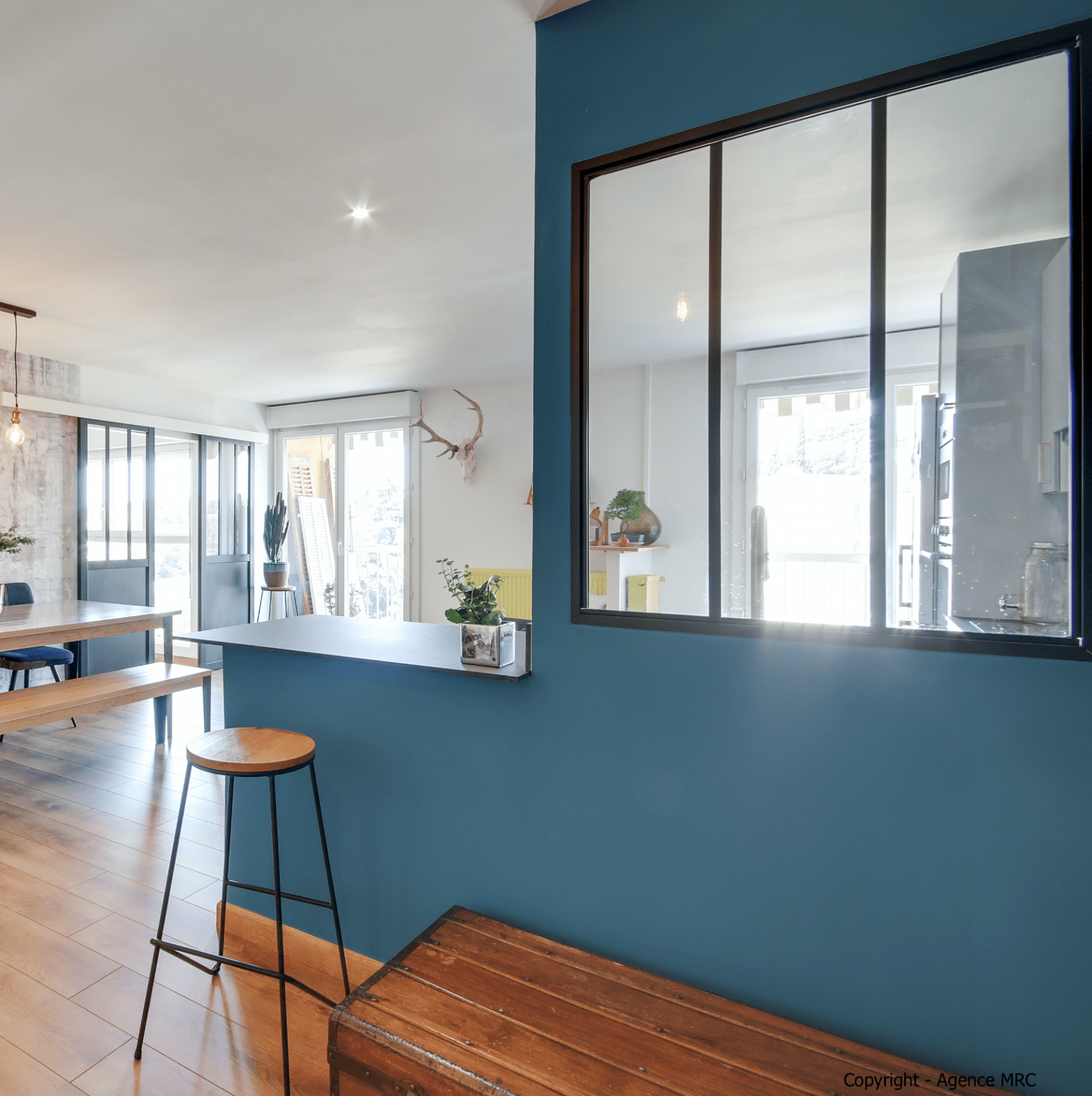
In a separate apartment renovation, a large deep-blue wall separates living areas. A black-framed interior glazed section crosses it above a solid lower wall, allowing light and views to continue between spaces.
The surroundings remain restrained: white walls and ceilings, a wood-look floor, natural timber furniture and a few black metal elements. The photograph shows that relationship, not a guarantee that every large dark wall remains equally light.
The blue emphasizes the separation and frames the glazing. Strong color can therefore occupy a substantial surface when openings, lighter planes and materials balance it.
This is another deep-blue architectural example, not proof that the photographed paint is the same teal discussed throughout the guide. The distinction keeps the project evidence honest.
Prepare the paint system as carefully as the palette
A suitable tinted primer, often gray in the source guidance, can help coverage and consistency. Two finish coats are the typical reference, but follow the selected paint’s instructions and actual coverage needs.
A deep matte finish can give a rich effect, while some products mark more readily under rubbing. A suitable soft-sheen or washable finish may be more practical in an entry, corridor or behind seating; check the product rather than relying on finish names alone.
The source cites NF EN 13300 wet-scrub classes from 1, the most resistant, to 5. It also cites the French indoor-air emissions label from A+ to C, favoring A+ in a bedroom. These are contextual product references, not US labeling requirements or a claim that A+ means no emissions.
Paint a sample at least the size of an A4 sheet, using two coats on the real wall. View it with the surrounding materials and the intended lamps before confirming a large area.
Avoid three common disappointments
First, do not use the color everywhere in a poorly lit room without considering the intended result. Balance with light, warmer material or quieter surfaces when the aim is not a fully dark atmosphere.
Second, do not assume a cool gray will automatically make the scheme elegant. It can flatten the blue-green where natural light is weak; warmer neutrals may be easier to balance.
Third, avoid adding several strong colors without a clear relationship. Teal already has presence. A restrained supporting palette usually makes its depth more legible than a collection of competing accents.
Questions before choosing teal
Which colors are the easiest partners?
Off-white, beige, warm natural tones and terracotta offer useful starting points. The actual samples and light determine the final balance.
Does it have to be a living-room color?
No. An entry or bedroom may use it effectively, while smaller cabinets, niches or accessories can suit kitchens and bathrooms. Match the amount to the role and conditions.
Can a whole wall work?
Yes, if its location, light and surroundings support the intention. A perpendicular wall is a trial position, not a rule that overrides the room.
Which finish is appropriate?
Choose for use, support, coverage and cleaning performance. A rich matte and a practical washable finish answer different priorities; test the product’s actual appearance.
What is the most important precaution?
Compare the shade in the room. Teal, a stronger pure blue and other dark blues are not interchangeable, and even a good color needs a clear place within the plan.
Can gray work with teal?
Yes, but assess the undertone and light. A warmer or deeper gray may support the palette, while a cool gray in a dim room can make it feel flatter. Compare it with the intended timber and metal rather than assuming all grays behave alike. Off-white and beige offer other ways to keep the color’s depth without adding the same cool impression.
Which materials give the color depth?
Walnut, brass, leather, linen, velvet and terracotta contribute different qualities. Decide whether each element needs to provide weight, light, texture or warmth. The useful combination is a relationship between those roles, not an instruction to fit every material into the same room. Product quality and the way each finish ages belong in that choice as well.