
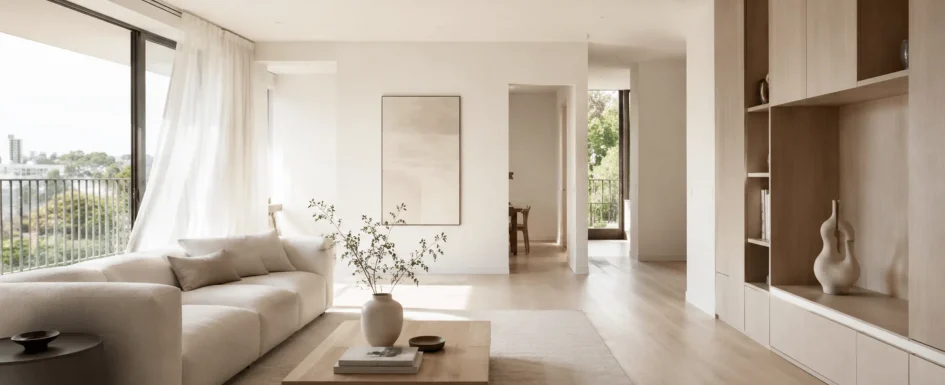
In interior design, empty space is often misunderstood. People see it as something missing, an unused area, almost a design error. Yet for an interior architect, empty space is a design tool in its own right, perhaps the most powerful of all. The principle holds as true in a 40 m² (430 sq ft) apartment as in a 150 m² house, indoors as well as outdoors: how empty space is handled shapes the overall perception of a place.
By Clara Ajmar, interior architect and landscape designer, updated June 2026.
What matters is not what you put in. It is what you choose to leave out.
How an apartment or a house can feel bigger thanks to empty space
The problem is not the size of a piece of furniture but its relationship with the space around it. In interior design there is no absolute rule about what is too bulky or too empty. What counts is the dialogue between solid and void: their proportions, how the room is used and the balance between technical constraint and personal choice.
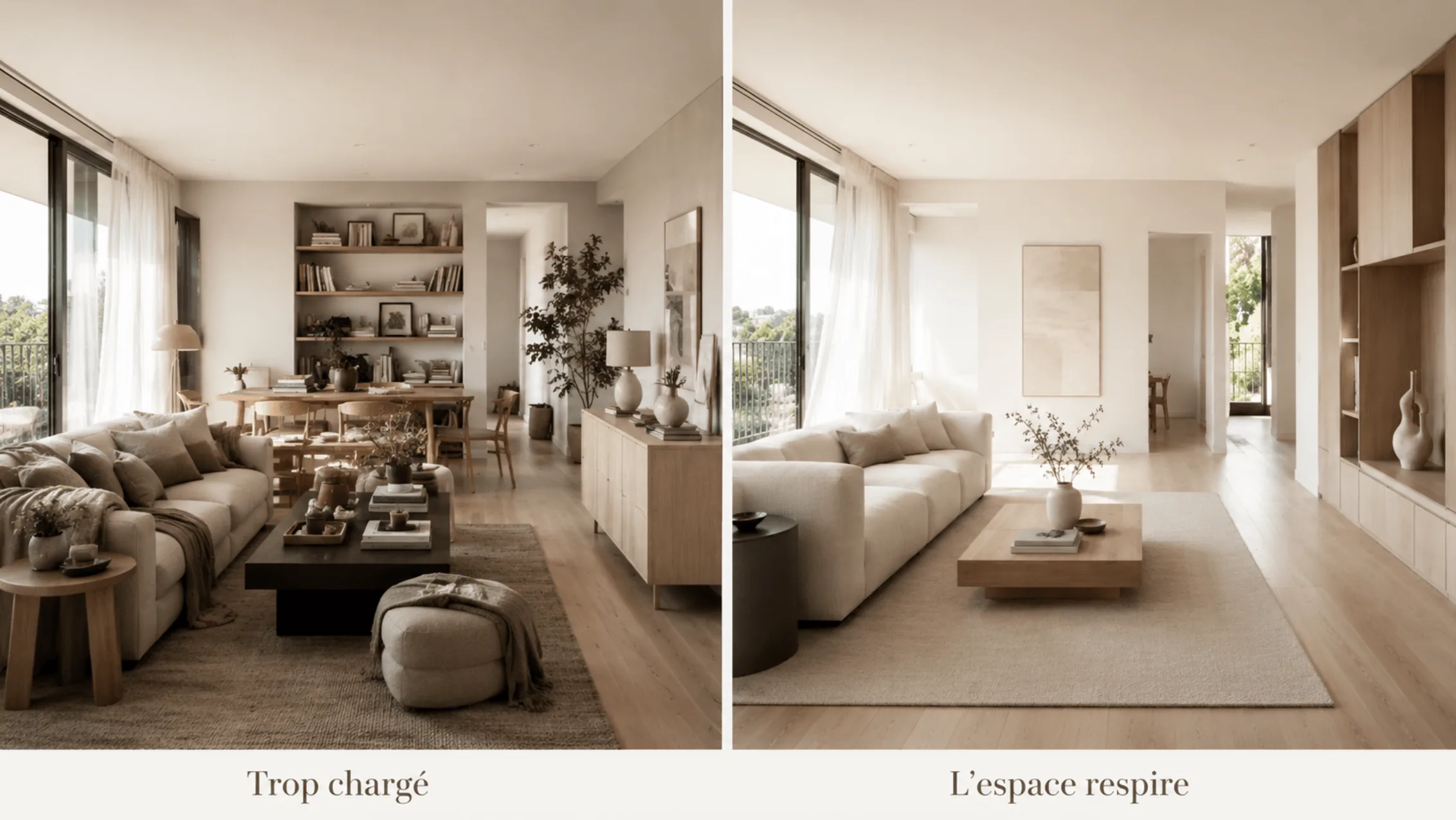
Empty space suffers from a stubborn prejudice: many people see it negatively, as an unfinished area. It is the opposite. Well thought out, empty space enhances what surrounds it. It highlights a material, a piece of furniture or an architectural line, and turns a functional interior into a lived-in space. The perception of volume is not a single dimension: it is built through height, width and depth, but also through light and circulation. Change just one of these and everything changes.
The same principle applies outdoors. On a terrace or in a garden, a space that is overfurnished, overplanted or overstructured loses its breathing room exactly like a cluttered room. Managing the empty space between planted masses, circulation zones and rest areas shapes the overall perception. To see how this logic applies on plan in a tight volume, our article on laying out 31 m² with an entry, a toilet and a primary suite shows how circulation space is defined from the very first scenarios.
Field experience: in an apartment as in a house, the first thing you read on entering is the empty space. Not the furniture or materials, but the clear ceiling height, the visual diagonal toward a window and the width of the passage. These voids create the feeling of space before you look at anything specific.
How to keep empty space when an apartment or house lacks storage
The real question is not storage or empty space. It is where to put storage so empty space survives. The method is to identify the strategic zones of each room and optimize them in height and depth. Recesses, niches, set-back volumes and unused corners absorb storage without eating into the room’s visual breathing space. The void remains, and storage slips in where the space naturally allows it.
This is targeted optimization, not systematic filling. In an 86 m² apartment, Clara and Mathieu of ArchiWorking worked on exactly this equation: linking a corridor entry, an open kitchen and the living room into a single fluid space, while absorbing storage into custom furniture that uses ceiling height and corners. The circulation space is protected, storage disappears into the volumes and the space breathes.
To go further on this method in a complete project, our article on linking entry, kitchen and living room in an 86 m² apartment details the design choices and dimensions.
See our projects in video
Real floor plans and renovations explained step by step on the ArchiWorking YouTube channel. Watch how spaces are reworked before the works begin.
How to open up an apartment to create a living space that breathes
Removing partitions is the most radical tool for creating controlled empty space. Taking out a non-load-bearing wall instantly enlarges the perceived space without changing its actual area. It is this new void, the visual diagonal that opens up and the light crossing two rooms instead of one, that turns a compartmentalized interior into a lived-in space.
In a 68 m² apartment for a recently retired couple, Clara and Mathieu removed all the intermediate partitions between the existing living area and an adjoining bedroom. The result: a 30 m² living room, bright on both sides and open to the terrace. The void created is not accidental: it is the central design decision of the project. Everything else, kitchen, bathroom and bedroom, was organized around it. For the full method, our article on optimizing a 68 m² apartment without an extension details each trade-off.
Pro tip: before removing a partition, we always check three things: whether it is load-bearing, whether services run inside it and the impact on how the home is laid out. Opening up planned on paper costs little. Opening up discovered mid-project can call the whole project into question.
When empty space becomes a design choice: the most radical project in 10 years
Among the most striking projects, some push the concept to its limits. One owner lived in a house of more than 100 m² with only the essentials: a bed, a coffee table, some seating and a kitchen. The rest was empty, deliberately and proudly so. He felt that every unnecessary object owned him more than he owned it. A radical point of view, but consistent to the end.
Few pieces, materials chosen with extreme precision and set off by the space around them: it bordered on conceptual art. The project illustrates a truth found in every great interior: what matters is not what you put in, it is what you choose to leave out. And that decision, keep or remove, place or leave empty, is made at the very start. Empty space is defined on the plans, before anything else. It drives flows, passages and the overall perception of an apartment as much as a house.
Empty space considered late is usually constrained. Empty space considered early is controlled. That is the difference between a space that breathes and one that feels stifling, whatever its size.
Field experience: this project taught us something no training course teaches: the ability not to fill is a professional skill in its own right. Most owners arrive with a list of what they want to add. Our work often starts by showing them what they can take away.
Frequently asked questions about empty space in interior design

Why does an overfurnished apartment or house feel smaller?
Because the eye reads the void before the furniture. When volumes are saturated, the eye has no vanishing point and no diagonal to travel along. It bumps into every surface. The sense of space is built through clear height, free passages and light that passes through, all of which are voids. A well-cleared 50 m² apartment can feel bigger than a 70 m² one crammed with furniture.
How can a small apartment breathe without sacrificing storage?
By moving storage to areas the eye does not read: ceiling height, corners, recesses and set-back volumes. A custom unit rising to the ceiling in a corner takes up less visual surface than a low cabinet in the middle of a wall. Storage should fade away, slipping into the places the space naturally offers without encroaching on circulation or visual diagonals.
Do you need to remove partitions for an apartment to breathe?
Not necessarily. Opening up is the most radical tool, but not the only one. You can create breathing room in a compartmentalized apartment by working on circulation, passage widths and the position of furniture relative to windows and doors. However, when volumes are too fragmented and light does not flow, removing partitions is often the most effective decision for its cost. Always check it on plan before any works begin.
Does empty space work in a house or on a terrace too?
Yes, in exactly the same way. Managing empty space is universal: it shapes the perception of any space. A terrace that is overfurnished, overstructured or overplanted feels as stifling as a cluttered room. The void between planted masses, rest areas and circulation creates the same breathing room as indoors. It is a matter of proportion, not area.
How do you know if a room has too much furniture?
The simplest sign: if you cannot cross a room in a straight line without walking around furniture, there is too much. In interior design, 90 cm (about 36 in) is the comfortable minimum for a passage and 70 cm (about 28 in) the acceptable minimum. Below that, the room is saturated even if it looks tidy. The other sign: if no wall has any free surface, the eye has nowhere to rest.
How do you decide what to remove or leave empty in a home?
It is a question at the heart of every layout project. Work on the plan: list what must stay for daily use, mark what could disappear, identify where empty space makes sense and where storage can be optimized to free volumes. Testing two or three layout scenarios side by side on the plan makes these choices much clearer before any purchase or works.