
La Morada began with a meeting in Marseille’s Cours Julien neighborhood. On an October Tuesday, unfamiliar cooking aromas drew interior designer Clara AJMAR through the door. Lucia explained that they came from traditional Mexican cooking. The conversation became the starting point for a small restaurant whose space and food would tell the same story.
The brief was more specific than making the room colorful. Lucia wanted diners to feel that crossing the threshold carried them into Mexico for the duration of a meal. The name, La Morada, means a dwelling or home. That sense of entering somewhere distinctive, rather than encountering a collection of themed objects, guided the design.
One strong idea for a small dining room
The premises did not offer generous floor space. Each square meter had to accommodate diners, allow movement, and leave enough visual breathing room. A rich, brightly colored interior could easily have made the room feel smaller if every wall had competed for attention.
The response was to work with perceived depth. Painted perspectives, contrasting planes, and an interior façade created the impression of an opening toward another place. Trompe-l’œil became a spatial device, not just a decorative trick. It could suggest a threshold and a view without requiring physical space behind the wall.
A concentrated focal point also allowed the rest of the room to stay calmer. For a compact restaurant, one strongly composed internal frontage may communicate the identity more effectively than scattering unrelated decoration everywhere. The architectural story becomes legible, and the eye has somewhere to rest.
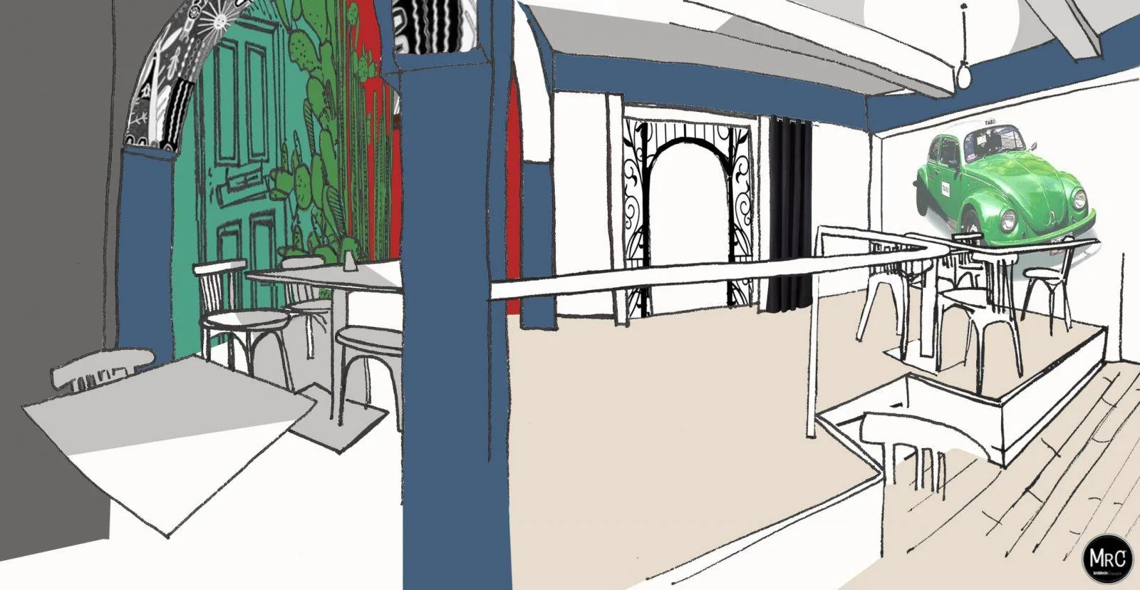
The study perspectives shown here preceded construction. A turquoise painted doorway, blue pillars, a white arch, bistro tables, and a green car within the wall painting tested the staging on paper. Another view explored blue walls, a red-and-yellow background, cactus imagery, and the relationship between the arches and tables. These are design images, not photographs of a completed room.
Resolve seating and access before the mural
A memorable theme does not make circulation constraints disappear. The source offers roughly 1.2 to 1.5 m² per diner in the dining area, including circulation, as an early planning reference. A two-person table around 60 × 70 cm is another starting point. Small tables that can join together generally offer more flexibility than a few permanently large tables.
These figures describe planning references from the French article, not a capacity approval. The actual usable footprint depends on the room, chairs in use, service routes, entrances, and applicable accessibility and fire requirements. Establish that workable arrangement before assigning every remaining wall surface to a decorative effect.
The original discusses the French framework for a public-access establishment, an ERP. It calls for a usable route to seating and an accessible table, with under-table clearance of at least 70 cm high, 60 cm wide, and 30 cm deep. Those dimensions are retained to explain the source context; they are not a complete accessibility design or a replacement for current requirements in France or elsewhere.
Check the applicable rules with the qualified team at the sketch stage. The important sequence is transferable: access and seating define what is genuinely available, and the visual composition follows. A painted illusion can extend perceived space, but it cannot enlarge an actual passage.
Cultural references rather than a tourist shorthand
Lucia expressly wanted Mexico in Marseille without a generic tourist-style set. The research therefore drew on specific references: Mexican popular art, colonial architecture, and the calaveras associated with Día de los Muertos murals. The objective was to establish a coherent cultural direction rather than multiply recognizable props.
Editing those references was as important as finding them. A flood of colorful inspiration still requires decisions about hierarchy, scale, and what to leave out. A strong identity can support the experience of eating well when its elements work together; vivid color does not automatically mean visual disorder.
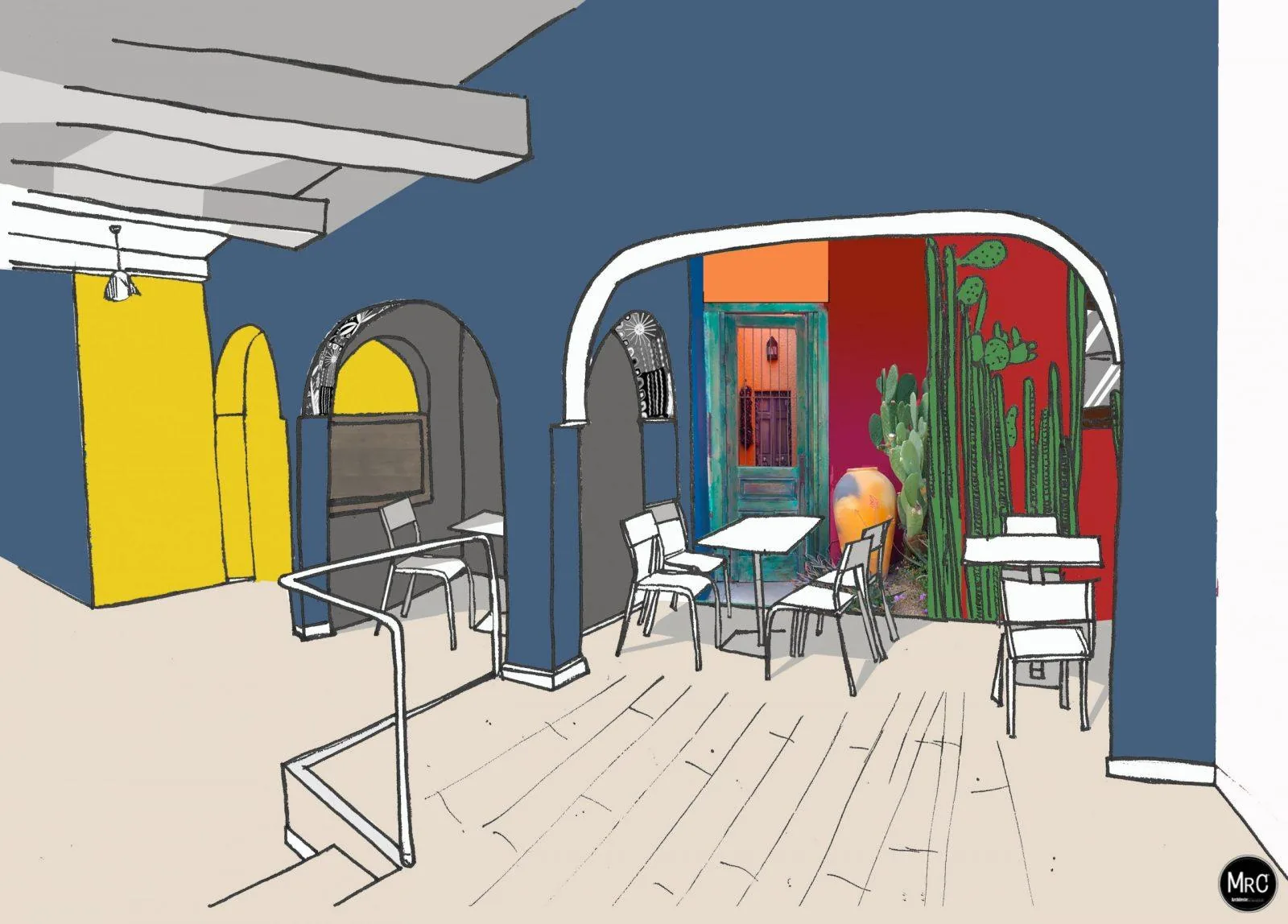
The palette was deliberately limited. Dominant blue, selected red and yellow areas, and white arches provided recognizable relationships and pauses. Rendered textures, relief, and contrasts between matte and glossier surfaces added depth without introducing another competing color at every turn. For a related discussion, see using orange in an interior.
The aim was not neutrality, but control. Walls, openings, and finishes had to carry the story so that loose accessories did not bear the entire burden. A restaurant with character can be expressive without requiring every available surface to shout.
See our projects in video
Real floor plans and renovations explained step by step on the ArchiWorking YouTube channel. Watch how spaces are reworked before the works begin.
Choose finishes for a working restaurant
A dining room is used and cleaned repeatedly. Near tables and in circulation areas, the French source recommends washable paint in class 1 or 2 under NF EN 13300, with a velvet-like low-sheen or satin finish rather than a fragile matte surface. Verify the actual product’s properties and the cleaning regime rather than relying on a finish name alone.
A painted mural may be protected with a suitable clear matte coating after testing a discreet area. Compatibility matters: a protective product should not unexpectedly alter the color or damage the work it is meant to preserve. Keep a small reserve of each paint color for future touch-ups.
Fire performance is a separate question from washability. Wall coverings, ceilings, and suspended decorative textiles in a French ERP must meet the classifications required by the applicable safety rules. Obtain the supplier’s classification documentation and retain it for the relevant review. The exact assembly and local regulations must be verified, rather than treating a decorative material as compliant by appearance.
Those practical details were part of making the atmosphere sustainable in use. A compelling opening-day photograph is not enough if routine cleaning, small impacts, or safety review make the finish impractical. Material decisions belong alongside the initial color work.
Let the exterior promise something the interior can deliver
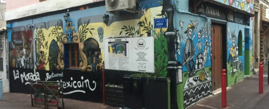
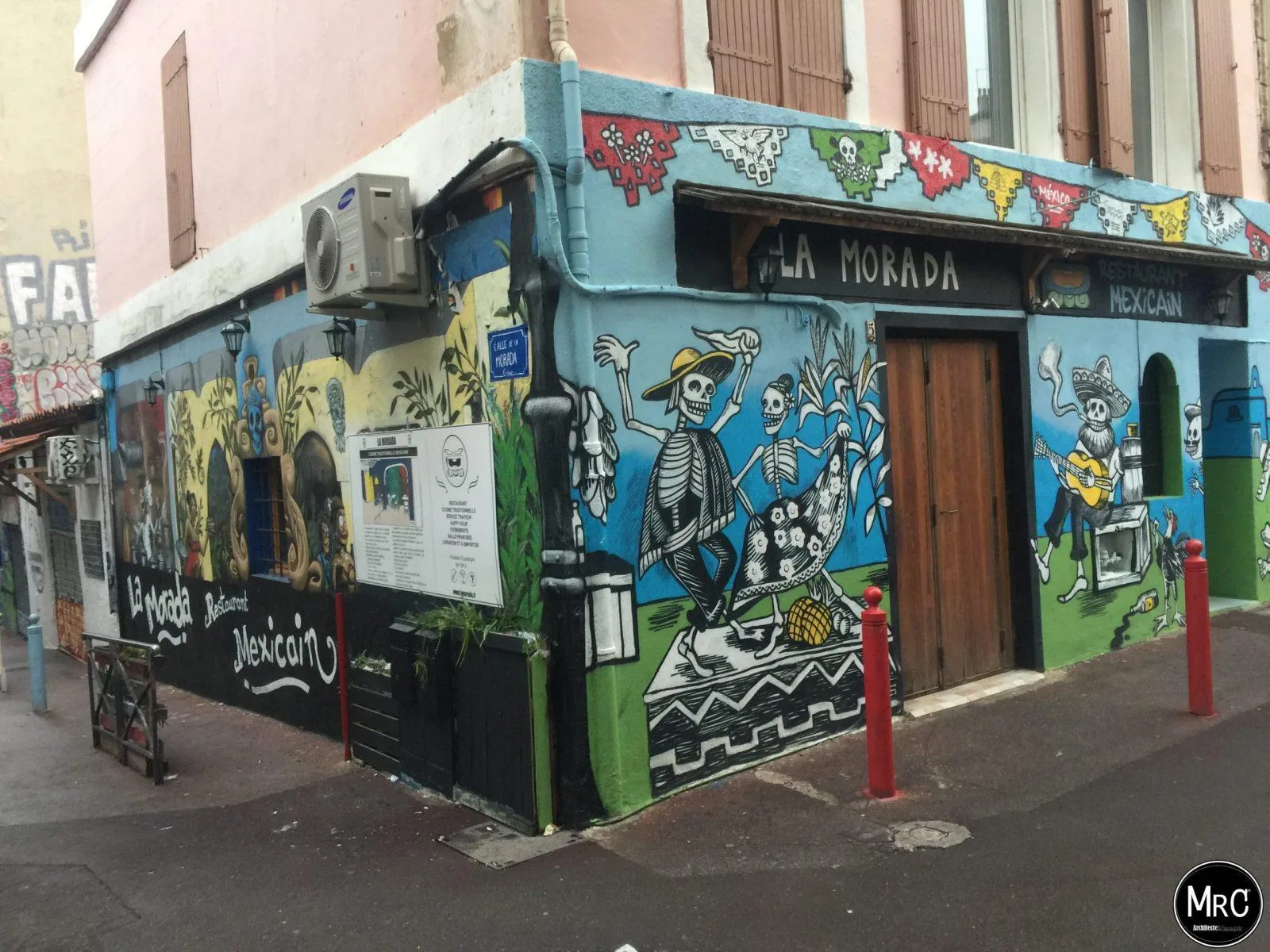
The corner façade uses generous imagery: dancing and musical calaveras, blue and green backgrounds, festive pennants, a timber door, and the La Morada sign. It introduces the identity before a passerby enters. The interior then develops that promise, rather than starting an unrelated narrative at the threshold.
Continuity does not mean copying the exterior across every internal wall. The dining room remains a separate composition with its own focal points and proportions. In this project, black-and-white drawings provided a contrasting interior approach; see the Huichol-inspired drawings at La Morada for the making of those arches.
Changing a commercial frontage is also an administrative matter. In the French context, altering a building’s exterior generally calls for a prior declaration to the municipality. A sign may require authorization under local advertising rules, and co-ownership approval may also be necessary. Verify the exact status and permissions before painting; this account is not an assurance that a particular façade is exempt.
For the substrate, the source mentions breathable mineral or siloxane façade paint and a compatible clear anti-graffiti treatment at hand height. The right system depends on the existing wall and finish. Breathability and protection must be assessed together, not selected as isolated labels.
When the setting and the cooking agree
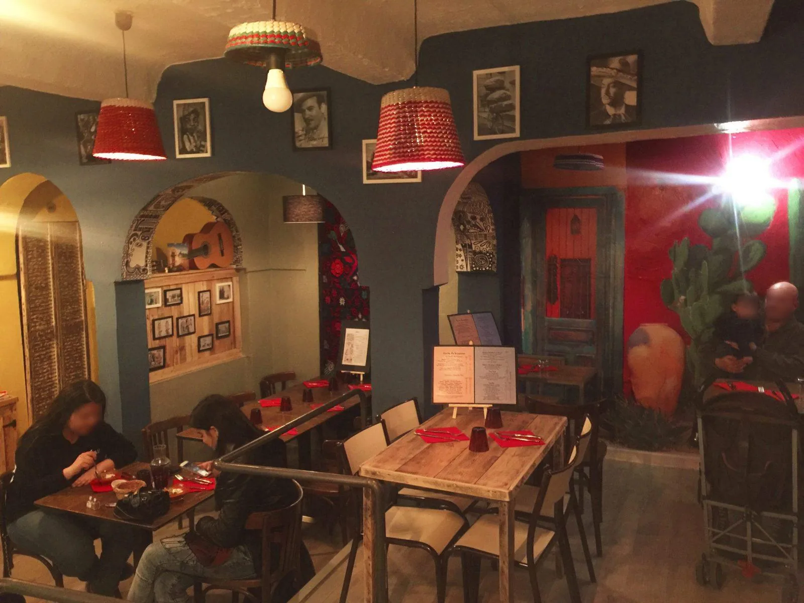
At handover, Lucia particularly valued the coherence between the dining room and the food. A chef had arrived from Mexico, and the intended journey extended to the plate. The decor was not an unrelated theme attached to a conventional room: atmosphere, materials, colors, and cooking were meant to belong to one experience.
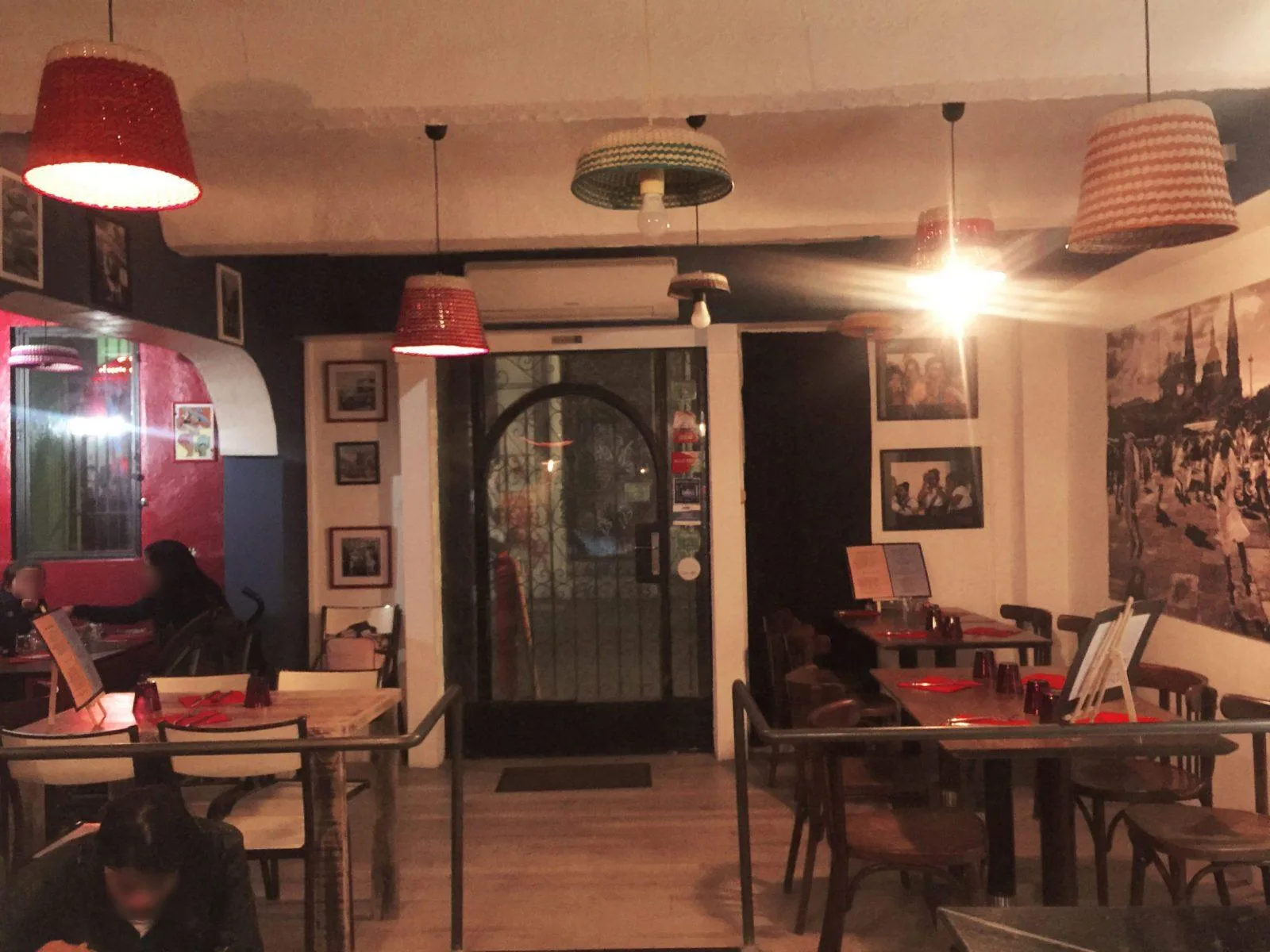
The finished photographs show how the limited palette became a real place: blue walls and arches, framed pieces in niches, a red wall with cactus imagery, woven-fiber pendant lights, and timber tables. At the entrance, the glazed door’s wrought-iron grille, monochrome framed pictures, and pendants continue the atmosphere up to the threshold.
For a domestic interpretation without restaurant operating constraints, see Mexican-inspired interiors at home. For the technical side of food preparation, professional-kitchen planning addresses workflow, hygiene, and materials. Those are connected but distinct questions: a memorable dining room does not resolve a kitchen’s technical design.
Questions raised by this project
What budget did the original article mention?
The source gives a broad historical reference of 500 to 1,500 EUR per m² excluding tax for a personalized restaurant renovation involving paint, finishes, and fitted elements. This is not an ArchiWorking service price, current quotation, or reliable total for another premises. Existing condition, scope, equipment, and compliance work can change costs substantially.
Note: prices are indicative, based on projects in France in 2017, and vary by project, region and finish.
How can a theme avoid becoming kitsch?
Use specific references, a limited palette, and an architectural hierarchy. Let volumes, surface textures, and selected focal points carry the idea rather than relying solely on a mass of symbolic objects.
Can decoration make a small room bigger?
It can increase perceived depth, as the painted perspectives did here, but it does not increase floor area or legal capacity. Physical clearances remain the first design constraint.
Is this only a decorating task?
Not when the project affects circulation, volumes, structure, or building services. Those issues require appropriately qualified design and technical professionals under the local rules. A decorator may focus more on aesthetics and finishes; titles and permitted scopes differ between countries.